

Each year, we look forward to seeing the latest in design at fairs around the world. As designers continue to reinvent themselves, starting industry trends that speak to the present moment, the fairs themselves also have to evolve. This year, IDS Toronto and ICFF revealed major rebrands, while Salone del Mobile debuted a data-driven campaign that works alongside its existing identity. We spoke to the creative agencies behind these initiatives to learn more about how their approach reflects the unique character of each show.
What was the brief?

- Melissa Agostino, Creative Director of Sali Tabcchi
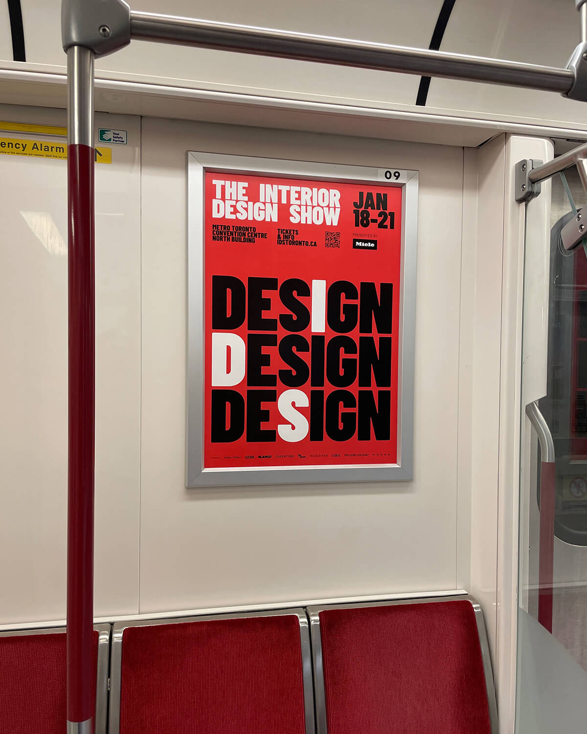
[IDS director] Will Sorrell had a history in the design world but, being new to this show, he wanted to change things up.
- Henry Tyminski, Creative Director of Sali Tabcchi
IDS also wanted something celebratory to mark its 25th anniversary — an identity that positioned it on the international stage and embraced its Canadian roots.
- Meilyn Weege, Strategy Director of ForceMAJEURE
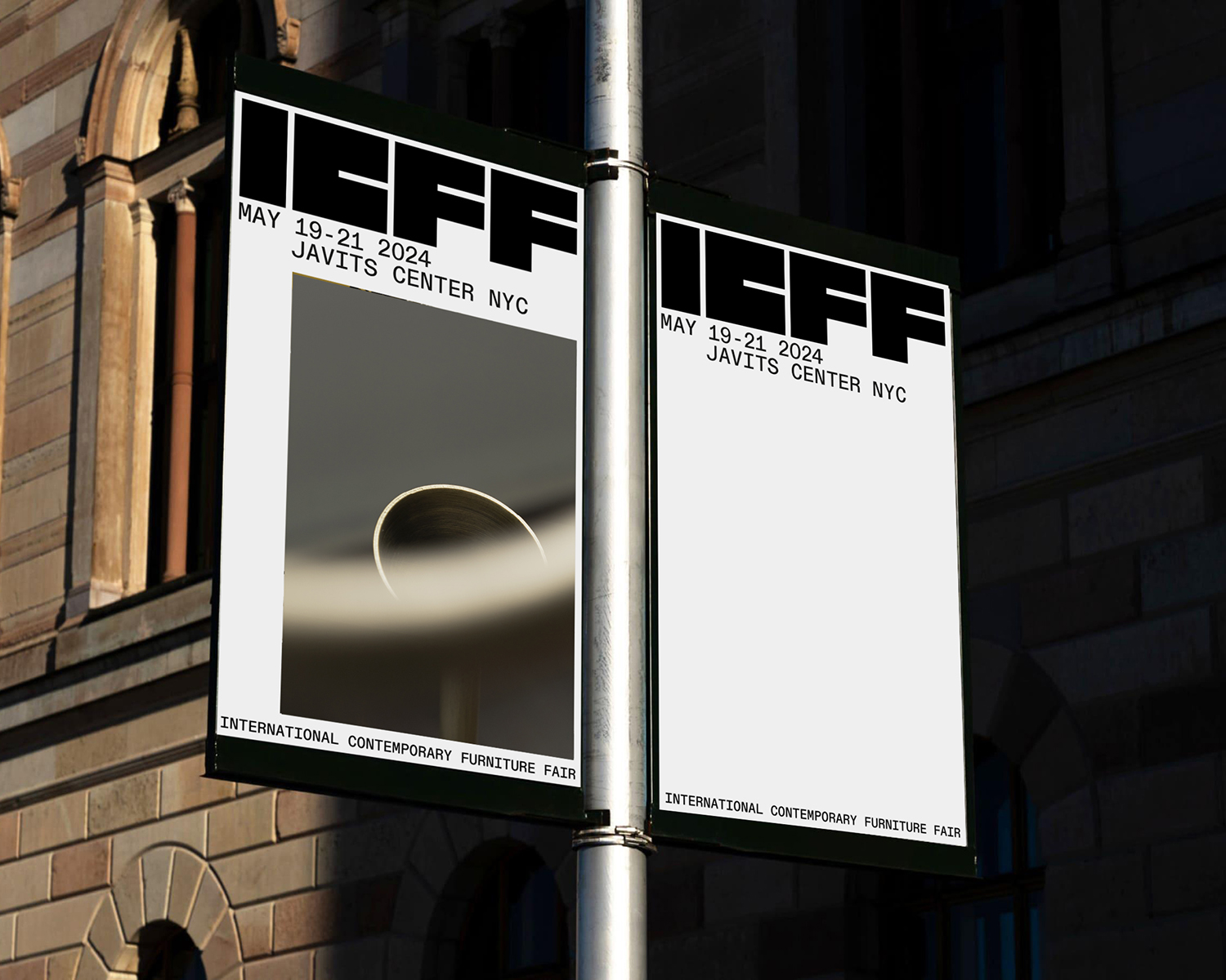
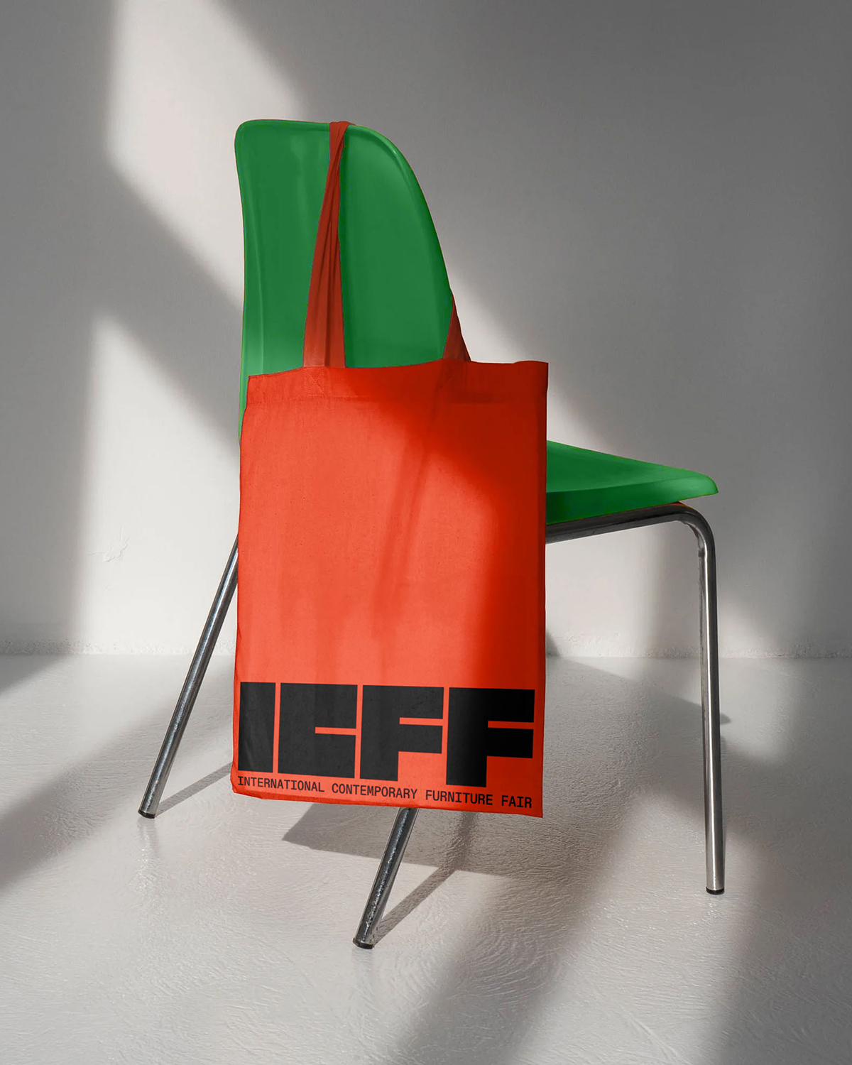
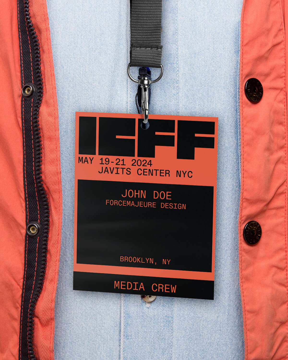
ICFF has a strong legacy in New York, but for a while, it felt like its heyday had passed. Then its partnership with WantedDesign brought a new buzz to the show. After WantedDesign co-founders Odile Hainaut [who is married to Laurent] and Claire Pijoulat became co-brand directors of ICFF last year, we needed to solidify ICFF as a leader with more authority.
- Alberto Fusignani, CEO of Publicis
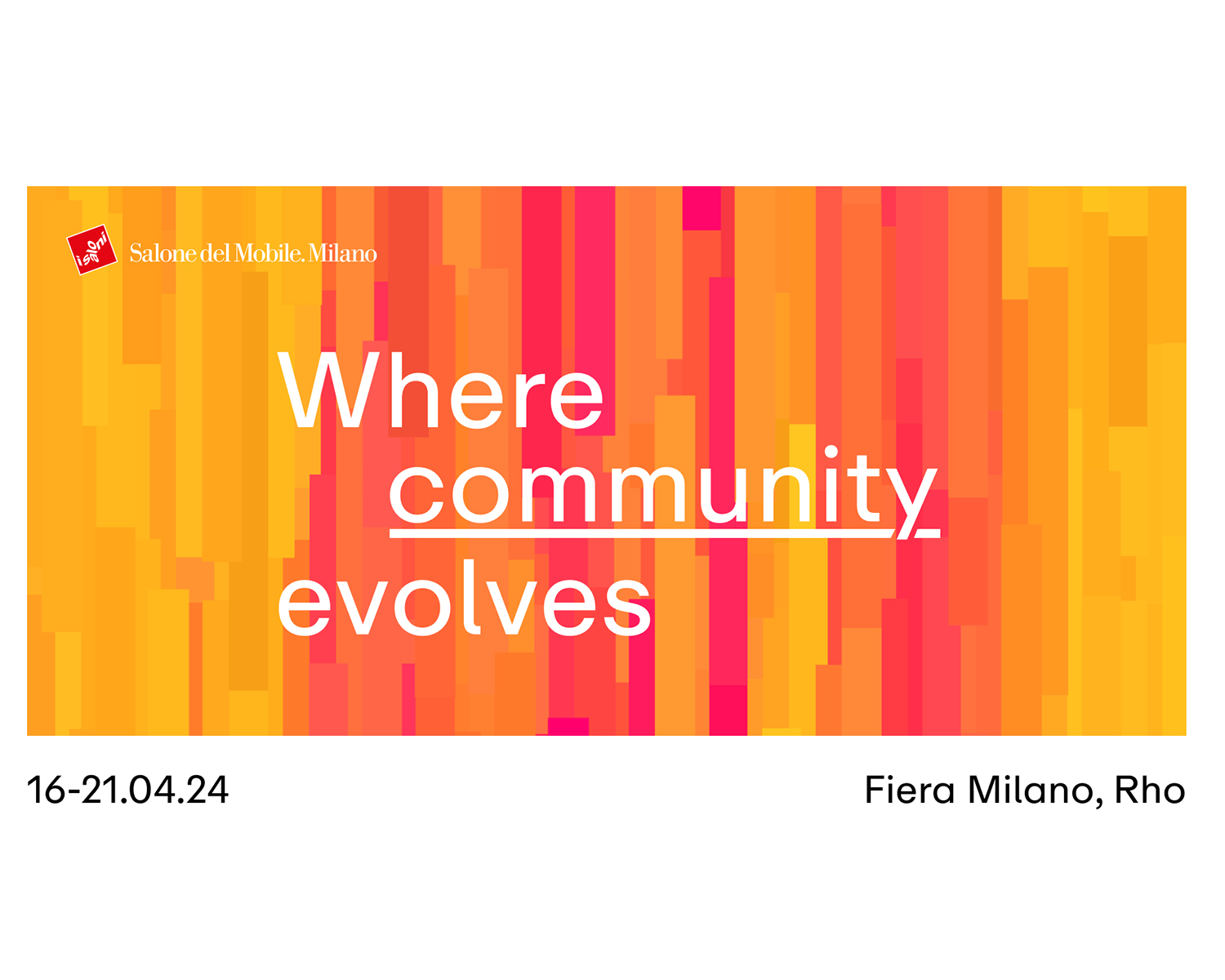
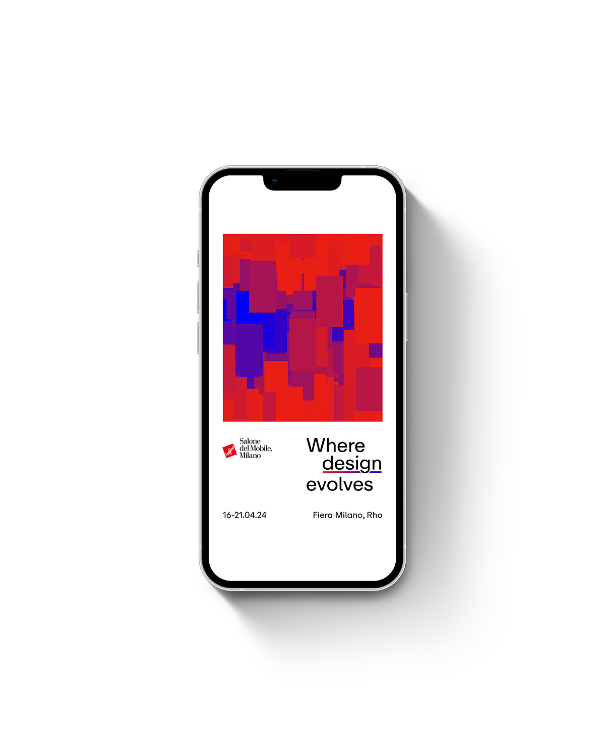
Salone wanted not just to promote the fair but also to create a platform for listening and sharing ideas, trends and innovation, 365 days a year.
- Paolo Ciuccarelli, Founder of DensityDesign Lab
Publicis approached me because they wanted to use data as a key element. They were searching for scientific validation of their design approach.
How does the rebrand reflect the spirit of the show?
- MA
IDS is a trade and consumer show, so we had to appeal to both audiences. It also spans the country, so we opted for a broader identity that expressed the two different design scenes, Toronto and Vancouver.
- HT
The most obvious Canadian reference is the colour scheme: red and white (with a bit of black). But it was also about conveying our friendly and approachable nature. We wanted something that felt serious but not exclusive, elitist or cold.
- Laurent Hainaut, CEO of Force Majeure
Nobody expected to see an evolution of the old identity, so we didn’t play to nostalgia. We kept the black four-letter logo and added a new pop of colour. It signals a return to the glory days when ICFF was breaking the rules.
- MW
We were starting from such a practical base. The branding was never the reason people loved ICFF, but none of what people loved was being articulated. Now, those things are at the forefront.
- PC
Design is shaped by the conversations around it, so we listened to both the public and industry experts.
- AF
It’s a visualization of a year’s worth of conversations about design — a dynamic campaign created by the community. Every image, video, photo and keyword was analyzed by A.I. to create an algorithm that reflects what Salone means to the design industry. When the fair launches in April and we have access to more data, the artwork and the copy will evolve in real time to convey the feeling of being there.
Key design inspiration:
- HT
I’ve always been inspired by Barbara Kruger’s use of colour. I also like the idea of creating patterns — using typography both as text and as a graphic compositional element.
- MA
We loved the boldness of this font, Barlow Condensed, and the satisfying way that the letter forms clicked together. Each one had its place.
- MW
We were inspired by NYC’s gridiron layout. Since interior designers and architects also work within a rectilinear framework, we felt it spoke to both the industry and the city.
- LH
NYC is a key point of entry for the U.S. market, so ICFF is not just a place to see the latest designs, but also a place to do business. This idea of culture and commerce coming together drove the new identity.
- PC
The campaign uses parametric design to connect data points with visuals. The artwork is made up of squares and rectangles, but we had to decide which colour represents which variable. Then, we tweaked the parameters to achieve a design that makes sense aesthetically but is still true to the data.
- AF
Red represents emotion, while the blue represents the rationality of design. The use of gradients and three dimensions adds a contemporary feel.
Roundtable: How Three Design Fairs Rebranded with High-Impact Identities
Creative agencies reveal the inspiration behind updated graphic identities for three major design shows.