

Logo Rhythms

From its beginnings on newsprint, Azure Magazine evolved to become a leading North American print publication focused on international design and architecture. The logo alone has been exemplary of the magazine’s many eras: It first appeared as a loose hand-painted scrawl, then morphed into a playfully warped font reminiscent of an ’80s shop sign. Digitally compressed typefaces had their day in the ’90s and ’00s. And, introduced in 2010, the bold and blocky word mark that currently graces the cover has held steady for its reliable sturdiness.
Blue is the Hue

In Azure’s first issue, published in 1985, co-founders Sergio Sgaramella and Nelda Rodger offered a simple and optimistic explanation for the magazine’s name. So we have developed a set of Azure blues that starts with a powdery sky and progresses to deeper shades derived from lapis lazuli, the stone from whose name the word “azure” originates.
A New Face
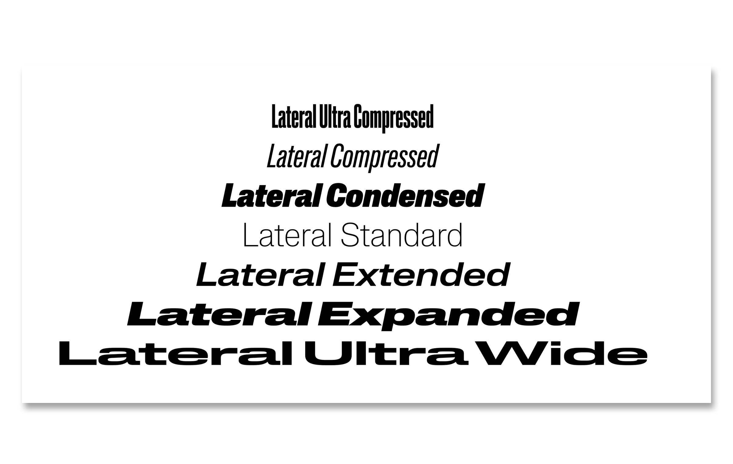
Lateral, our new sans typeface, is designed by independent type studio Schick Toikka, out of Berlin and Helsinki. Drawing on the idea of expansion, the font encapsulates the range of compressed to wide letterforms that have been used throughout Azure’s four decades in print. We hope it makes for a dynamic, varied and — above all — easy-to-read experience.
40 Years of Print Love at Azure Magazine
You may have noticed that Azure has undergone some…renovations. Here’s how we conceived a new look for our book.