
Architecture firms come and go. In an industry moulded by stark economic cycles and even starker personalities, tides of layoffs, mergers, retirements, acquisitions and insolvencies are an almost metronomic constant. The few longstanding practices that endure through multiple generations of designers — from SmithGroup and SOM to Henning Larsen — tend to eventually consolidate into a corporate mega-scale, or drill down into a narrow, highly technical niche of expertise. Operating out of a row house storefront on Queen Street, Toronto’s RDHA is a 126-year-old exception to the rule.
Founded by Ferdinand Marani in 1919, the firm soon became a hub of local design culture. Their work includes the Georgian Revival Medical Arts Building at the corner of Bloor and St. George, as well as Art Deco offices across Toronto’s downtown core. After World War II, the studio — eventually renamed Rounthwaite, Dick & Hadley — evolved with the times, later designing modernist edifices like the Bank of Canada Building (1966) at 250 University, and then partnering with Arthur Erickson to design Ottawa’s Bank of Canada (1979) headquarters, before nearly going out business during the early 1990s recession. Then, in 2009, the firm now known as RDHA completed Toronto’s Bloor Gladstone Public Library.

The widely celebrated project was the first for architect Tyler Sharp, who had recently joined principal Bob Goyeche as part of the firm’s leadership. Now helmed by Sharp, Goyeche and Geoff Miller, RDHA has evolved into a heritage firm with the energy of a boutique practice. Over the last decade and a half, the studio has won multiple Governor General’s Medals while taking on a wide range of public commissions — from public projects like Cambridge’s Old Exchange Post Office transformation to recreation centres and transit infrastructures like downtown Toronto’s striking Scott Street Interlocking Signal Tower Generator, and two more recently completed libraries, Mississauga’s Hazel McCallion Library and the Story Arts Campus Library at Centennial College.
Stefan Novakovic: RDHA is a pretty distinctive practice. The firm is well over 100 years old, but really started to capture the architectural zeitgeist within the last decade or so, starting with the Bloor Gladstone Library. Tell me about your journey.
- Tyler Sharp
Yes, it is a unique practice in that regard, and it has gone through a rather significant transformation in the last 15 to 20 years. From generation to generation, the firm has been passed down to new partners. And the name and ethos has changed many times over the last hundred-plus years. The current group of partners chose to keep the RDHA acronym intact to maintain a connection to this long history, but we made the decision to reimagine the vision of the office and the work, and in doing so, define a very specific kind of design language for the creation of public architecture.
For me, the beginning was really the Bloor Gladstone Library. It was actually my first design project at RDHA (prior to that, I was at KPMB) and it marked the beginning of a process of developing a design language and approach that has become pretty pervasive in my work and the practice.
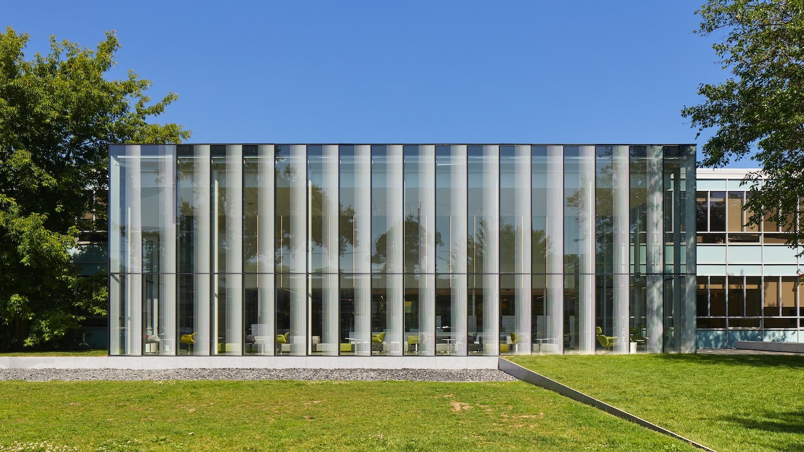
It’s a renovation and addition project to a beautiful old heritage structure — a neo-classical brick building. It was easy to start from a standpoint of reverence for the history of the building. We began by drawing and analyzing the existing architecture; decoration; proportions; structural bays; eave height; curtain wall divisions, etc…
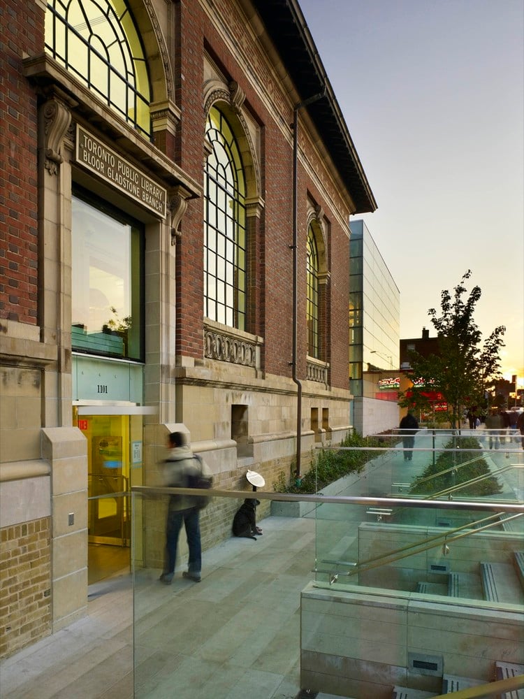
The old building has a division of five prominent bays, which informed the rhythm and number of curtain wall bays in the new wing. That rhythm quietly guided the composition of a very contemporary addition. There’s a coursing pattern, and there are points of reference that are drawn across into the new addition. The frit patterns on the glass change subtly to relate to the horizontal courses of decoration, and the joint lines in the podium all relate to the joint lines in the historic building.
Over the last 15 years or so, much of my practice has been dedicated to adaptive projects, and expansions and renovations of public buildings, although I’ve certainly designed standalone buildings — like the Springdale Library in Brampton.
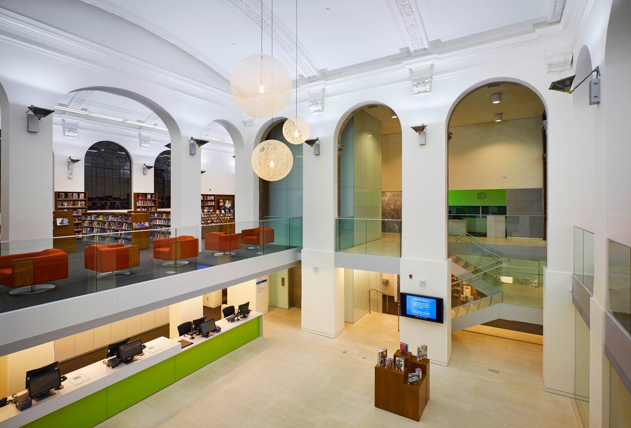
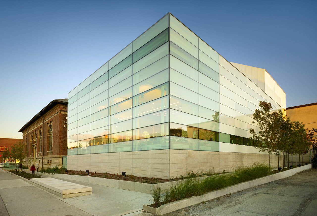
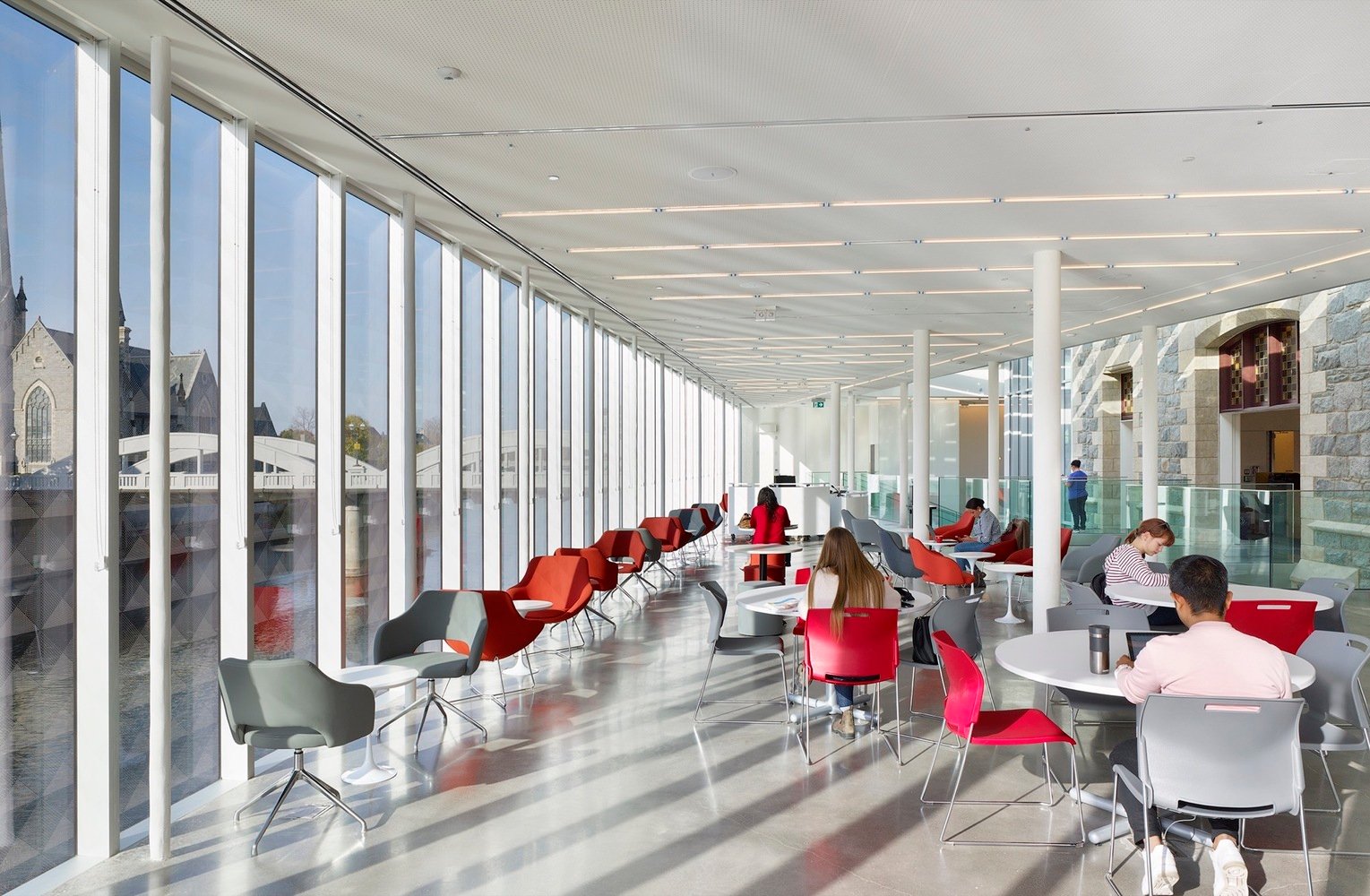
I’ve spent a lot of time at the Bloor Gladstone Library over the years, and I always enjoy being there. There’s a pleasant sense of openness, and coherence between old and new. At the same time, it’s a modernist glass box politely tucked alongside a heritage building, which is a design move with ample precedents. When I look at your more recent work, like the Idea Exchange Old Post Office in Cambridge, the relationship between heritage and intervention is much more complex. What I like most about it is how the new volume is so deeply intertwined with the pre-existing building — it almost swallows it up while ultimately still celebrating it.
With Bloor Gladstone, I started out by trying to keep it as simple as I possibly could. I was a very young architect and I was being given responsibility very early and so I needed to keep it simple so that I could understand how to resolve all this. And so with each project, I am intentionally trying to bring more complexity, while keeping a sense of coherence intact. I think there is a sense that they these buildings are slowly becoming more expressive and complex, project to project. While still attempting to very carefully analyze and respect those existing heritage conditions.
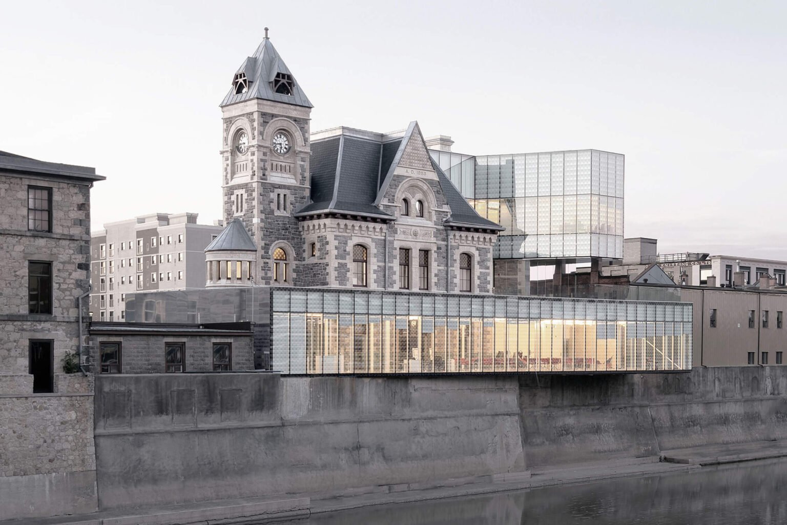
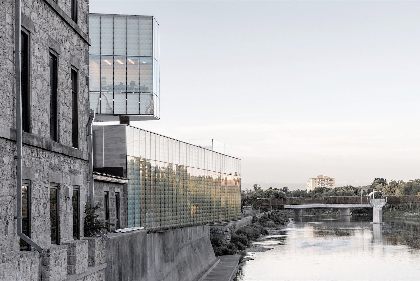
With Idea Exchange, it was a fundamentally similar process to what we developed for Bloor Gladstone, in the sense that it’s a renovation addition to a listed designated heritage facility that had been run down after decades of use. A big part of the concept is restoring the existing building, adaptively reusing it and then adding to it. But the other element of complexity was the site. Because it’s a highly constrained urban lot right on the Grand River, you’ve got very little space to maneuver. There’s a building immediately to the north and another building to the south, so we had no space to put in the new program that they wanted to introduce. There are zoning bylaws and regulations that prevented going particularly high vertically, and you’ve got a flood wall and the river on one side. so it was the most complex project in terms of how many parameters affected the built footprint.
And so it evolved to become this very contemporary form that is pushing out to to gain the program space that our client group wanted. But it’s also also contoured to create views up and downstream and allow views toward the historic property, where there’s sort of an upper cantilevered volume with a cant to it that opens up a view to the heritage property. We were very careful to always ensure that the heritage building is really in a prominent position. And that the defined heritage elements are on view. We broke down the new volumes into parts, which made the intervention easier to manage formally, allowing more views of the existing building. Volumetrically, the geometry of those forms — the angled planes, and the fact that they’re broken into these smaller volumes — allows for these multiple views from up close to the building, or from across the river at the Waterloo School of Architecture.
Did you face a lot of opposition regarding the extent of the transformation — and the changes to heritage?
Yes and no. The building was in such a bad state that there was a lot of public appetite to renovate and reimagine it. It was Canada’s first “bookless library,” which was the brainchild of the chief librarian, Greg Hayden, who was very supportive of it. And for the mayor at the time, Doug Craig, it was kind of a legacy project.
But we did face some opposition from a local heritage activist group. There were lots of meetings and presentations to try to deal with their concerns and we spoke to them in the same way we speak to clients: You communicate the logic and the reasoning of the project — with diagrams and plans and language. We want to show that everything was done for a clear reason.
Over the last few years, you’ve started to take on cultural projects that adapt more recent buildings. At Toronto’s Centennial College, the Story Arts Campus Library is an expansion of a 1954 Peter Dickinson design, which won a Massey Medal in its day.

I have been lucky enough to work on numerous interesting projects that deal with renovating and adding to historic buildings, and then equally interesting admirable mid-century modern buildings, most recently Peter Dickinson’s Story Arts building at the Centennial College.
With this project, we took a similar approach to dealing with an older heritage building. In this case, our intervention was perhaps more complimentary, as the Dickinson building is a clear example of modernism, and it’s closer to our own design language. I am a great admirer of Dickinson, and his building is a great piece of educational architecture — one that I think was actually initially designed as a convent. Anyhow, my first impression was really just respect for the building, and an understanding of its modernist language and spatial organization of rational curtain wall grids and orthogonal lines. It’s efficient planning but also punctuated by these moments of modernist, Corbusier-like curvature.
There were already a few modifications to the original design, including a fairly recent addition by Kongats. And there was an existing library in the same location, as well as another addition that was what I would call a piece of late deconstructivist architecture, and stylistically dated. The initial scope of the project was simply to renovate the interiors. But the scope was expanded to include the rebuilding of this addition along with the transformation of the interior spaces.
As with Bloor Gladstone and other renovations and adaptive projects, we began by drawing and analyzing the existing building to understand the architecture as deeply as possible. And we looked for references and points in the design that we could draw on to create coherence — in spatial proportions, and the rhythm in frit and fenestration. From the beginning, we worked to develop a clear concept to guide the project all the way through to construction. This type of “parti” is something that a lot of architects leave behind after they finish school, but I never did. I think that every good project has a strong guiding concept.
Another tenet that we always layer in — and that was important here — is accessibility. When I say accessibility, I mean it both in the physical sense of universal accessibility, but also the idea of perceptual accessibility, the notion that the eye proceeds the body. I think it’s important that one can understand and engage with the building perceptually — even before entering. We aim to make the architecture legible, something that can be easily understood by users and architects alike.
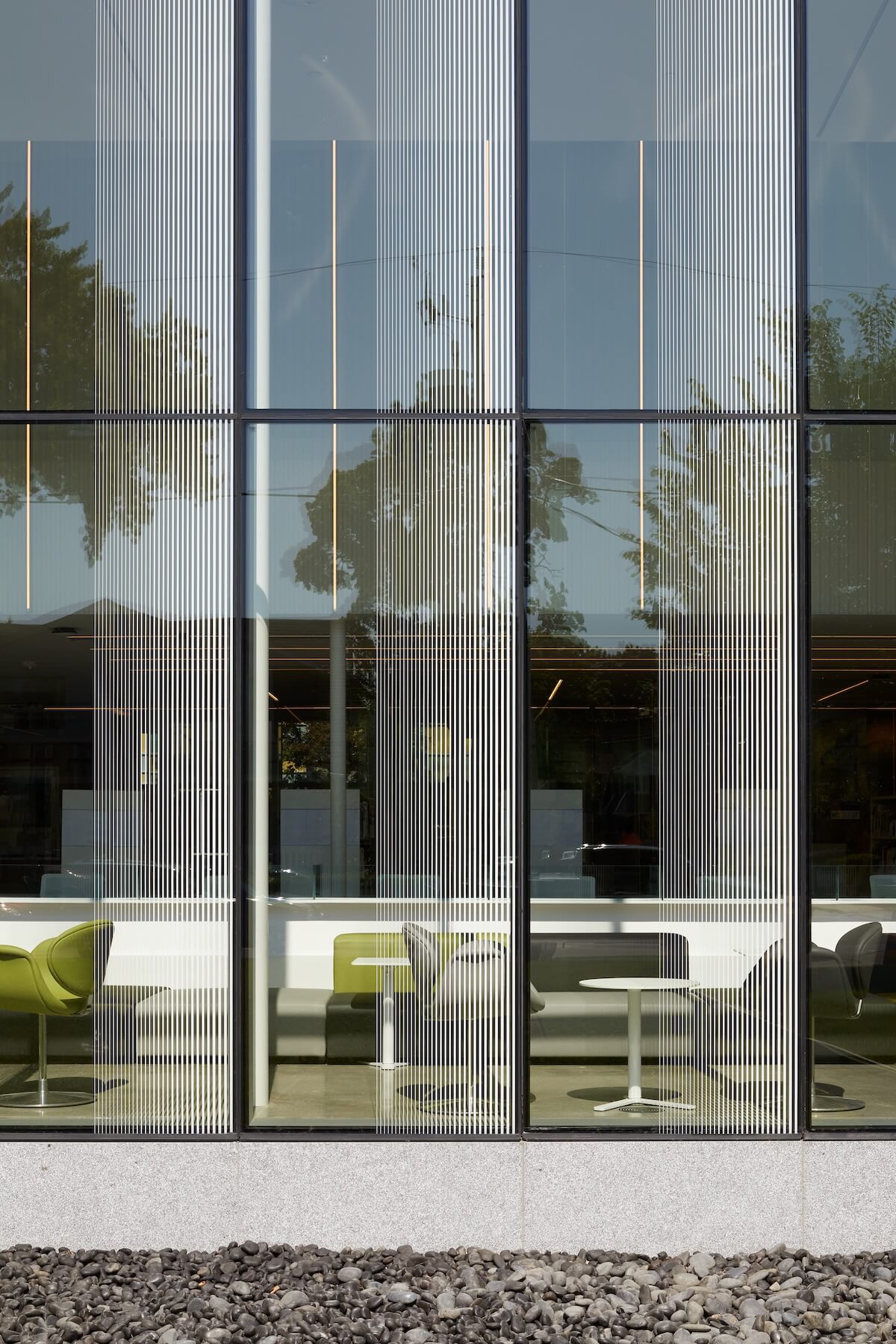
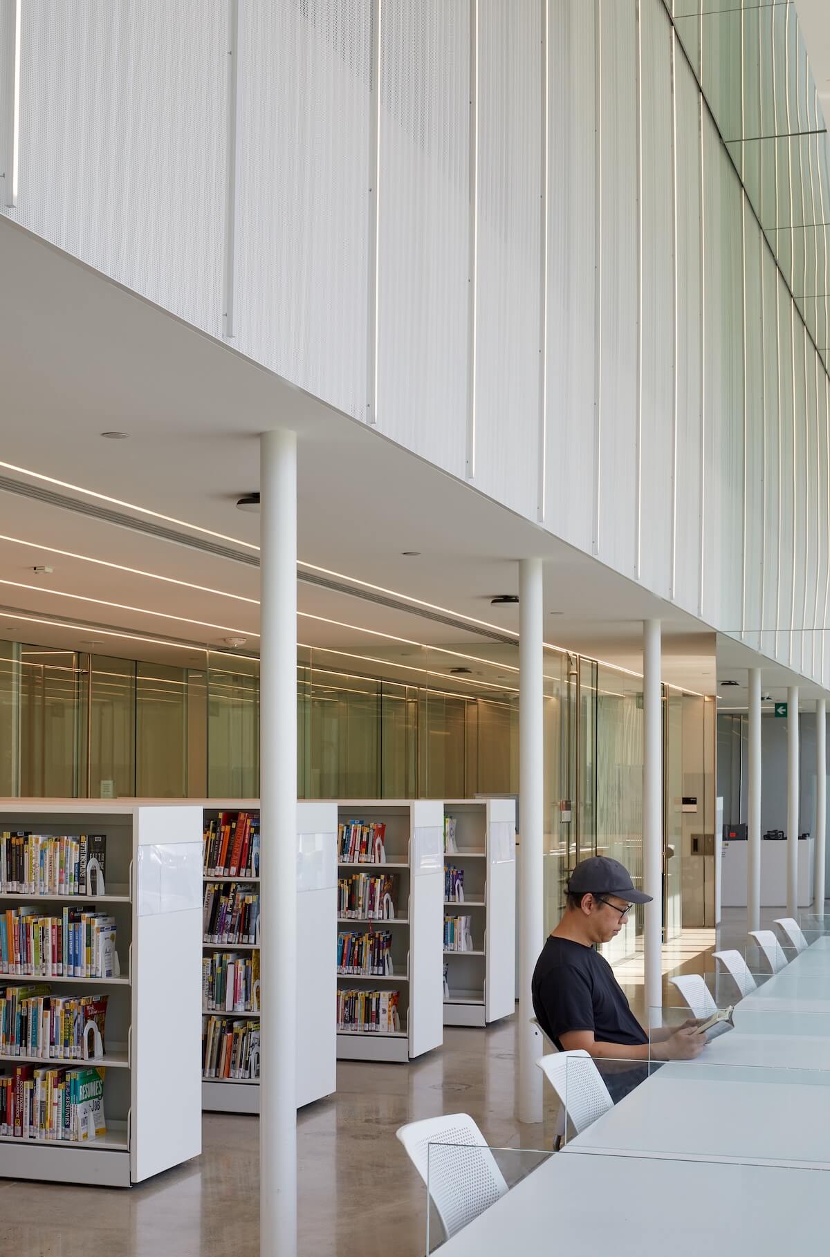
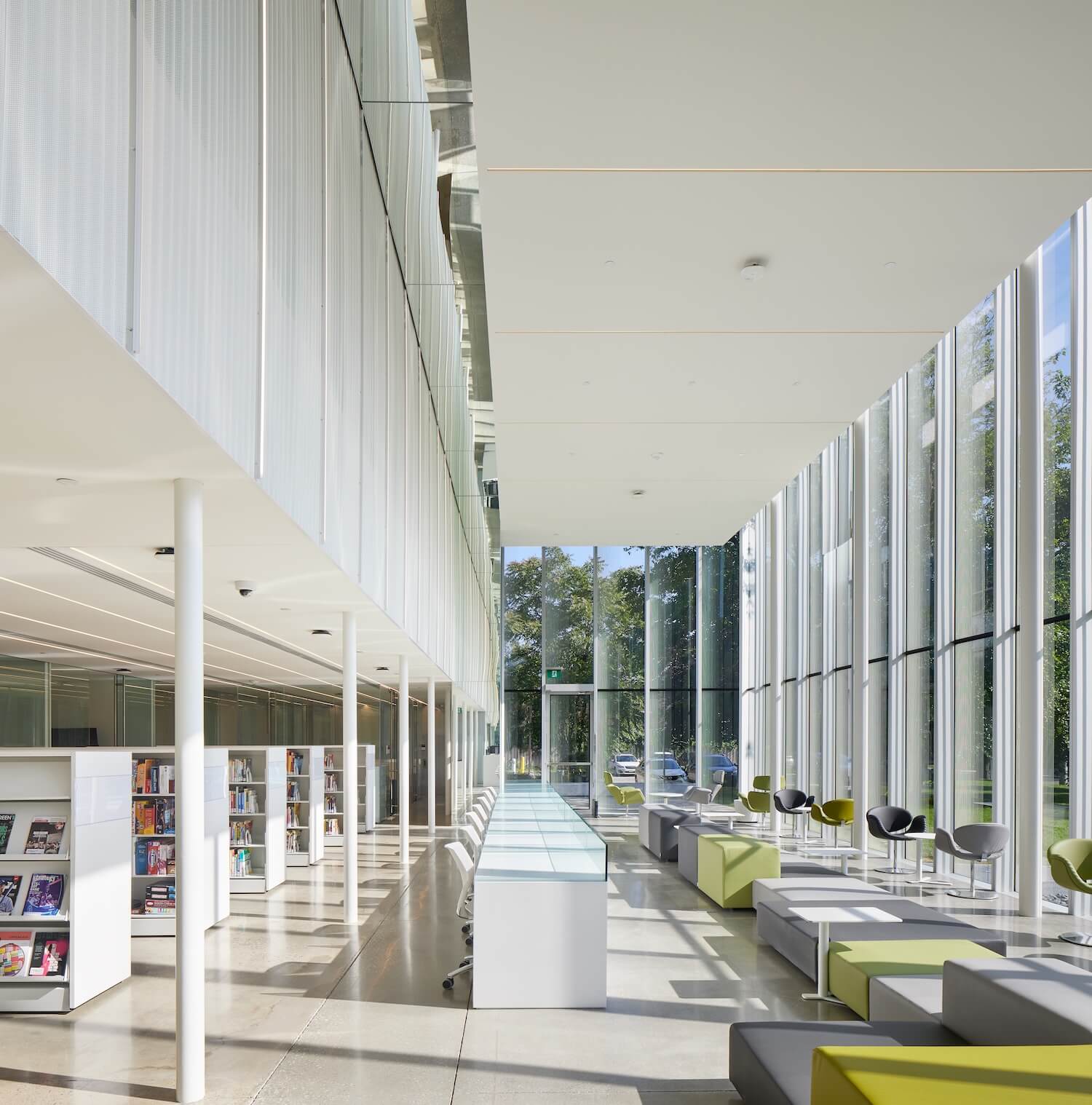
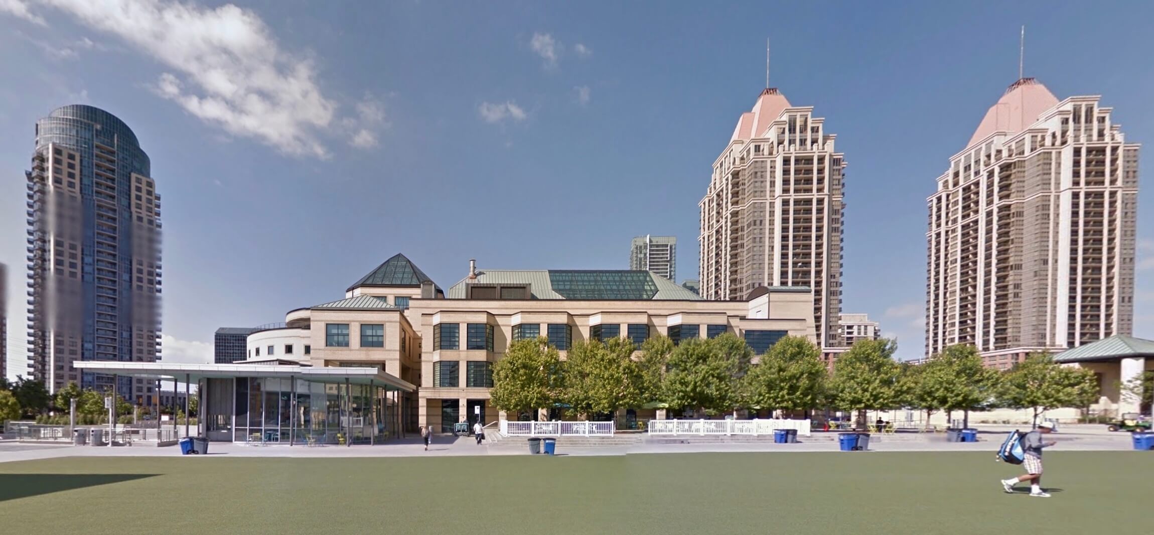
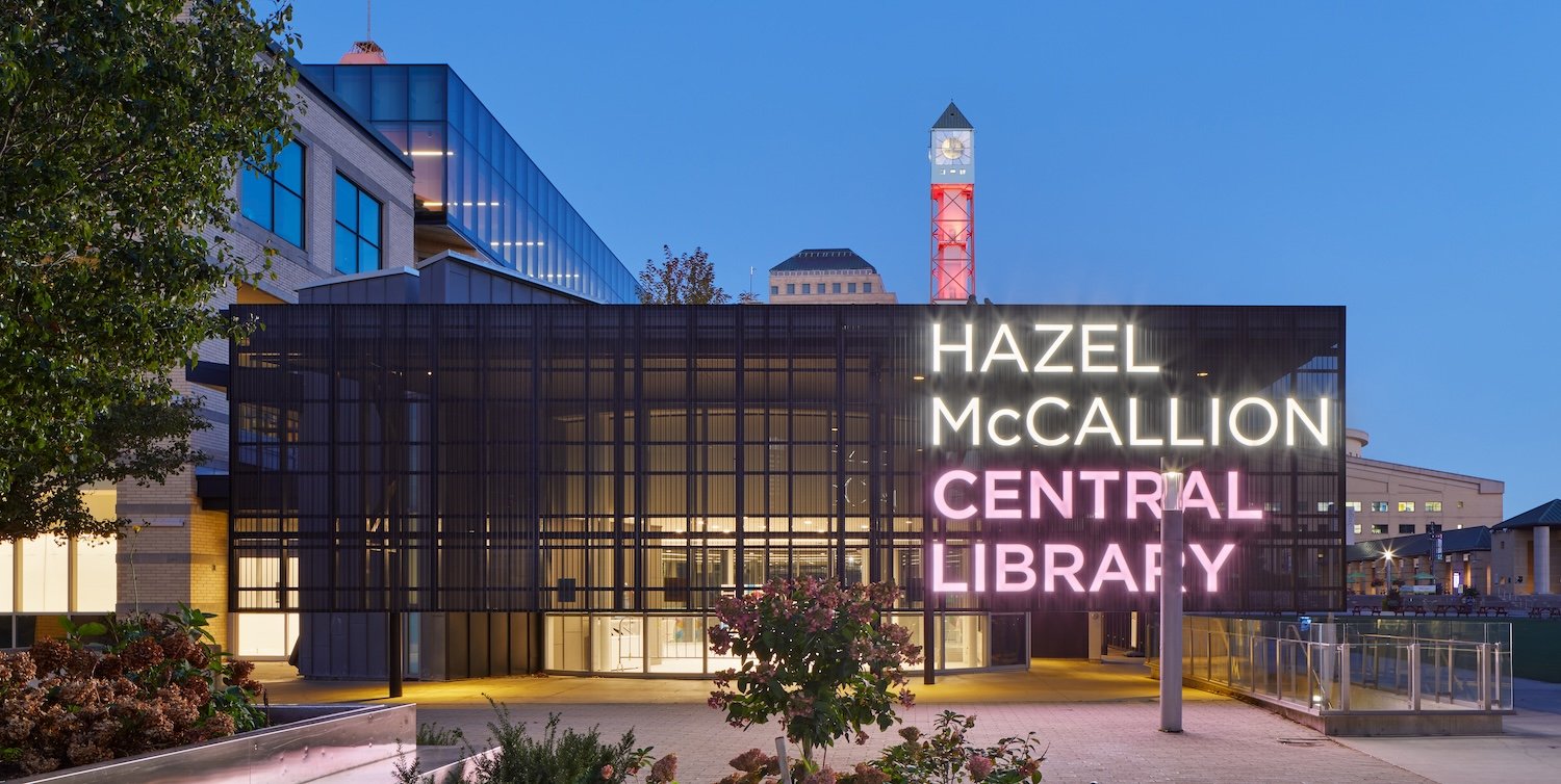
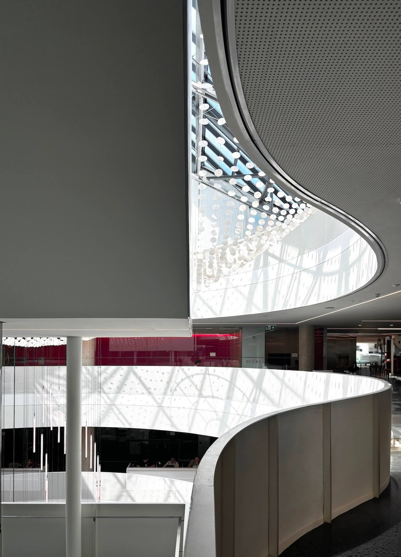
Although there’s an obvious formal sympathy between your addition and Dickinson’s building, it strikes me as another example where the addition isn’t hiding behind history. You’re complementing it and creating a dialogue, though one where the new intervention is arguably more assertive than the older structure. But let’s move forward one more era. In Mississauga, you recently undertook a revitalization of the Hazel McCallion Library, which is housed in a 1991 postmodern building by Shore Tilbe Irwin + Partners. How did this inform your approach?

The Hazel McCallion project was complicated on so many levels. First, we can see immediately that existing architecture will be challenging to deal with. Architecturally, it’s a very heavy-handed piece of post-modernism, and there have been modifications made to it that are problematic. The initial reaction is: What am I going to do with just this building? How do you approach a piece of heavy-handed post-modernism when you don’t have the same level of reverence that you might have for a traditional “historic” building? Do you try to remove that language or honour it?
And in the end I think you have to accept the building and its style, and to honour it in the same way as you might with a more traditional piece of architectural history. And anyway, we didn’t have the budget to change the envelope even if we wanted to. So I had to accept the existing architecture and develop a design dialogue between the existing and new design work.
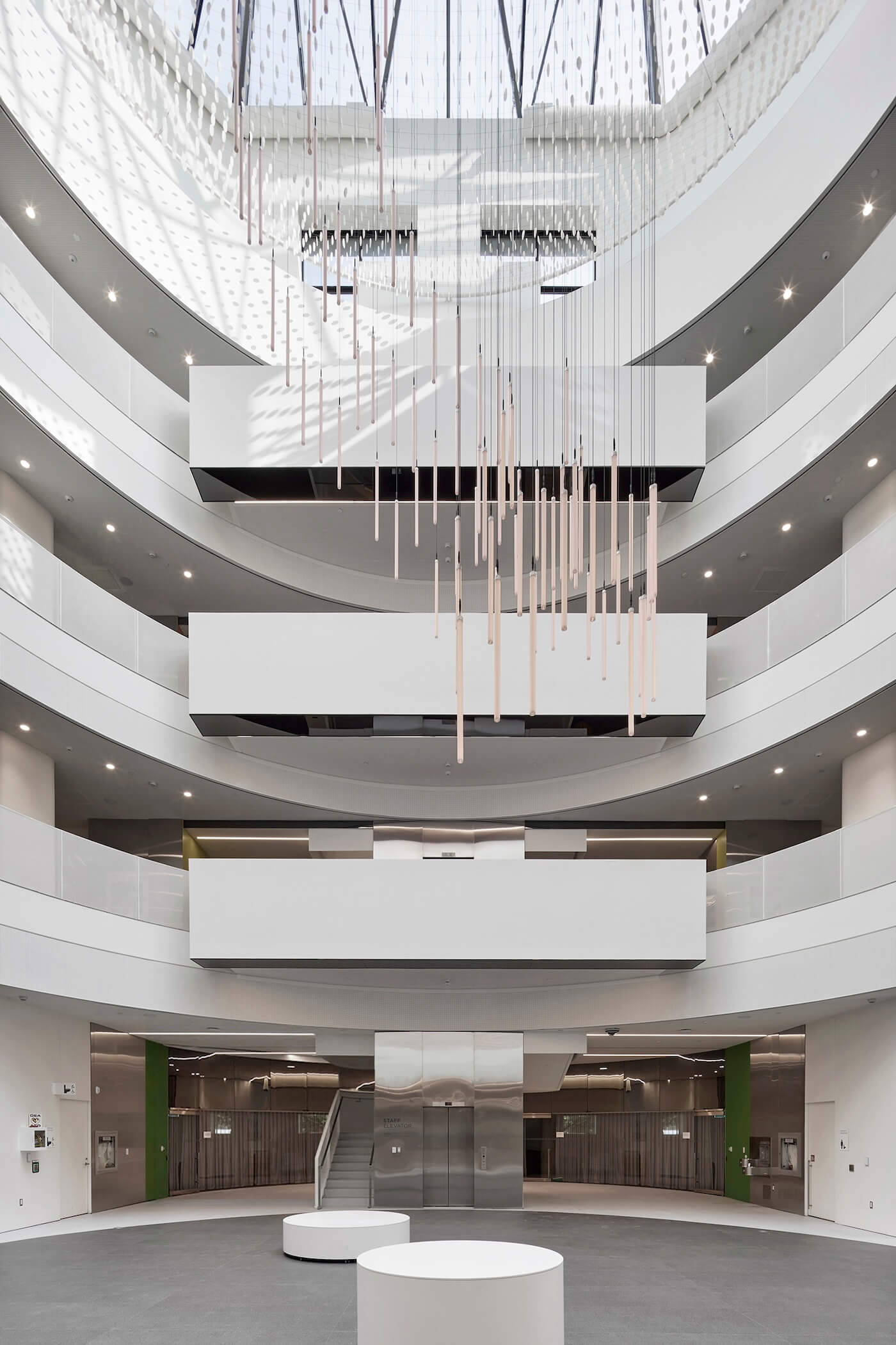
Aside from style, the next thing we noticed as we first went into that building was that there was little sense of legibility. It has a grand atrium, yet it was also a very enclosed condition with no views being offered to see what was happening on the upper levels or across the plan. It was almost like two separate buildings, with a south building and north building and numerous physical barriers — thresholds and rooms — that made it difficult to understand and move through.
Even though it’s right across the street from Mississauga’s famous City Hall — a notable 1987 design by Jones & Kirkland — it didn’t really feel like a civic building. From the street, one might’ve guessed it was an office complex. As a passerby, you wouldn’t know that it was a library.
The sense of entry was confused. People were often confused about how one gets into the building. It certainly wasn’t clear. So trying to mark those entry points in ways that were clear became very important to the project, as was redefining the entry sequence and choreographing how people move into and through the space.
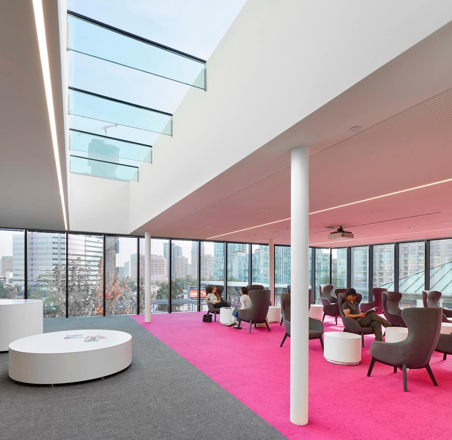
There was little budget that could be used for major exterior modifications. As a result, we used a kind of “parts to the whole” process of creating small exterior insertions at several key points around this building. In the hope that the placement of smaller architectural components, using a new language, might be read together to have a larger impact. This includes the high level glazed addition; the charcoal grey perforated metal screens adjacent to entries and the new glass corner opening set within the existing auditorium.
It’s all done within a fairly minimal design language. The benefit of a very quiet architecture — devoid of too much decoration or expression — is that it tends to marry well with most existing conditions. It’s strong enough to make an impression, but quiet enough that it’s not competing with the existing condition. But it was a challenging project to work on, because I had an immediate reaction to the postmodern architecture.
What made a postmodern building more difficult to work with? Contemporary architecture — and certainly Canadian design culture — has much more in common in modernism than postmodernism and other late 20th century styles. Why do you think that is?
When I was in architecture school, it was at a point in history where postmodernism was in its decline, in terms of both popular and critical opinion. The other dominant style was deconstructivism, and it was also just beginning to decline in popularity.
Both styles were sort of neck and neck at that time and then very shortly after that, there was a a rise in popularity in architects like Peter Zumthor, who were developing a much calmer and more rational kind of expressive, almost minimalist architecture. And this led to the rise of a quieter and more conceptually pure type of architecture – a breath of fresh air for me after seeing the historicism of post-modernism and the formal clutter of deconstructivism.
With postmodernism, one of the inherent flaws — for me at least – was this appropriation or pastiche effect of incorporating historic details and forms, arranged in a contemporary manner to meet new program requirements and make the historic contemporary. It was successful because I think that the general public very familiar with these historic forms and details and it was perhaps an easier sell, that is, cloaking contemporary program in a familiar historic architectural language of form and detail. People are comfortable with — and impressed by — a dome, a vault, or a Doric column.
Historic architecture is beautiful, and our understanding of that beauty comes through hundreds of years of generational familiarity. People understand and accept this historic body of work because it has been a part of our built culture for so long. That said, this appropriation was perhaps a bit too easy, and for me, a bit creatively stunting to think of as a style that I could adopt.
It doesn’t mean that there’s no place for history, or that everything has to be minimalist. I remember one of the first projects that I did in architecture school involved a trip to see Exeter Library by Louis Kahn. Experiencing this very pure, rational and legible library had a big impact on me. And while modern, it synthesizes aspects of historic architecture, in a manner that does not seem appropriated but monumental and pure. Upon entering the atrium, one seems to immediately understand how the building is organized: you understand how you are situated, and where program might be located in a way you can intuitively perceive. I like the idea of architecture, and specifically public architecture, that is legible.
I also like the idea of reducing architecture down to its essentials, and that is quiet enough that the program and users become a final layer of decoration within the design. The people, the program, the technology, the books all become part of the architecture.
Tyler Sharp will be speaking at a workshop on adaptive reuse and renovation at this year’s AZURE Human/Nature Conference, taking place at Toronto’s Evergreen Brick Works on October 29-30. Tickets are available now!
Legible Space: RDHA’s Tyler Sharp on Heritage and Expressive Adaptation
The architect reflects on reinvigorating a century-old practice and honing a specialty in adaptive libraries that combine contextual sensitive with surprising flair.