
For Michael Bierut, co-founder of the influential New York design studio Pentagram, it all began with a forklift. As a child, Bierut’s obsession with graphic design started with a logo on a piece of machinery, depicting a company name in capital letters: CLARK. The logo’s L lifted up its A – like a forklift might – tidily depicting the brand’s identity and purpose. He was immediately hooked. “It was like magic,” he told a packed audience at Toronto’s DesignThinkers 2018 conference in October. “It was like someone was hiding things in plain sight.”
The relationship between design and truth – illustrated so clearly by that forklift’s logo – was the basis for How To, his DesignThinkers keynote lecture. Through his presentation, which touched on his game-changing work for Hillary Clinton, the New York Times and Walk NYC, another thread emerged: the importance of compromise. Each of Bierut’s projects balanced competing egos, inflexible client constraints and old-fashioned laziness – and each, somehow, came out for the better. Here, according to Bierut, is how designers can compromise gracefully.
1 Learn to let go of good ideas
In 2008, Portland architect Brad Cloepfil completed a redesign of Manhattan’s Museum of Art and Design (MAD) – and Bierut was tasked with rethinking the institution’s logo. Cloepfil cut channels of interconnected glass through the building, allowing light to penetrate, which gave Bierut a brilliant idea: he’d create a logo for MAD made from a single, continuous line. “We’ll have a logo just like Brad’s [design], one line that goes around without taking pencil off paper,” he said. “It turns out that M-A-D are not good letters to do this with.”
But Bierut wanted to make it work, eventually creating a logo that simply used the letters A and D. He tried convincing his clients that it worked – that “AD” was a better acronym than “MAD.” He tried displaying the logo on shopping bags. He tried transforming the continuous-lined logo multiple ways. Nothing worked. “Finally, I just shut up and just looked at [my clients], and had a moment of truth. I asked them, ‘Well, you guys… really don’t like this, right?’ And they said, ‘Honestly, not really.’ “
He realized that he’d “married this logo very young,” that he was pushing his work beyond its logical limits. After swallowing his pride, he scrapped the logo.

From then on, he developed a simpler icon from squares and circles – referencing the form of MAD’s building and the site it sits on – that the museum still uses to this day. And he’s as happy with it as his clients are. “As a designer, you have to be true to yourself,” he says. “But you also have to be honest with yourself.”
2 Don’t be above doing homework (and drawing inspiration from the past)
When Syracuse University approached Bierut to unify their design language, it likely didn’t seem like a fun job: the school had a number of departments, professional schools and logos, each with their own identities. And on top of that, Syracuse wanted to retain its signature colour: orange. There didn’t appear to be much flexibility.
Some designers might turn down the job – or worse, deliver half-baked results – but not Bierut. Instead, he elected to dive deep into the school’s design history. In the process, he discovered that influential type designer Frederic Goudy had once created a typeface meant for Syracuse’s journalism school. After going into a “rabbit hole,” he reconstructed the font, uniting Syracuse’s myriad departments with typography that had a deep link to the school’s history.
“The truth is out there,” he says. “We were able to create a spine for all the materials they have, and in a way that looks Syracuse – in a way that no one can deny.”
Here’s a fascinating re-telling of this story:
3 Get used to the fact that your idea doesn’t belong to you
When Bierut designed Hillary Clinton’s logo for her 2016 presidential campaign, it was panned. “I was freaking out,” Bierut laughs. “When it came out to the world, someone asked: what lucky third grader won the design for Hillary Clinton?”
Design experts, Politico notes, trashed the logo. And Bierut openly feared that he’d be disavowed for the logo, which featured a simple H paired with an arrow – an element that was meant to signify the dynamism of Clinton’s campaign. On a personal level, it must have hurt. But the logo didn’t belong to Bierut – and it wasn’t built to belong to him. “I kept on saying, over and over, that I want this to be a logo that’s so simple, a kindergartener could make it with a pair of scissors and Alymer’s glue,” he said. “You didn’t need to make it with Photoshop and Illustrator.

That simple, hated logo eventually took a life of its own: it became adapted for holidays. Someone made the logo out of seashells and sand. People started making it at home with masking tape, scissors and construction paper. It was evolved into an entire typeface. Someone sculpted the H from cheese. And eventually, it became less about Bierut’s idea, more about what people did with Bierut’s idea.
His logo will be remembered for its virality, but not for pushing the needle on election day, which Bierut calls “one of the happiest and saddest days of my life.” But even if the logo didn’t win Clinton the presidency, Bierut has no regrets. He’s glad it became emblematic of Hillary. “Some people said, ‘Maybe it was all too perfect.’ Maybe it needs to be more accessible to the mysterious people who voted for [Trump], who don’t care about letter spacing,” he says. “But it was reflective of [Clinton]. She doesn’t know how to say this, but she’s the type of person who really wants perfect kerning.”
4 Embrace constraints. They can lead to unexpected outcomes

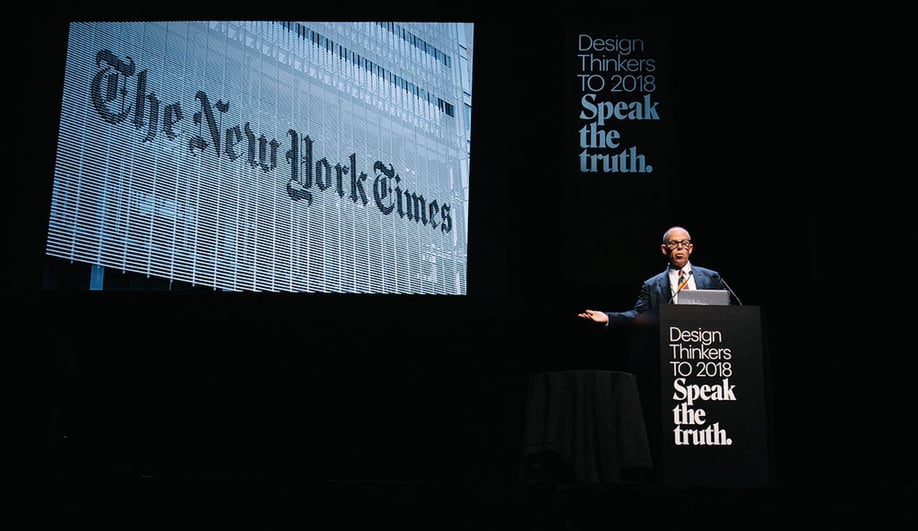
After years of contributing to the New York Times’ opinion section, Bierut landed a job creating the graphics program for the newspaper’s new Renzo Piano-designed headquarters in Manhattan. It would seem like a simple enough job, but there was one problem: the glassy office, which was “transparent in the way journalism is supposed to be,” was located close to Times Square. And due to the “bizarro world” laws surrounding the area, every building had to feature large, prominent signage to preserve the character of Times Square. “Some New Yorkers might say, ‘We don’t want Times Square turning into Toronto, do we?,’ ” he said.
Point taken. So he embraced those constraints, creating a multi-storey logo that’s among the most prominent in the area. Piano had used blinds, made from a series of ceramic rods, to shield the building from the sun. So Bierut blew up the New York Times logo, cut it into 900 teardrop-shaped pieces, and applied them to Piano’s ceramic rods. When viewed straight-on, the building seems transparent; when experienced from below, the logo looks solid.
It’s an elegant solution that responds to two competing objectives: the New York Times’ desire for a transparent building and Times Square’s signage requirements. “It’s become really emblematic of the NYT. When I talk to people about the sign, they don’t know what I’m talking about, because it just appears to be stuck on the side of the building,” he says. “Mission accomplished.”