
Come January, as some Torontonians bundled up to engage in winter sports, others pulled on their warmest layers to venture out and admire great design. Over 10 days, the 2026 DesignTO Festival revealed the thriving creative community hiding behind the city’s towering snowbanks. Who needs a skating rink or a ski hill when you can trek to a basement art gallery filled with oyster-like lighting and rubber side tables?
Given the historic, 60-plus-centimetre snowstorm that coincided with this year’s festival, winter survival gear was the subject of much water-cooler discussion during DesignTO’s evening mixers — and no one evaluates outerwear or footwear better than a designer. From praising the straps that allowed a parka to be worn like a backpack once indoors to cautioning against a pair of boots that weren’t as waterproof as expected, the crowd had no shortage of sage seasonal wisdom to dispense.
These moments were perfect demonstrations of how DesignTO encourages attendees to value and celebrate well-considered, well-crafted solutions to our daily needs. And this year’s festival had plenty of those, from a playfully interactive wall sconce by Mark Khoury and Devansh Shah to beautifully detailed solid wood furniture by Heidi Earnshaw.
Of course, DesignTO’s strength is also in reflecting the different ways that we each relate to design. While we can probably all agree that good winter boots should be waterproof, design can also be deeply personal. Sure enough, identity proved to be a hot topic throughout the 2026 programming, as major exhibitions discussed themes like migration and queer space.
Meanwhile, food anchored several great explorations of cultural expression. A standout group show organized by the Montreal collective Ensemble paid tribute to la belle province by adopting the name (and variegated, throw-it-in-the-pot spirit) of pot au feu, a French Canadian stew, while Mason Studio hosted intimate dinners in a pop-up setting modelled after traditional Chinese courtyards.
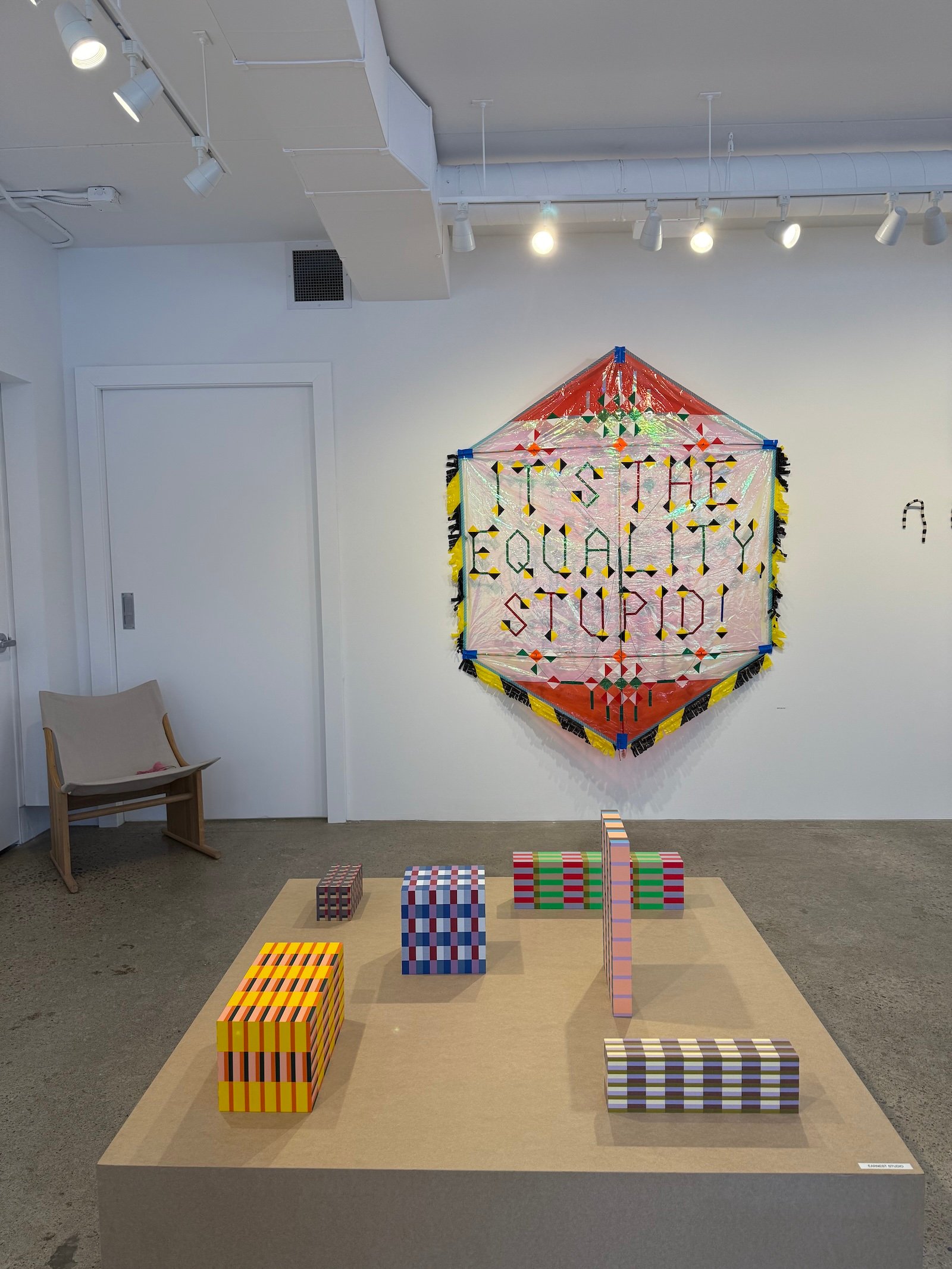
Even the conceptual exhibition “Tape,” which featured a group of designers obsessing over adhesives, prompted reflection on the human condition. Dutch designer Bertjan Pot contributed a tape kite emblazoned with the slogan “It’s the Equality, Stupid,” using a low-cost material to create a political protest sign that made a timely case for a more egalitarian world.
Building off that idea, this year’s edition of DesignTO set an example for how design can improve every aspect of society — from our coat closets to our communities.
Below, we recap a few of our favourite stops:
- Pot au Feu
- To•Be•Longoing: Portraits of Queer Living
- Pressing Matters
- Tape
- Tracing Symmetries
- Slow Furniture
- All Light
- Nice to Meet You
- Light Gathering in the Yuàn
- Neptis Foundation’s Impossible Toronto Panel
- Mjölk with Norm Architects
- Signs of Love and Pearls of Memories
- Traces
.
1
Pot au Feu
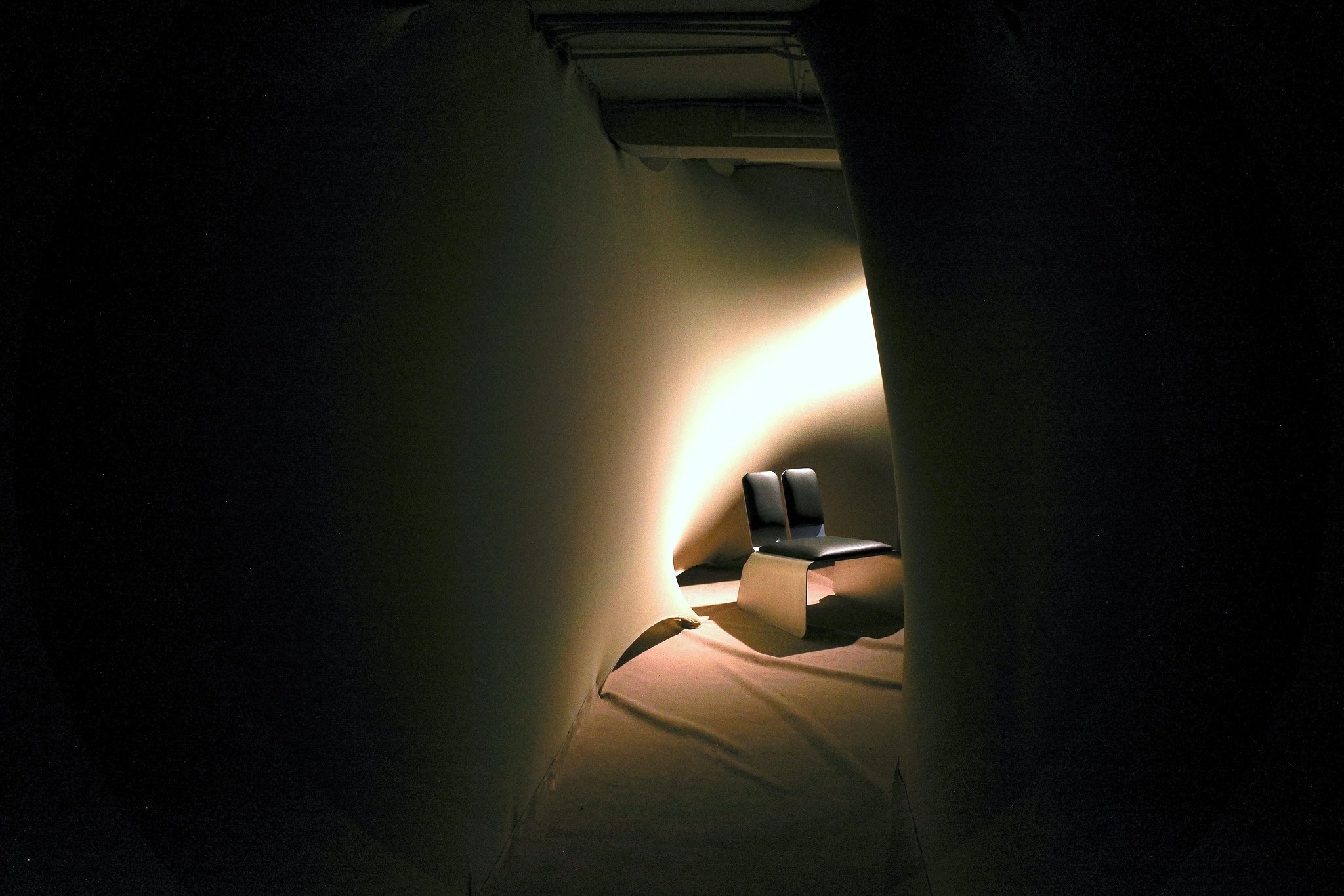
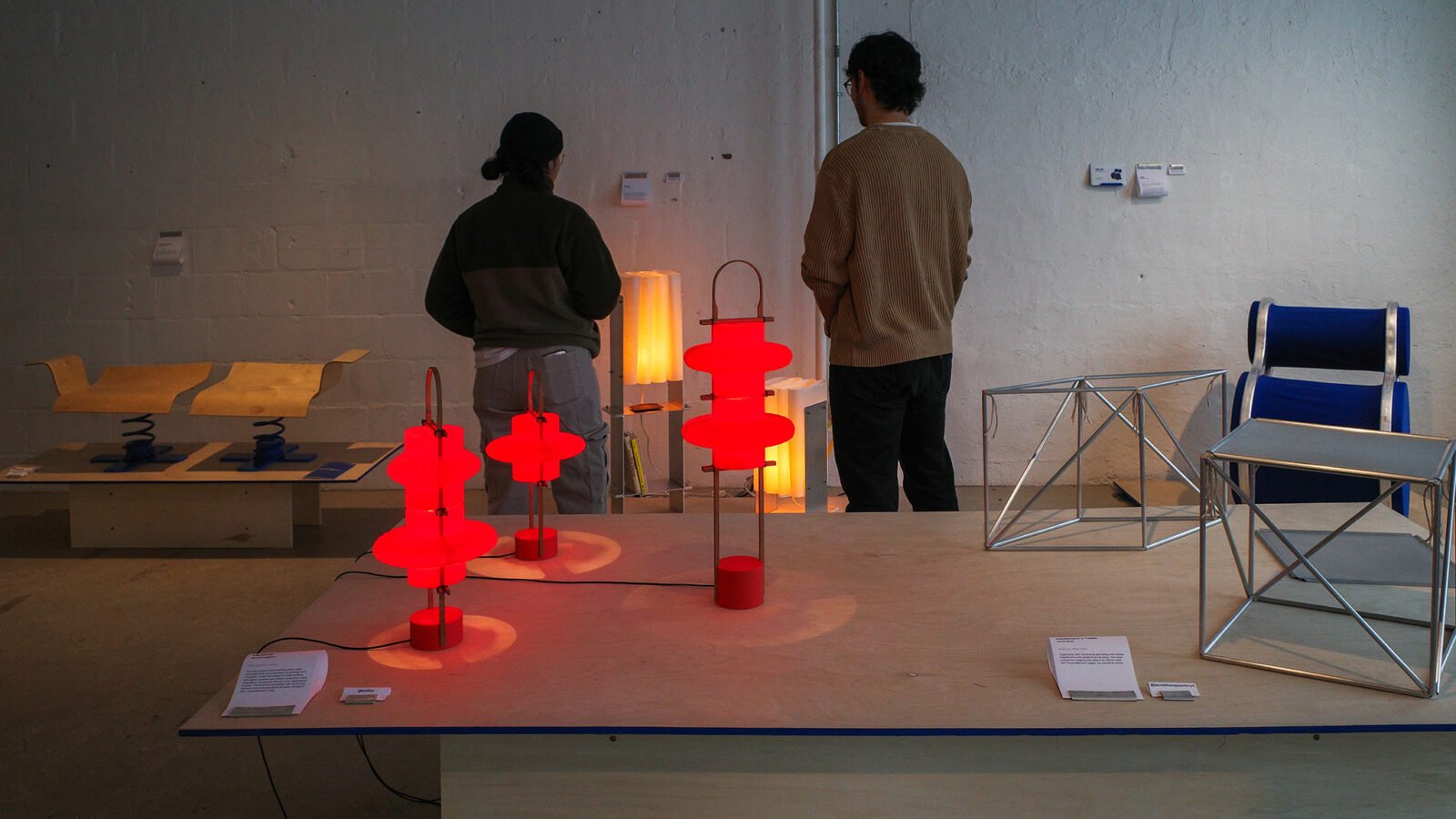
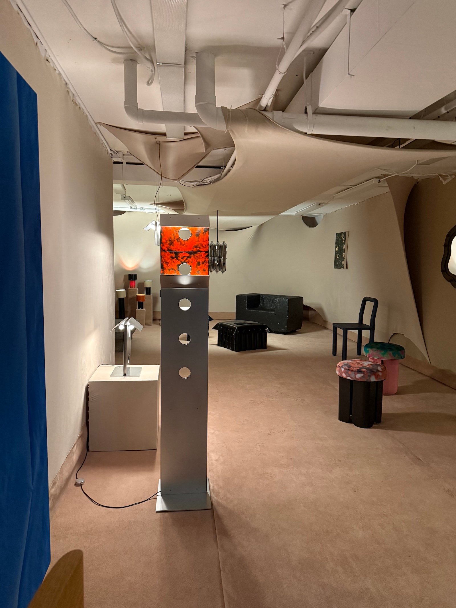
All the cool kids were at the opening-night party of the latest Ensemble group exhibition, Pot-au-feu. In the subterranean depths of The Plumb, a hip little gallery off the beaten path — where Quebec-based designers, artisans and artists had assembled a staggeringly inventive collection of pieces — everyone was sipping piquette and partaking in jovial conversation. The energy itself was something to behold.
If you could get a close look at them in the bustling, intimate setting, the pieces proved to be astounding: Atelier Fomenta’s goth-like rubber tables, Studio Darmes’ dazzling Doppler light, Simon Johns’ trompe l’oeil ceramic furnishings, Lambert & Fils’ captivating collaboration with Kwangho Lee and so much more. The exhibition design, which wrapped the gallery’s two narrow rooms in a cocoon-like textile, gave the arrangement of wildly different works a harmonious backdrop. But what came through above all else was the prodigious dexterity with media of all kinds that this loose collective has mastered.
Ensemble was on everyone’s lips as a highlight of DesignTO — for its energy, creativity and comraderie. Toronto and Montreal need to get together a lot more often.

.
2
To•Be•Longing: Portraits of Queer Living
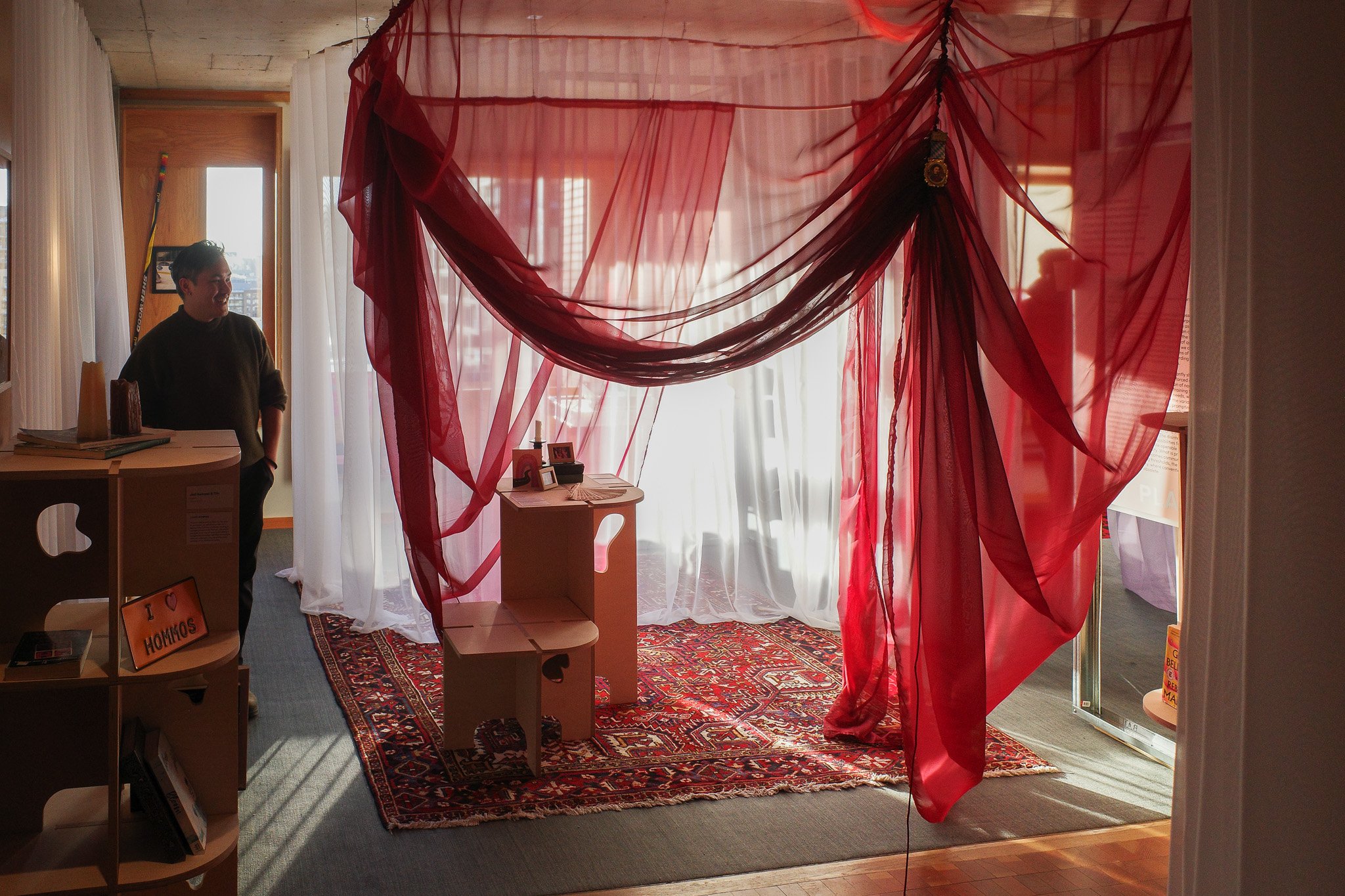
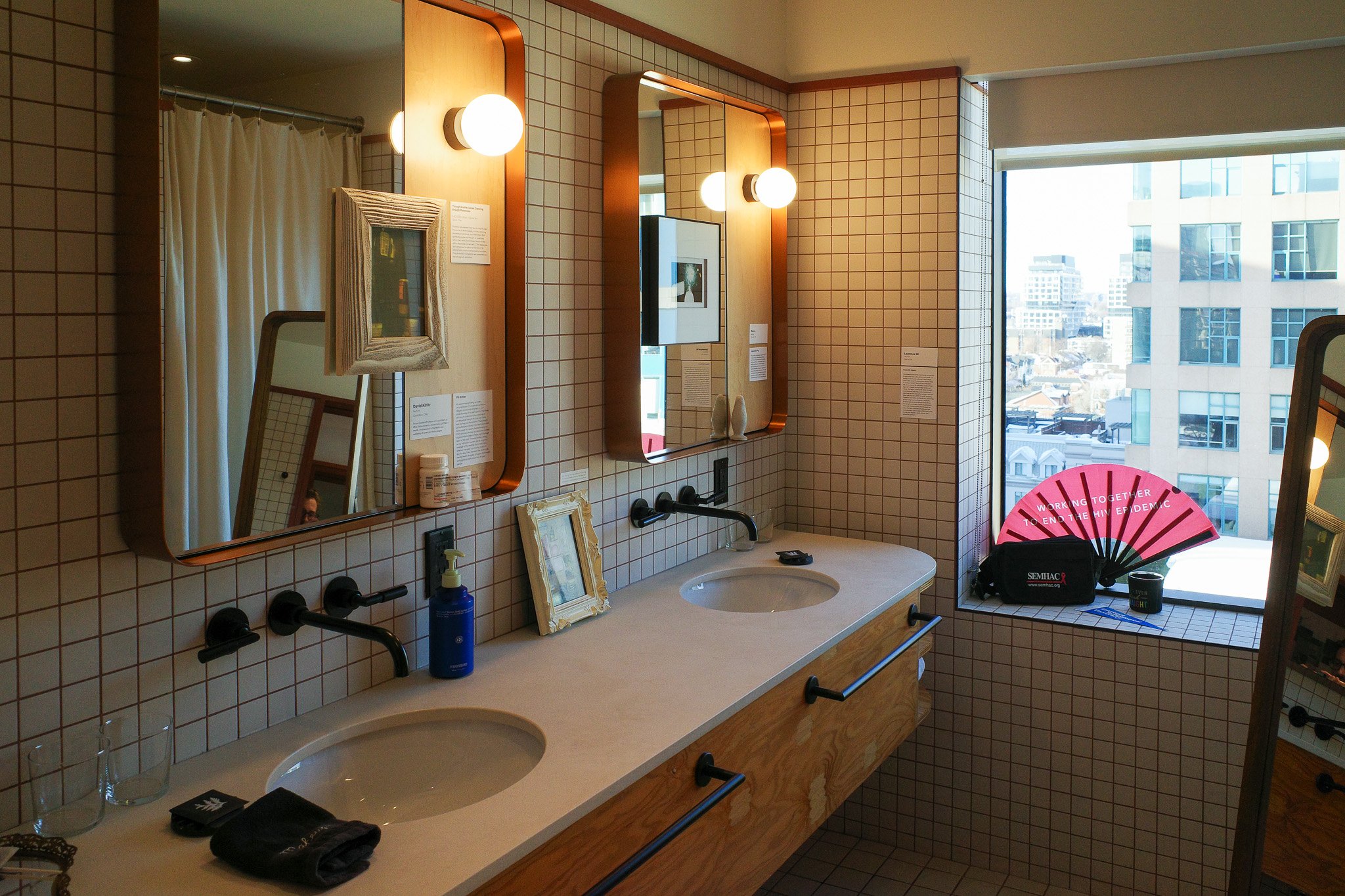
Staged in a 12th-floor guest room at the Ace Hotel Toronto, this exhibition combined architectural interventions by curator Quan Thai with personal ephemera sourced from a large network of collaborators — all with the goal of demonstrating how the homes of queer individuals deviate from the norm. Sheer curtains formed interstitial zones that blurred the rigid boundaries of traditional rooms, while a system of versatile wooden modules was used to configure a series of display tables. On each one, a collection of personal artifacts — including postcards, framed photos, and other tchotchkes, each accompanied by a written reflection provided by its owner — joined queer cultural touchstones like Rebecca Makkai’s The Great Believers.
In a panel discussion that accompanied the exhibition, Yabu Pushelberg’s Bahar Ghaemi noted that many of her favourite queer spaces are dive bars with relaxed designs that are not overly precious, but rather have evolved organically. This exhibition captured that same relaxed, lived-in spirit.
.
3
Pressing Matters
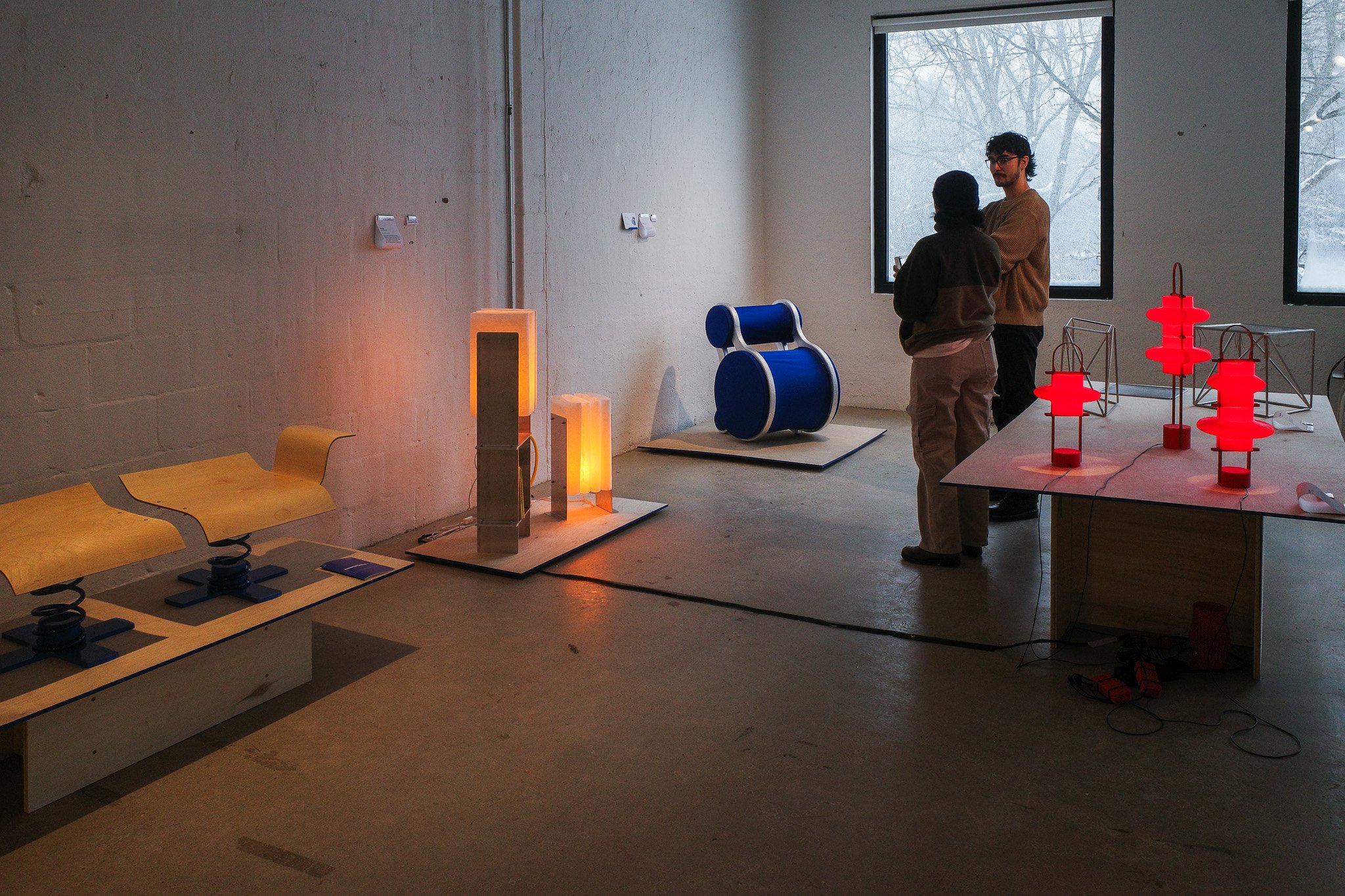
Leave it to recent industrial design grads to understand the art of working under pressure. New alumni from Carleton University and Humber Polytechnic teamed up for this exhibition featuring clever responses to the theme of compression. Mary-Beth Scully took inspiration from bookbinding for her industrial take on a Noguchi lamp, which sandwiched clusters of folded washi paper in between aluminum frames, while Thomas Ferreira developed a seat from two elastic PVC textile-upholstered cylinders that flexed outwards once someone sat down.
.
4
Tape
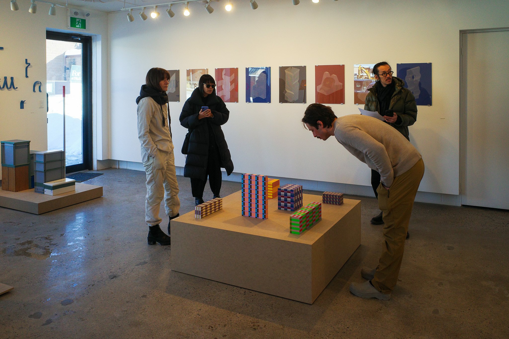
It’s always a delight to step inside 8×7, the gallery that fronts Jamie Wolfond’s studio. The Toronto designer is busier than ever, collaborating on products with brands like Moooi, Muuto and EQ3, but he remains committed to the art side of design. Like his last curatorial project — “24 Hours,” which presented both poetic and practical interpretations of keeping time — Wolfond’s DesignTO exhibition, “Tape,” focused on a single, seemingly simple idea that yielded manifold renditions by a motley group of international and local stars. What’s so interesting about tape? you might think. Everything, it turns out.
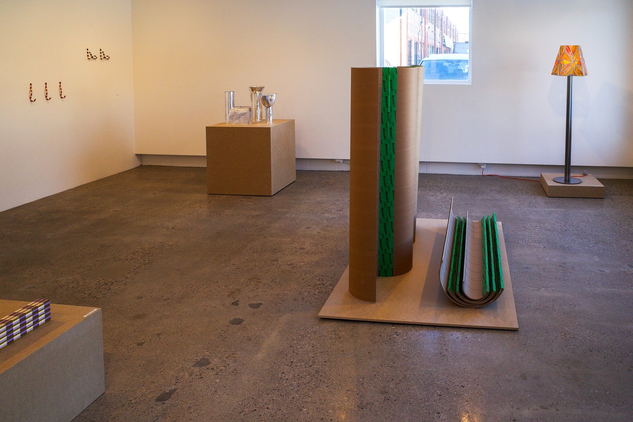
MSDS Studio made aluminum foil tape (typically used for sealing ducts) the structural material of its vases, and Earnest Studio turned layered Washi tape into an aesthetic tour de force with Pattern/Colour Studies. A green adhesive held together Matriyoshka, a modular screen of undulating (nested, when disassembled) elements made in another humble material — cardboard — by Leon Ransmeier. And Bertjan Pot combined various tapes and plastic sheets, along with synthetic rope and glass fibre rods, to fashion a kite that spells out It’s the Equality, Stupid. In the hands of these incredibly creative people, the humble roll of tape is the most malleable of materials.
.
5
Tracing Symmetries
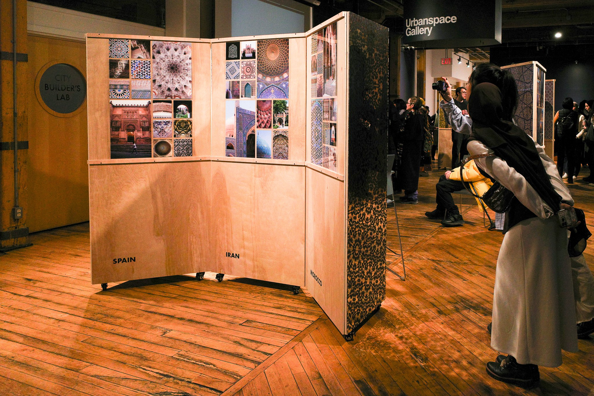
Around the world in 40 cities. Pulling from her field research, architect Safoura Zahedi charted the spread and evolution of Islamic geometry across 12 centuries and 17 countries in this photographic exhibition held at Urbanspace Gallery. In the process, she demonstrated the potential for historic patterns to provide fresh inspiration for contemporary art and architecture. To that point, we especially loved how the show’s prismatic display modules reflected the show theme, making the whole room feel like the inside of a kaleidoscope. As part of the exhibition, Zahedi also hosted a series of workshops teaching attendees how to compose their own geometric sculpture using 3D-printed tiles.
.
6
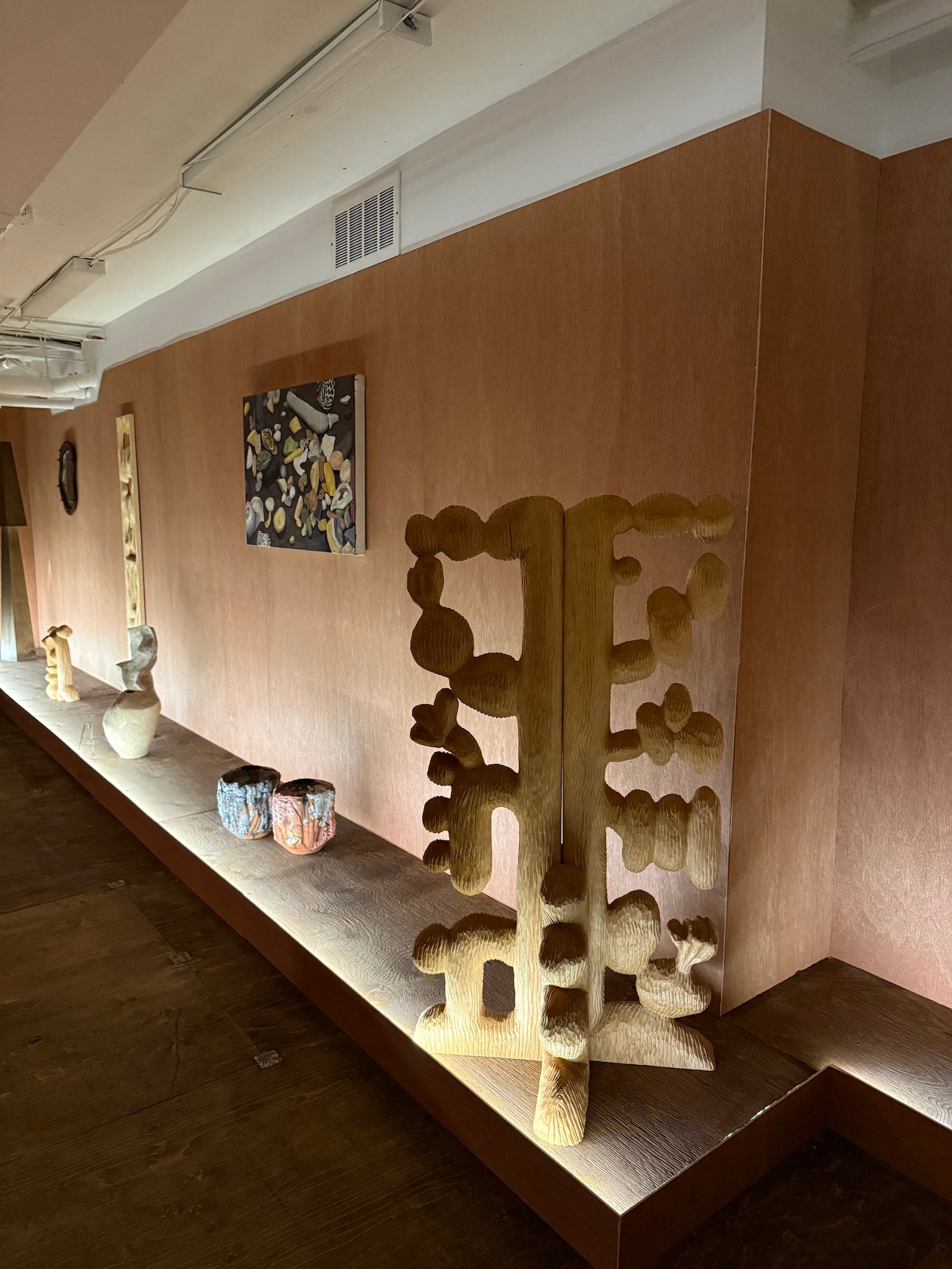
Slow Furniture
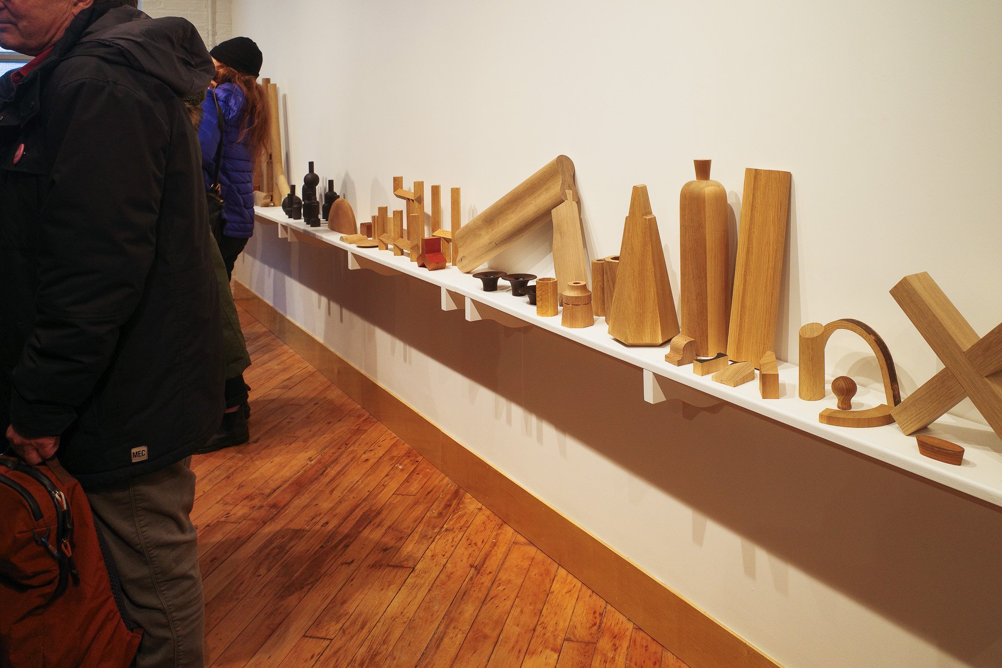
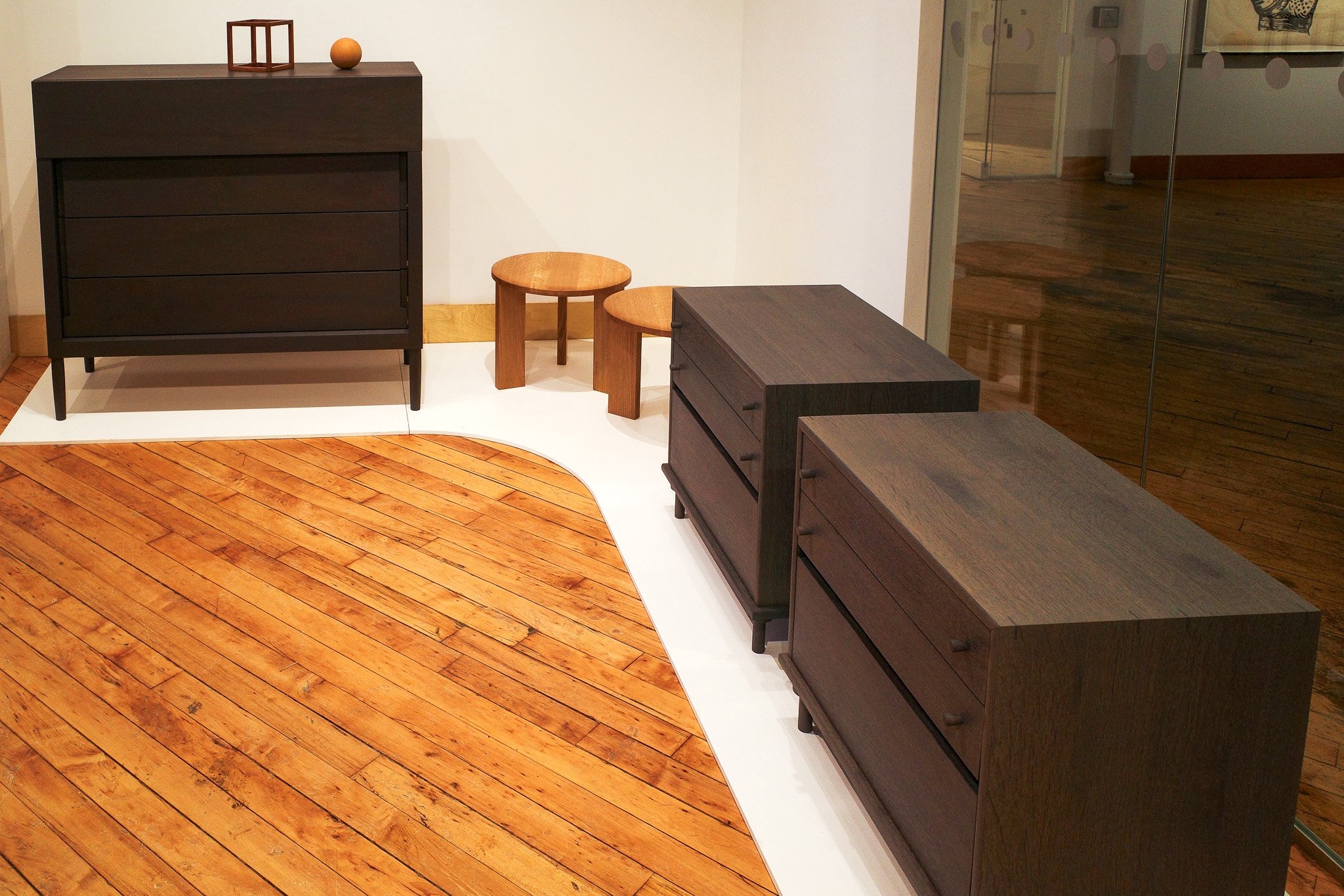
Heidi Earnshaw sees room for the furniture industry to mimic the “slow food” movement, encouraging people to save up for one thoughtfully crafted heirloom piece rather than buying a bunch of cheap junk. To that end, all the designs in this exhibition at Craft Ontario’s 401 Richmond gallery were handmade in Earnshaw’s Eastern Ontario workshop by her or her studio manager, Tim Steadman. Gorgeous details abounded — from the inky blue stain on a pair of dressers at the front to the subtle “Vendredi,” “Samedi” and “Dimanche” labels carved into the drawers of another. Rounding out the display was a ledge filled with charming wooden totems — including maquettes, trial runs of various furniture components, and a grouping of abstract sculptures — all brought in from Earnshaw’s studio to appropriately capture what it’s like to be around a genius at work. (Our words, not hers.)
.
7
All Light
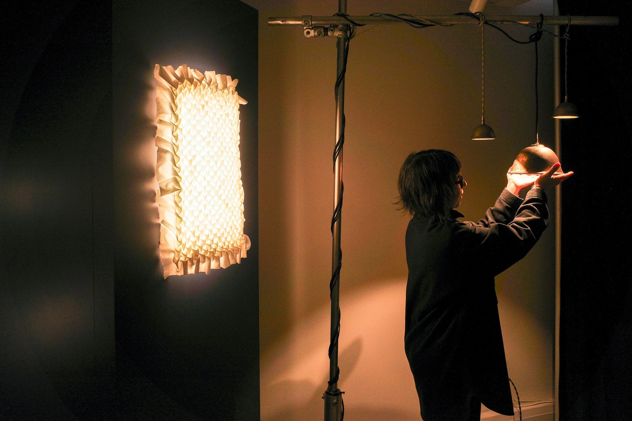
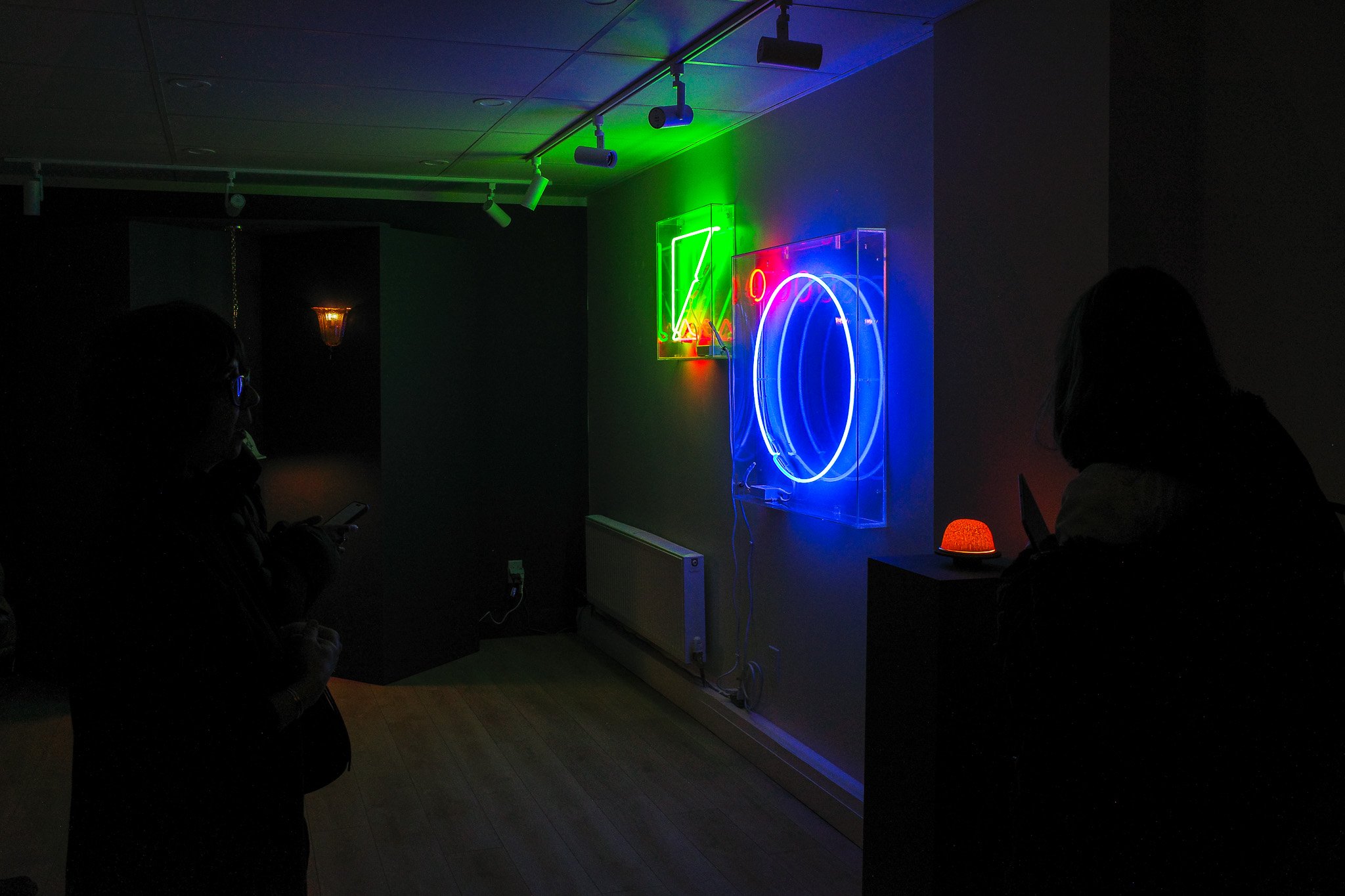
“A sign of brighter days ahead…” read the marquee above Gallery 1065, which hosted this show curated by designer Kate Tessier — AKA Kilowatt Kate — and Common Good Studio. Sure enough, the space inside was filled with bright ideas for combating seasonal affective disorder. Alongside contributions from seasoned lighting designers like Anony, Concord and Stoneface Co. (which introduced a new tabletop version of its sailboat-inspired Coastal lamp), the exhibition featured Tessier’s many inventive collaborations with other local designers and craftspeople. For one such experiment, Tessier partnered with textile artist Khadija Aziz to develop a light featuring a hand-stitched linen diffuser. Geometric neon sculptures by Atomic Design rounded out the backroom.
.
8
Nice to Meet You
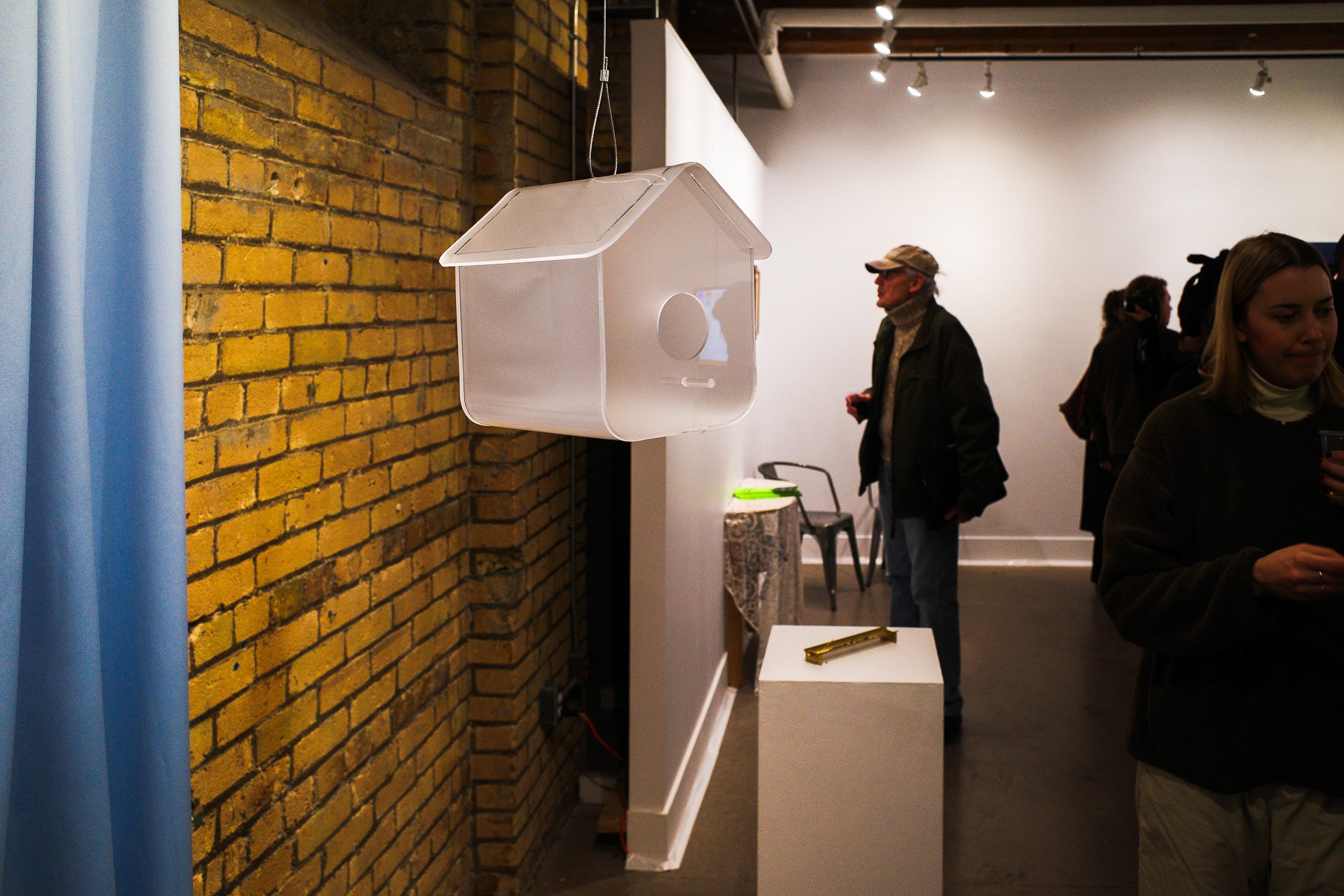
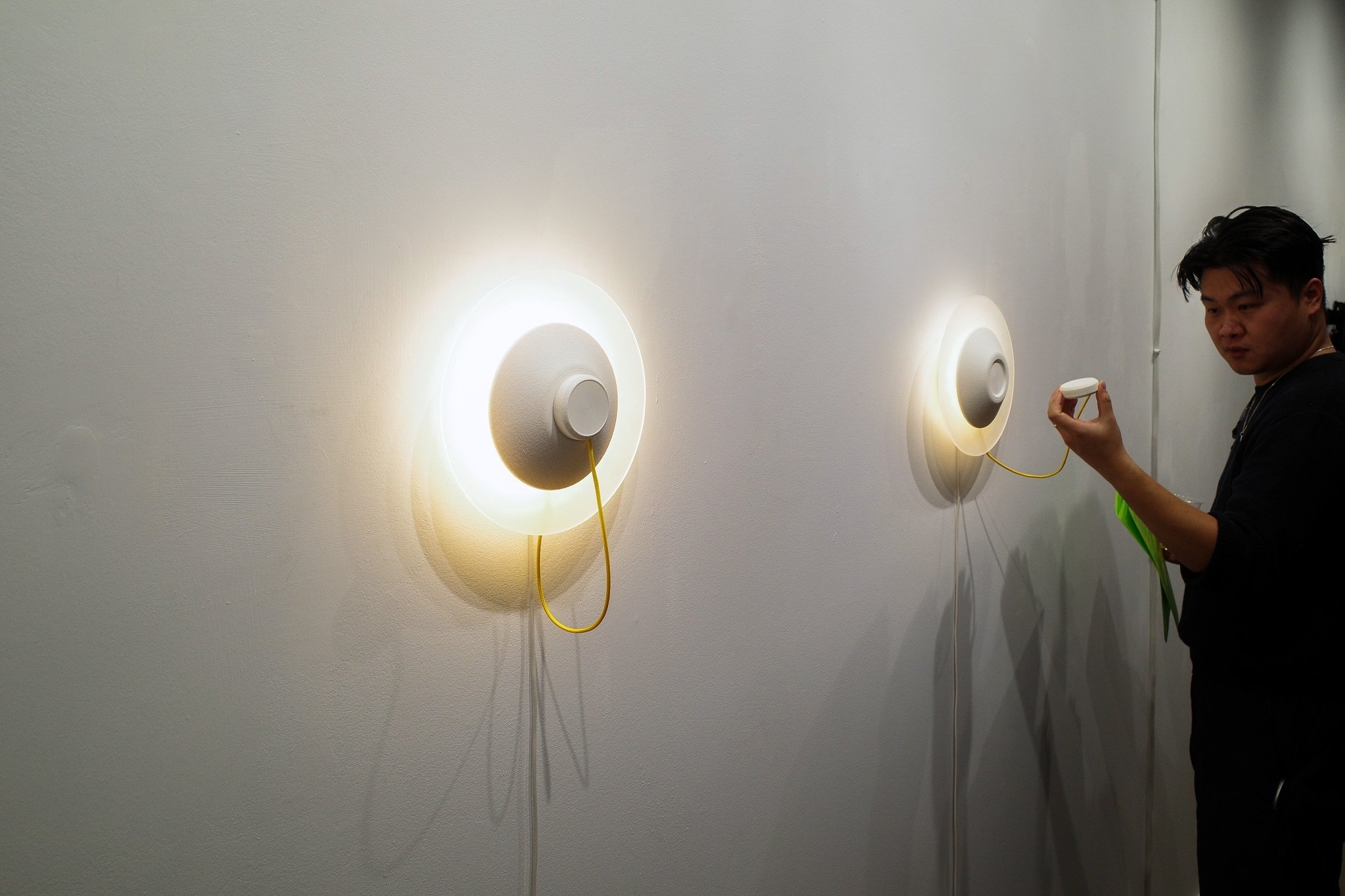
The “act of a greeting” served as the focus of this group exhibition curated by Simran Dadlani and Clara Wu’s Table Collective at Gagné Contemporary gallery in 401 Richmond. In keeping with that theme, Touch Point, a playfully interactive sconce by Mark Khoury and Devansh Shah, only came to full life once its hanging puck had been secured to the magnetic disc above it. That said, the fixture would start to partially illuminate as soon as the puck was in close proximity — almost as if the two components were waving to each other from afar before they could engage in full embrace.
Nearby, designer Dylan Newman’s translucent birdhouse gave the avian community its own version of Philip Johnson’s famous residence while avoiding the threat that fully transparent glass can pose to birds. Newman, for his part, describes the design as a reflection on how the concept of shelter is both “functional and symbolic.”
.
9
Light Gathering in the Yuàn
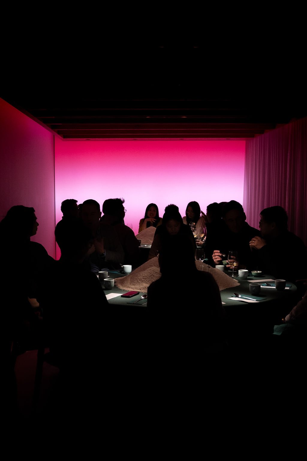
Anticipation was high heading into Mason Studio’s collab with Yan Dining Room, which sold out in just 12 hours, and the experience exceeded every expectation. Upon arrival, we traded our snowy boots for a comfy pair of slippers and were greeted with a soothing cup of hot tea. Tucked behind a folding screen, the entrance vignette set the scene: lush green moss lined the floors, fabric banners hung from the ceiling, lanterns throughout bathed the space in a warm glow, and traditional Chinese music played softly in the background.
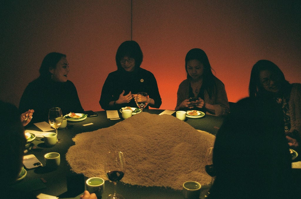
As we moved further inside, Mason Studio’s office had been transformed into a yuàn or courtyard. Here, Chef Eva Chin put the final touches on the first dishes, as guests mingled and played rounds of Mahjong and Xiangqi (Chinese chess). Then came the grand reveal: The doors to the Light Room opened, unveiling the dynamic setting in which we would enjoy our dinner. From the first sip of rich, clear seafood broth to the final dessert — a custard of sweet potato with ginger and roasted rice milk — the meal unfolded with an almost narrative quality, the lighting installation, by VYVYD, shifting in hue to reflect each dish. We left with bellies full, and as true believers that food and design are a natural pairing.
.
10
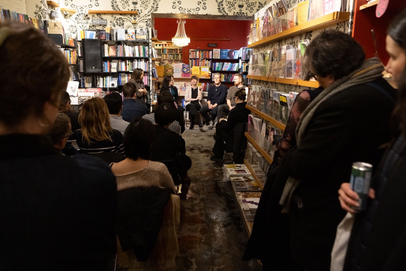
Neptis Foundation’s Impossible Toronto Panel
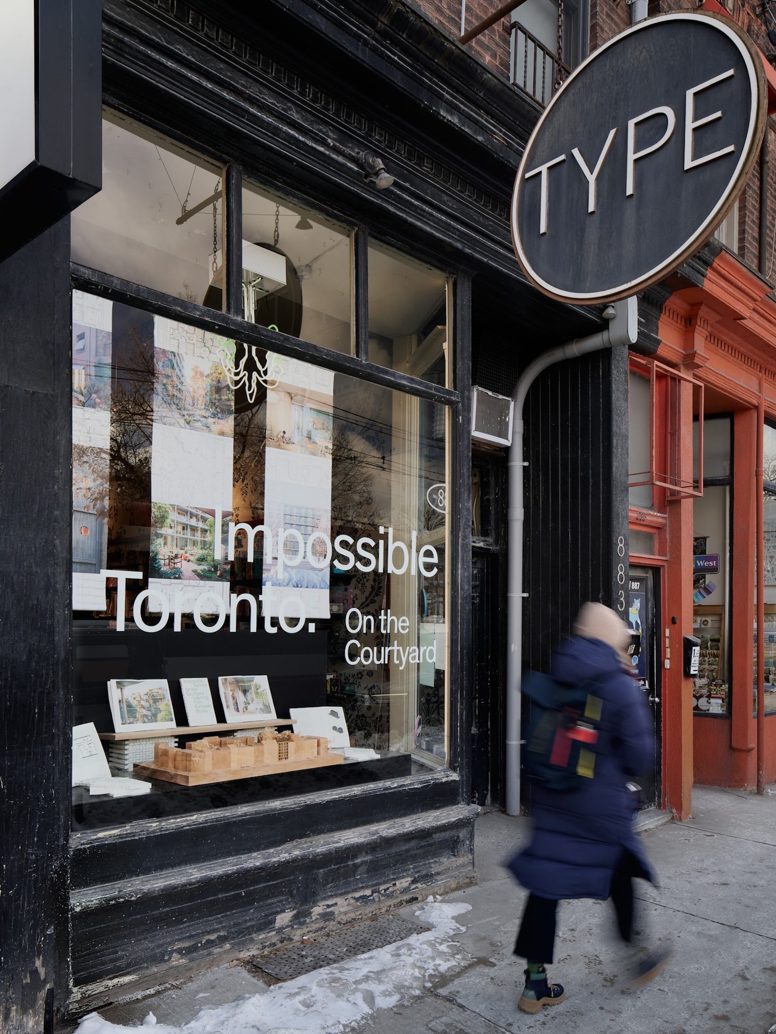
What better place than a beloved independent bookstore on one of the city’s trendiest, most culturally vibrant streets to discuss the future of Toronto? At Type Books, the window installation was given over to a celebration of Impossible Toronto: On the Courtyard, the first in what will be a series of explorations supported by the Neptis Foundation that look at how we can build a better, more accessible city for all. The book centres on the courtyard block typologies seen throughout Europe, and proposes that they could be adapted to Toronto’s major streets – ushering in more (gentle) density, unlocking more housing, and changing the quality of life itself inside of multi-unit dwellings.
For DesignTO, Neptis hosted a conversation with three of the book’s contributors: Aleris Rodgers, one of its co-authors along with Francesco Valente-Gorjup, her partner at Studio VAARO, and architect Gabriel Fain; landscape architect Marc Ryan of PUBLIC WORK; and public housing developer Graig Uens, formerly senior planner the City of Toronto and now director at Batory Urban Planning and Project Management.
Moderated by AZURE Editor in Chief Elizabeth Pagliacolo, the conversation delved into the various possibilities beautifully illustrated in the book and the impossibilities that hold them back: How do we begin to consolidate single-family home lots into a block? What kinds of landscapes could evolve in the courtyard? Can we develop new paradigms for shared responsibilities when it comes to caring for these private-public spaces? A packed house presented more questions and points of intrigue for what was an engaging and optimistic exchange about how Toronto can be built up to support a growing population.
.
11
Mjölk with Norm Architects
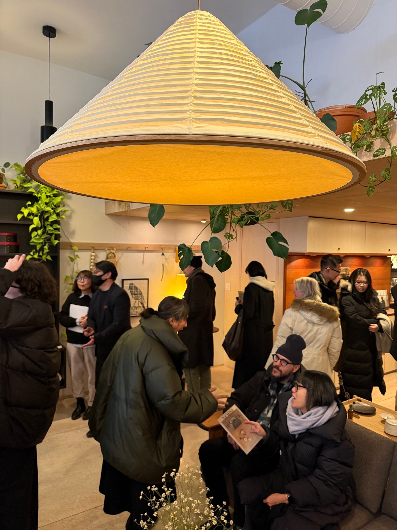
Now 17 years in operation, Mjölk has become an eminence grise of the Toronto design scene, an inspiring destination to find impeccably crafted furniture collections from brands and makers based in Europe and Canada. During DesignTO, the showroom hosted a presentation by Frederik Werner of Copenhagen’s Norm Architects, which creates some of the most hygge-influenced spaces that we’ve seen.
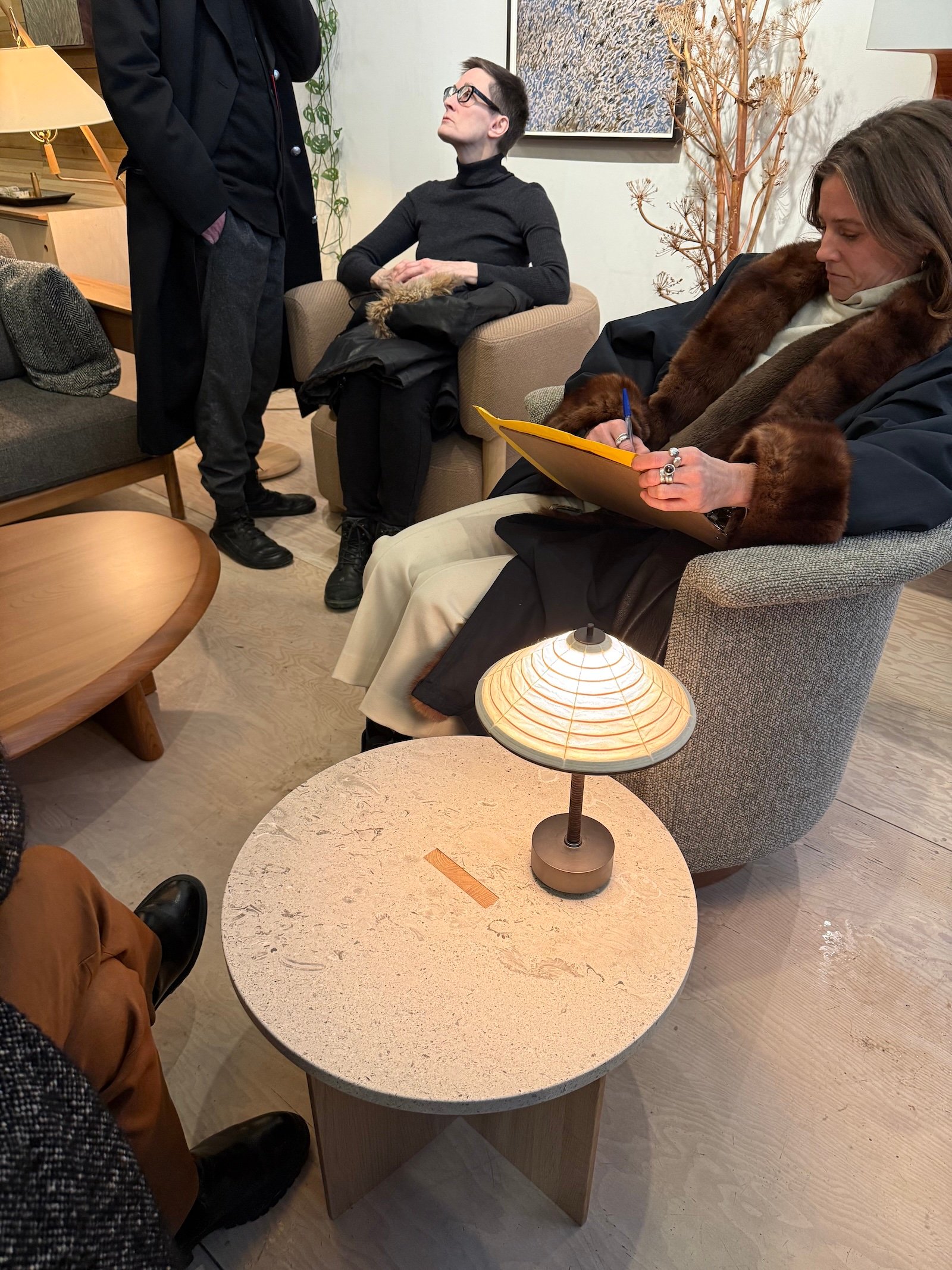
Werner shared insights into the studio’s collaboration with Japan’s Karimoku Furniture – a truly Japandi melding of the minds that brought about a serene collection called Karimoku Case. As Werner described the craftsmanship that went into the pieces – soft seating that remixes Japanese traditional methods and mid-century Danish style, stone-top benches based on the doors found in Japanese shrines, Washi paper lanterns in delicate and enormous proportions – the crowd gathered in the shop could experience the works up close and personal: the bulk of the collection had been shipped to Toronto, all of its warmth intact during one of the city’s biggest snowstorms.
.
12
Signs of Love and Pearls of Memories
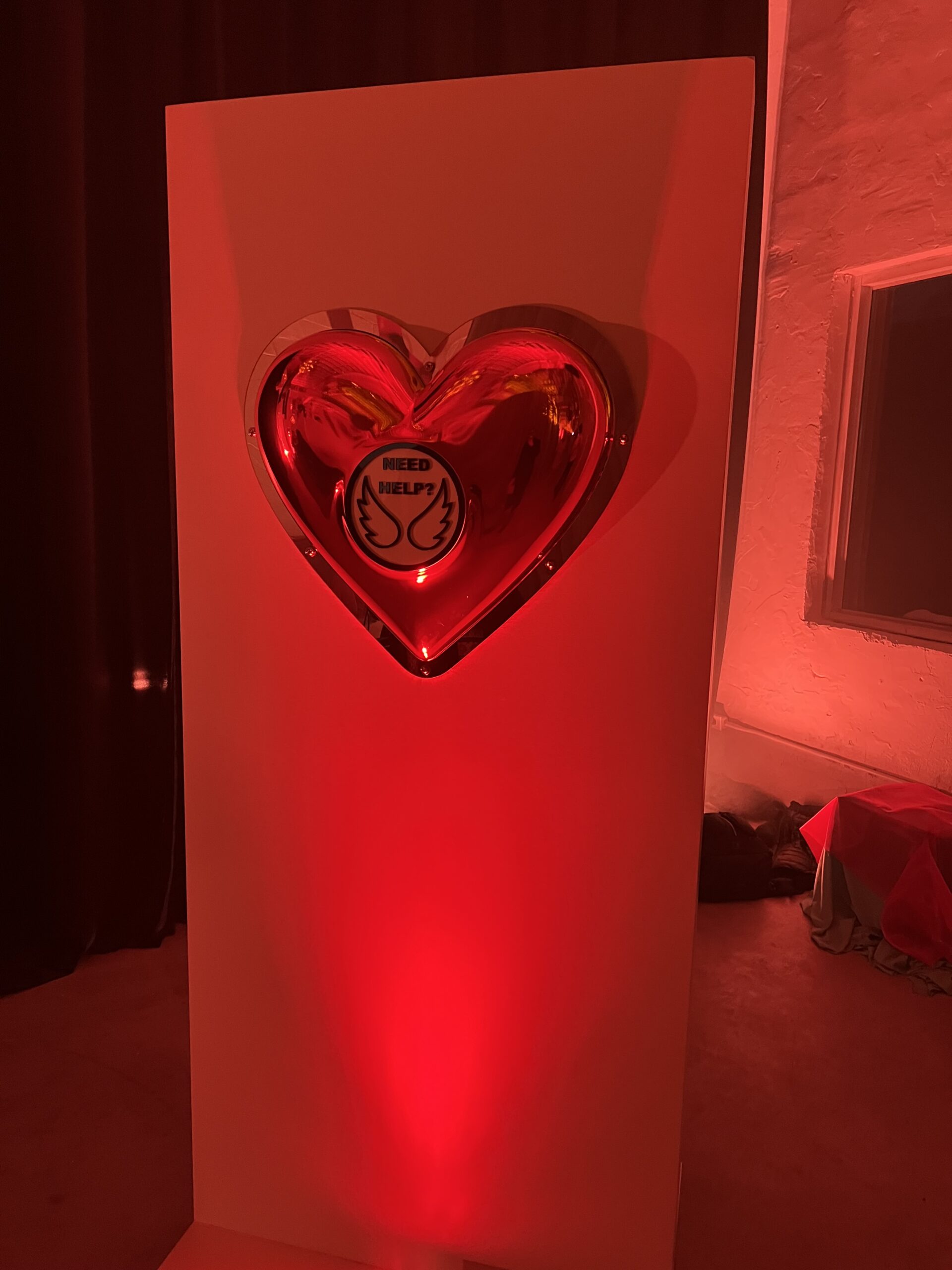
It’s not every design show that culminates in a marriage proposal. But during designer-artists Yury Goncharov and Alina Tacmelova’s two-part, one-night-only exhibition, a guest was inspired to get down on one knee and pop the question. The designers could not have asked for a better moment to reinforce the themes of their joint projects.
In “Signs of Love,” Goncharov embedded a series of road signs inside of shiny metallic heart-shaped sculptures. While stock symbols (like the crossed-out “P” that signals “no parking”) emphasized familiar themes of control and restriction, new graphics designed by Goncharov instead sought to promote moments of connection. Ultimately, Goncharov hoped to inspire reflection on the many barriers (including technology and social media, where hearts are synonymous with “likes”) that prevent deeper relationships in modern society.
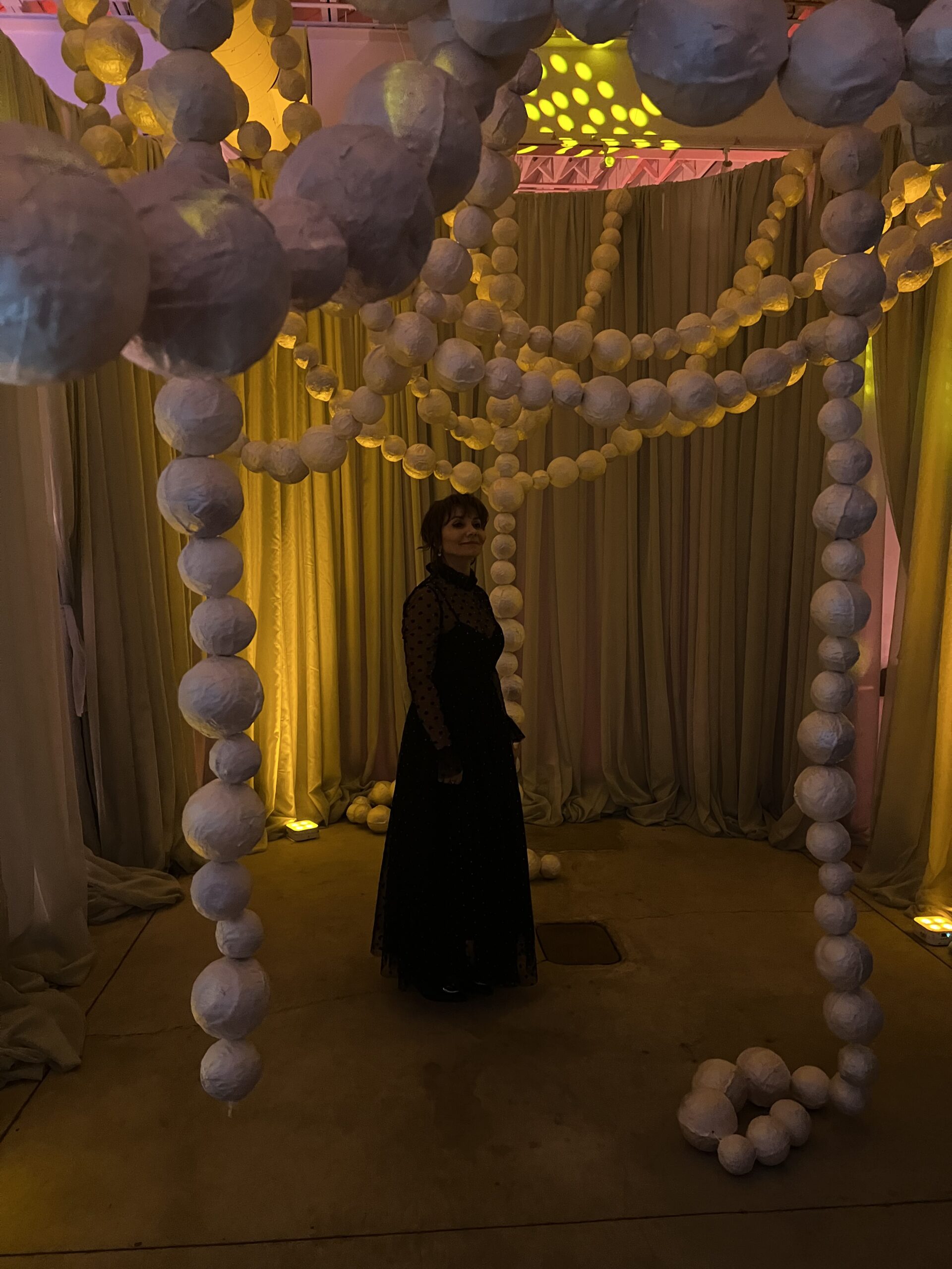
Meanwhile, Taclemova’s “Pearls of Memories” represented memories as strings of oversized beads hung from the ceiling. “I believe memory is an act of creation. Each moment we choose to hold becomes a pearl, strung along the fragile thread of existence. This work is my invitation to remember — deeply, emotionally, deliberately,” says Tacmelova. Each bead was handmade from fabric in a paier-mâché technique. A corresponding art video featured the artist moving through the woods with the necklaces strung through tree branches.
January was an especially busy month for Goncharov and Taclemova: Just a week earlier, the duo had staged another fantastical installation, Field of Interaction, at IDS Toronto. As far as we know, nobody proposed at that one.
.
13
Traces
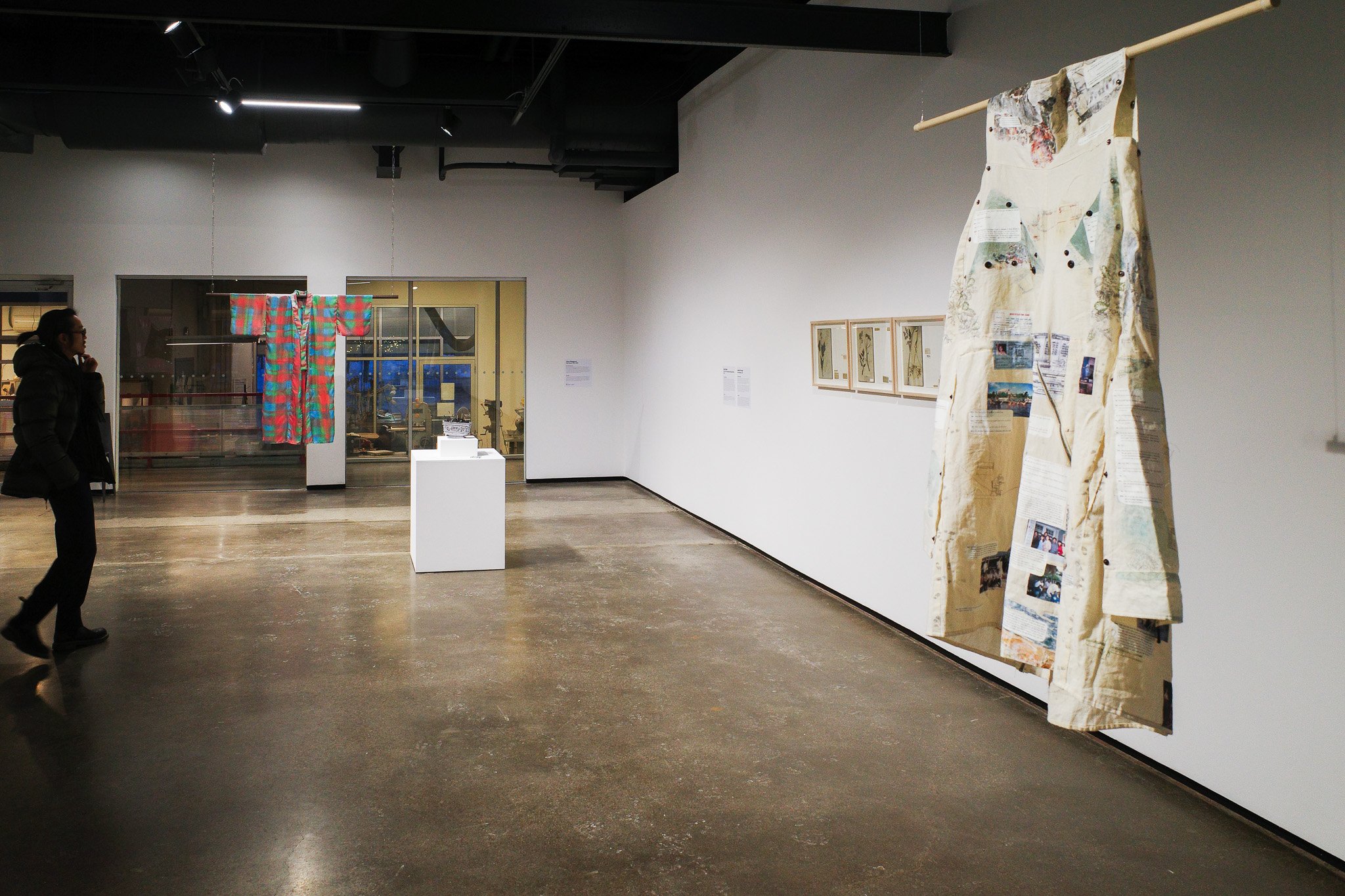
“Displacement is often documented through maps” writes Meena Chowdhury in her artist’s statement for her contribution to this migration-themed group exhibition at Harboufront Centre. Taking an alternative approach, Chowdhury opted to instead reflect her mother’s experience as a Vietnamese refugee using clothing — specifically, a custom garment that can be worn in a variety of different ways, transforming from a shirt to a pair of pants, then a jacket and finally a dress. (A video documents this shapeshifting in action.) The work (titled No Place Like (no) Home) pays tribute to Chowdhury’s mother’s sewing skills while also capturing the way that she experienced forced relocation: as “places moving through her.”
Curated by DesignTO, “Traces” is filled with pieces that exist in quiet parallel to one another. Complimenting Chowdhury’s garment, Jenn Kitagawa merges her Scottish and Japanese ancestry by hand-painting tartan onto a silk kimono. Meanwhile, both Rose Nordin and Dennis Lin engage with the transportive power of scent. The latter contributes a monumental work composed of some 9,000 partially burned incense sticks that he collected from temples across Taiwan. Each day, a Harbourfront staff member removes one of the sticks to burn it outside and then return it, “completing the wish of the person who once prayed to it.”
Photo Gallery: Our Favourite Moments From DesignTO 2026
Toronto’s annual design festival led us on a full-blown creative odyssey. Here are 13 standouts, from group exhibitions to pop-up dinners.