
Even when experienced as just another flat image in a feed, the best interior design projects manage to exude an immediate sense of depth and texture. Sometimes, that’s because of their expressive finishes and the rich visual layering at play in their arrangement of seating, lighting and other elements. But ultimately, when it comes to creating depth, that’s only half the story.
Sure enough, many of this year’s standout interiors embrace fabulously tactile surfaces that urge you to pay them a visit in person to appreciate the full effect. And just as many incorporate intriguing, evocative references that simultaneously encourage you to delve deeper into their backstories — gradually revealing, layer by layer, the intellectual and creative rigour that have gone into their execution.
Here’s yet another feed of amazing images — but also, so much more.
Our top 10 favourite interiors from 2025 include:
- Printemps, New York, by Laura Gonzalez
- Peridot Bar, Hong Kong, by Studio Paolo Ferrari
- V&A East Storehouse, London, by Diller Scofidio + Renfro
- Day Job Office, Los Angeles, by 22RE
- Living Beauty, Toronto, by Odami
- Va! Caffè, Olia and Mimi, Edmonton, by Ste Marie Studio
- POUTx, Toronto, by Studio Author
- W New York – Union Square, New York, by Rockwell Group
- Palazzo Molteni, Milan, by Vincent van Duysen
- Anduhyaun Indigenous Women’s Shelter, Toronto, by LGA Architectural Partners
..
1
Printemps, New York, by Laura Gonzalez
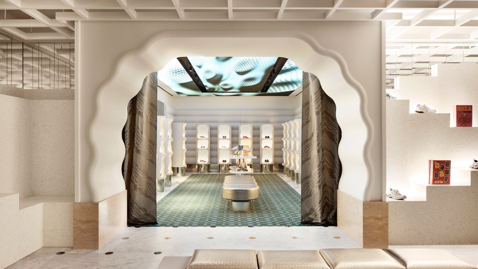
If you thought Wicked’s sets were a visual feast, just wait until you step inside the New York location of Printemps. The French retailer’s first North American outpost, designed by Parisian architect Laura Gonzalez, makes the fairy tale world of Oz seem downright dull by comparison. Spanning 5,110 square metres, the department store rewards exploration with intriguingly compressed passageways opening up to fantastical moments of awe that seem not so much built as conjured into existence. Rather than expressing a single identity, the space (which we first profiled in our September/October issue) functions like a series of connected boutiques, as well as hospitality zones like a restaurant, café and bar — each with its own individual ambiance, defined by distinctive fixtures and finishes.
One of the most showstopping areas, the double-height women’s shoe department on the ground floor, highlights a 1931 art deco mural originally created from some 2.5 million red and gold tiles by artist Hildreth Meière for the lobby of Printemps’ 1931 building, 1 Wall Street, back when it was home to Irving Trust. Not content to just rest on those historic laurels, Gonzalez also introduces towering floral lamps that double as magical merchandising display stands.
Other zones are just as inspiring. Sneakers live inside a cave illuminated by a ceiling screen showcasing abstract visualizations, and entered via a squiggly doorway. The men’s department, in another refreshing twist, embraces pink, hanging frilly Murano glass chandeliers from the ceiling. Frescoes, stained glass and intricate ivy floor mosaics are just a few of the many other wondrous details that await. And then, of course, there are the clothes themselves. Rather than tasteful black trousers, Printemps is stocked with the type of colourful attire that will help shoppers carry some of the store’s signature joie de vivre out into the real world.
.

2
Peridot Bar, Hong Kong, by Studio Paolo Ferrari
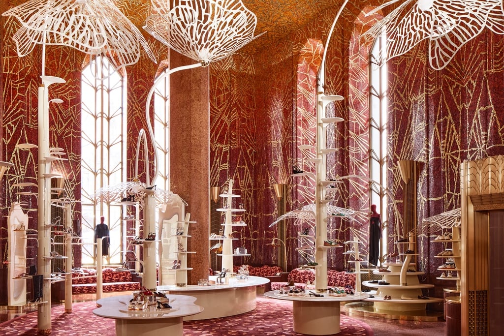
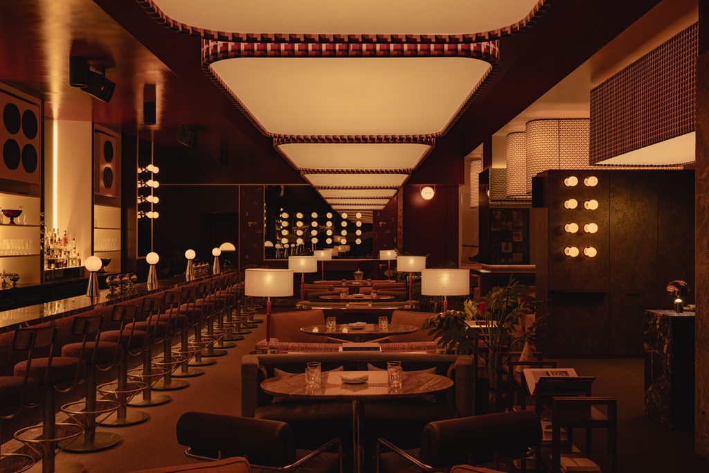
Over the past 10 years, Paolo Ferrari has emerged as one of the world’s most exciting interior designers. The environments his Toronto studio creates, in residential, hospitality and retail projects across the globe, are strikingly crafted; they combine materials-driven luxury with bold innovation and big ideas and they demonstrate an abiding love of texture, colour and variety of experience. Recently, Ferrari has encapsulated his philosophy as “timeless futurism.” It’s a fitting description for the world he is fashioning, which borrows from the past (and its comforts) but features technologically advanced forms that dare us to leap forward.


The Peridot Bar on the 38th floor of The Henderson in Hong Kong brings his unique sensibility into a setting that seems to have been custom created for it. In Zaha Hadid’s architecture, Ferrari finds a simpatico fascination with sensuous curves and spatial experimentation. The restaurant is characterized first and foremost by a soft green plaster wall pixelated with steel-capped, frosted acrylic cylinders (an ode to Carl Andre’s AI Cloud and Yayoi Kusama’s Self-Obliteration). Like a sequined gown that drapes the space, this softly glowing surface is the backdrop for plush mohair seating, lacquered furniture, and green marble accents. It’s a wow moment unto itself, but there are also a few other surprises in store: Namely, the monumental bar and a bespoke stainless steel and marble wine tower with sculptural holders for each bottle on wondrous display. Peridot Bar continues Ferrari’s exploration into timeless futurism and ultimate luxury with uncommon candour and confidence.
.
3
V&A East Storehouse, London, by Diller Scofidio + Renfro
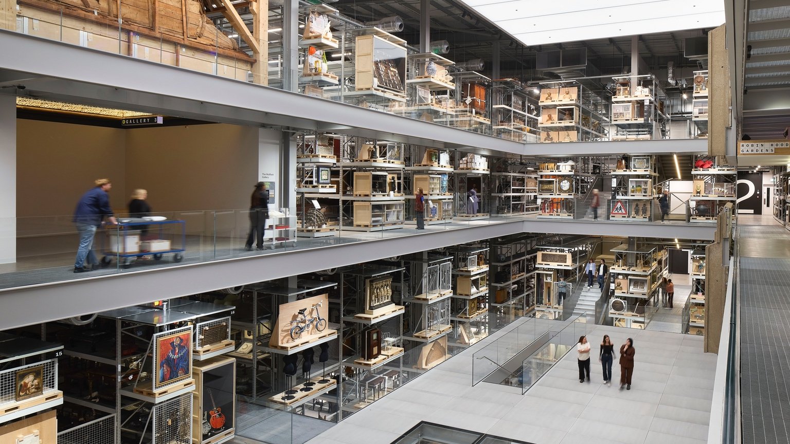
How do you reinvent the art gallery for the 21st century? 2025 brought us no shortage of provocative approaches, from Jean Nouvel’s Fondation Cartier (which you’ll read about in our upcoming issue) to Diller Scofidio + Renfro’s V&A East Storehouse. The latter, in London, U.K., truly breaks mould, thanks both to the architects and to the museum’s leadership, who had one overarching objective: Show it all. The vast majority of pieces in an cultural institution’s collection are hidden from view, rarely or only temporarily making it onto the exhibition roster. V&A East Storehouse was designed specifically to shine the spotlight on the massive storage systems that house every last treasure and make them fully accessible to the public.
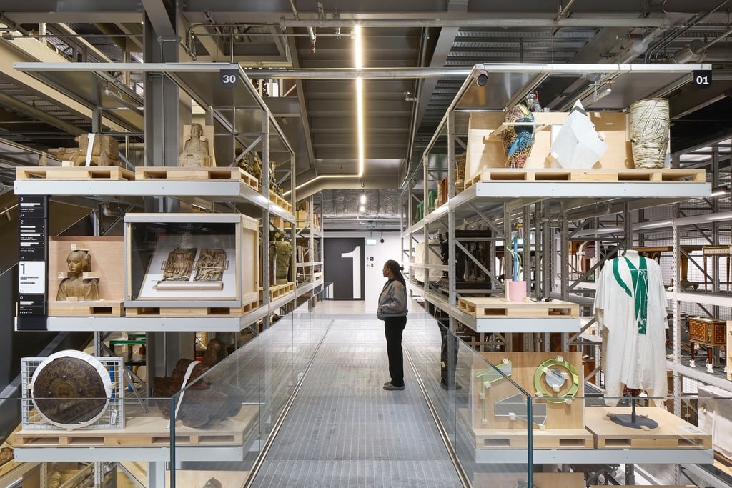
Diller Scofidio + Renfro’s warehouse-like interior is an ode to these magical repositories. As Giovanna Dunmall reported in Azure, the architects “leaned into the eclecticism” of the V&A’s collection and turned the 16,000-square-metre storage facility into an “immersive experience.” The V&A boasts 250,000 objects — an array that includes “fashion, textiles, furniture, theater and performance, metalwork, ceramics, glass, sculpture, architecture, paintings and product design,” according to DS+R, and everything from a collection of thimbles to Frank Lloyd Wright’s 1930s office for Edgar J Kaufmann Jr. It also stewards 350,000 library books and 1,000 archives.

The main space is a central public collection hall — a capacious atrium ringed by levels of storage out in full view. Glazed cuts in the floor are windows onto more unveiled pieces below, evoking the archaeological dig. In addition to spaces integrated for pop-up displays and workshops, there is also a dedicated room where museum-goers can get up close and personal with up to three pieces at a time, via the Order an Object service. And some of the collection is also integrated into the interior design: a 15th-century marquetry ceiling from the now destroyed Altamira Palace near Toledo, Spain, has been repurposed as an architectural element above a new public space. But the most impressive aspect of V&A East Storehouse is that you might not even notice the interior: It fades into the background, while the objects come into full view. It’s form that follows function with an almost religious fervour.
.
4
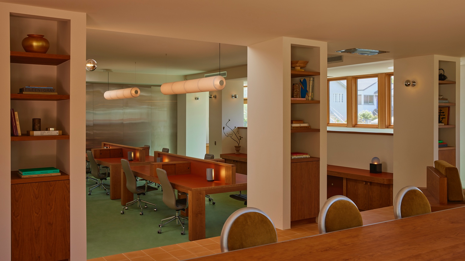
Day Job Office, Los Angeles, by 22RE
At the hands of the right designers, even the most venerated and widely replicated aesthetics can re-emerge as fresh, timely and surprising designs. In Los Angeles, the new offices of creative agency Day Job — taking over a space that was previously artist Ed Ruscha’s spartan studio — could easily have devolved into another evocation of mid-century style. And yet, 22RE’s careful layering of form, tone and texture results in a 170-square-metre space that infuses a comfortable yet buttoned-up sense of residential warmth into the contemporary workplace.
Custom cherry-wood desks, green leather task chairs and tactile terracotta tiles are paired with a luxurious olive-green carpet in the office lounge. The harmonious ambiance is complemented with a surprising green concrete floor and walls and countertops in sleek stainless steel. A strong emphasis on custom furniture and hardware — all designed by 22RE — makes for an exceptionally coherent aesthetic that allows for new twists to familiar design archetypes. In the middle of the space, a slightly sunken piazza hosts an elegant row of workstations. Here, it feels like a dinner table.
.
5
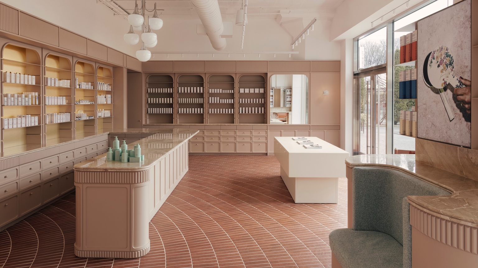
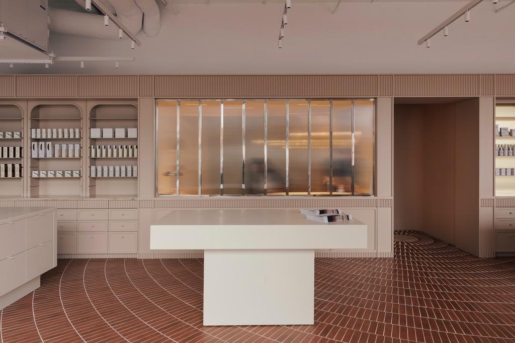
Living Beauty, Toronto, by Odami
It was love at first sight when the Azure team laid eyes on this beauty of a retail space. In signature Odami fashion, the Toronto boutique elevates humble materials to striking effect. Take the floor, for instance, whose ruddy tiles are arranged in a radial formation that truly makes the space. From there, the layers of the project begin to reveal themselves — and perhaps most impressive is how the young studio (our 2025 AZ Awards Emerging Interior Firm winner) references historic typologies without leaning into kitsch or cliché.

Here, Odami reimagines an apothecary through a contemporary lens, trading cavernous, dark wood for a palette of warm, soft neutrals. Clay-coloured millwork with subtly arched display alcoves lines the perimeter, with small drawers below that keep backstock close at hand. The designers use ornament with remarkable restraint. The L-shaped bar is both a conversation starter and a conversational hub, with a luxurious Breccia Oniciata marble top with a double bullnose edge and rounded tambour trim with beveled details that repeats throughout the interior.
That restraint makes the next reveal even more striking. Tucked behind a fluted glass window, the private spa takes on a character all its own: glossy mint green walls, mirrored millwork and vintage sconces come together to create a space that feels distinctly of the moment. This last gesture captures the breadth of Odami’s work — confirmation that its point of view extends far beyond any single reference.
.
6
Va! Caffè, Olia and Mimi, Edmonton, by Ste Marie Studio
Designer Craig Stanghetta is not one to shy away from theatrics. With his Vancouver-based Ste Marie Studio, which he founded in 2010, the former actor has been crafting immersive and narrative-driven hospitality spaces infused with originality, nostalgia and just the right amount of whimsy. Case in point, Va! Caffè, Olia and Mimi – the trio of interconnected restaurants in Edmonton’s Citizen on Jasper residential tower that the studio designed for chef Daniel Costa of the Corso 32 Group. Like a perfectly orchestrated three-act play – though without the conflict – the venues are complementary yet distinct destinations, with each offering its own culinary experience throughout the day.
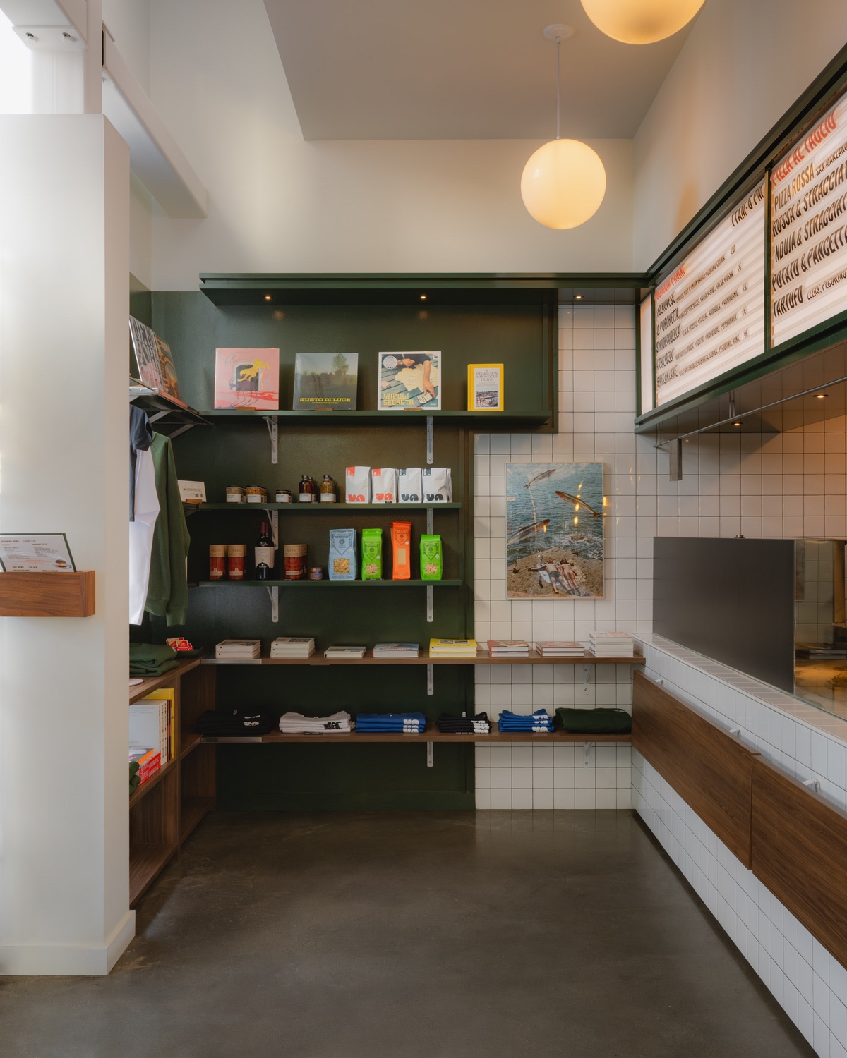
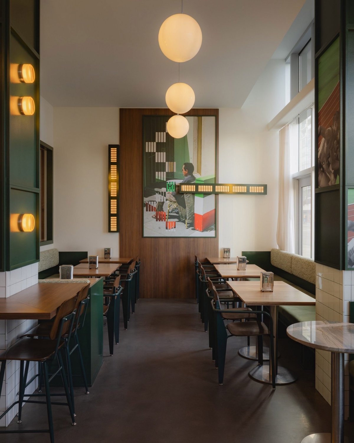
Inspired by traditional Roman Forno-style bakeries, Va! Caffè serves up morning espresso and pastries and lunchtime paninis and pizzas in a relaxed setting that hews slightly industrial. Outfitted with forest green panelling, glossy white tiles, gleaming stainless steel and rich walnut millwork and furnishings, the atmosphere is casual, refined and more than a little charming. Original photographs by chef Costa adorn the walls, a personal touch that lends authenticity.

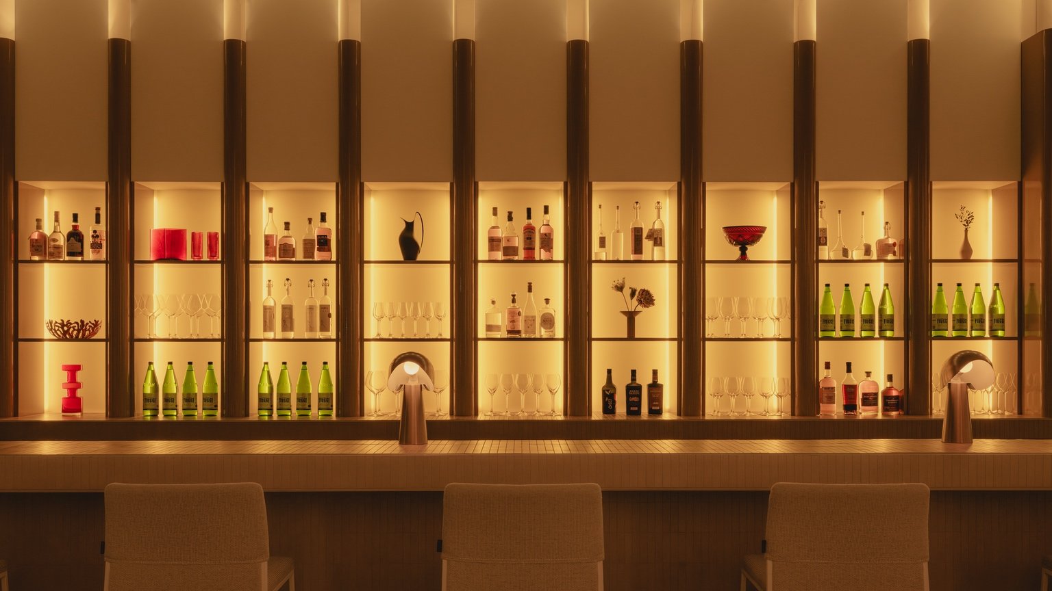
With Olia, fine Italian cuisine is presented in an “achromatic” space anchored by a spectacular backlit fluted-glass bar that casts bottles and a curation of objects in silhouette. Creamy, buttery tones are sophisticated yet intentionally subdued to let the food being served take the leading role. Santorini quartzite, pale wood and small format white tiles introduce texture and are illuminated by oversized canvas-covered pendants and sculptural table lamps.
Offering a “distinct nocturnal experience,” Mimi draws on the effortlessly chic Milanese lounge culture. A subtle cinematic sensibility permeates the space, where deep brown leathers, notes of saturated red and Rosso Rubino marble rub shoulders with moody lighting, plush upholstered banquets and another stunning bar, this one more retro speakeasy in vibe. Whether you’re seeking your morning pick-me-up or your end of the evening nightcap, these three settings by Ste Marie Studio provide the perfect backdrop.
.
7
POUTx, Toronto, by Studio Author
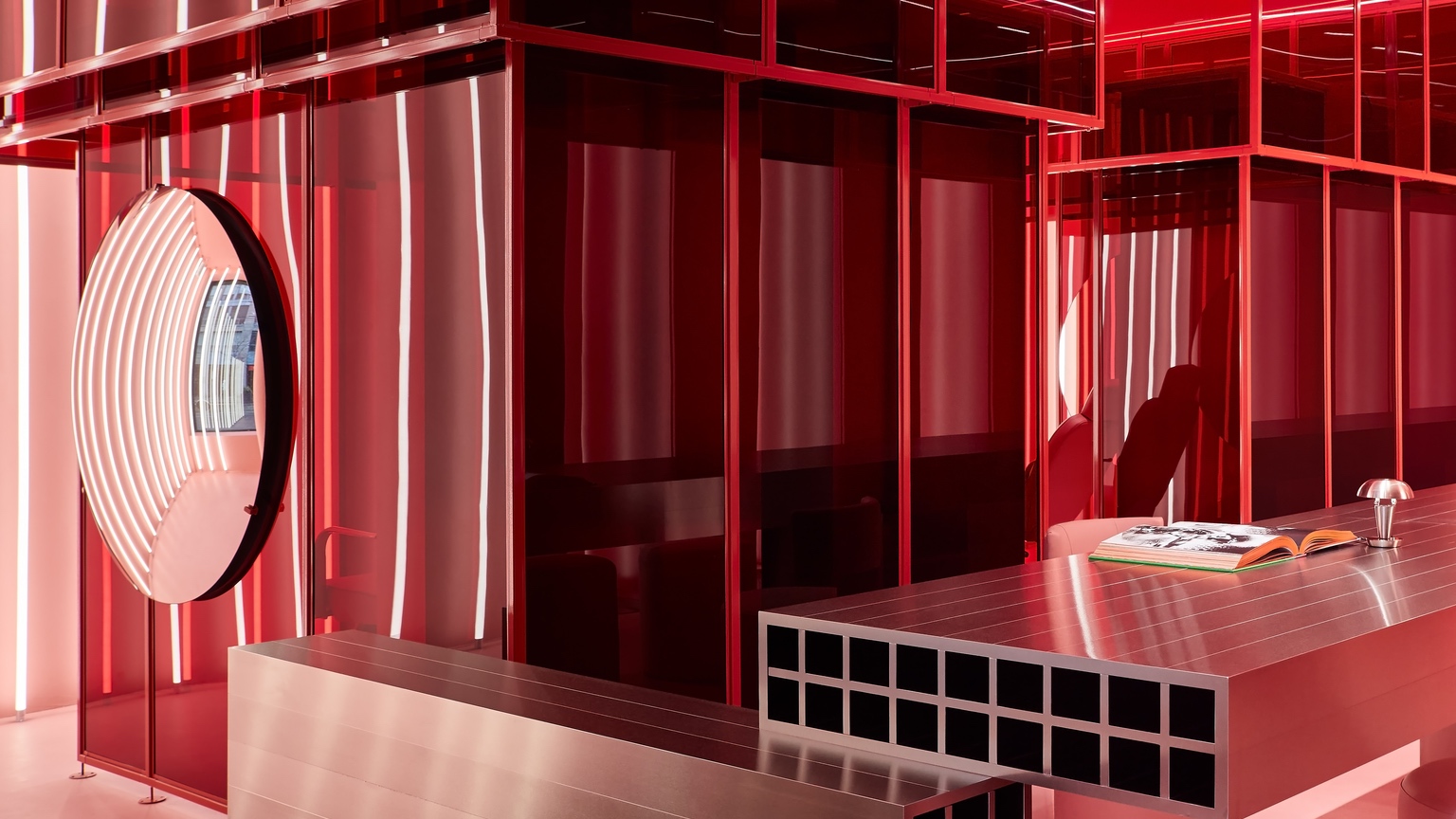
This Toronto med spa clinched our July/August issue cover — and a 2025 AZ Award — for good reason. With its unapologetically bold, colour-blocked interior, courtesy of local firm Studio Author, the space makes a clear statement: cosmetic procedures are no longer the taboo they once were. The vibrant pink and lipstick red palette is complemented by surgical stainless-steel finishes (this is technically a medical setting, after all), which lend the interior a futuristic appeal.
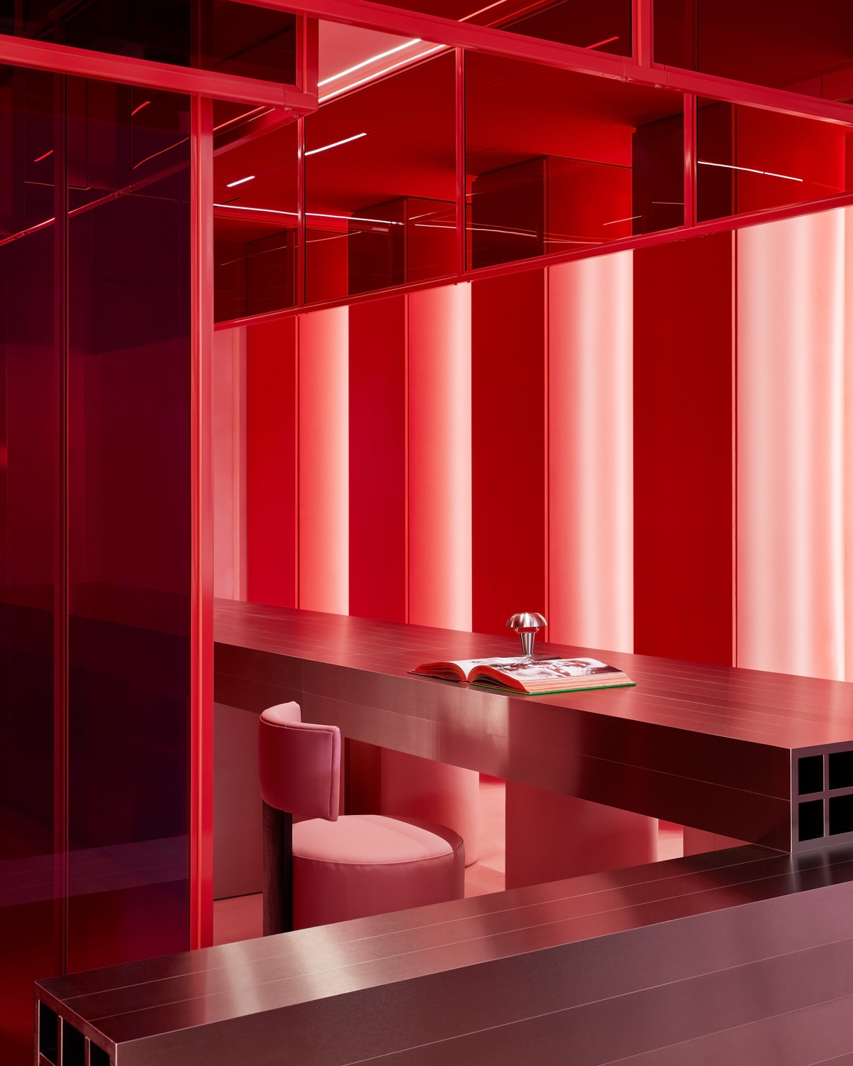
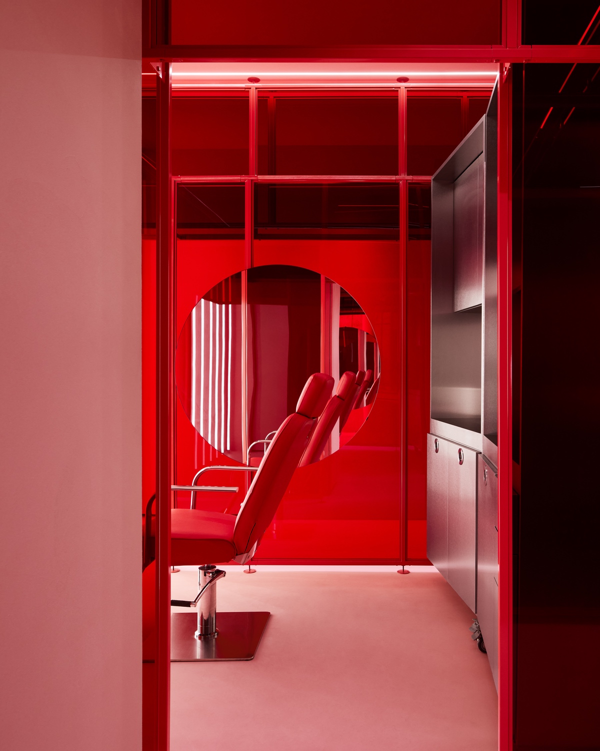
From the street, the neon glow of vertical tube lighting draws the eye. Once inside, a high-gloss red colonnade frames the 5.8-metre-long stainless-steel welcome desk — a high-impact design move that doubles as practical hidden storage and a guest coat closet. Past the reception area, two open treatment pods are framed by layered transparent acrylic walls in the brand’s signature red hue. Each is kitted out with a reclining salon chair reupholstered in durable red vinyl to match the walls, an operatory-style nurse’s station, a large circular mirror for client consultations and overhead surgical lighting for maximum precision.
Despite its tight 75-square-metre footprint, the space feels expansive thanks to its open plan, and the use of transparency and mirrors that subvert the idea of privacy as central to clinical design. What’s more, these design choices come together to create an illusion that prompts a shift in perspective. In other words, POUTx is proof that things aren’t always as they appear.
.
8
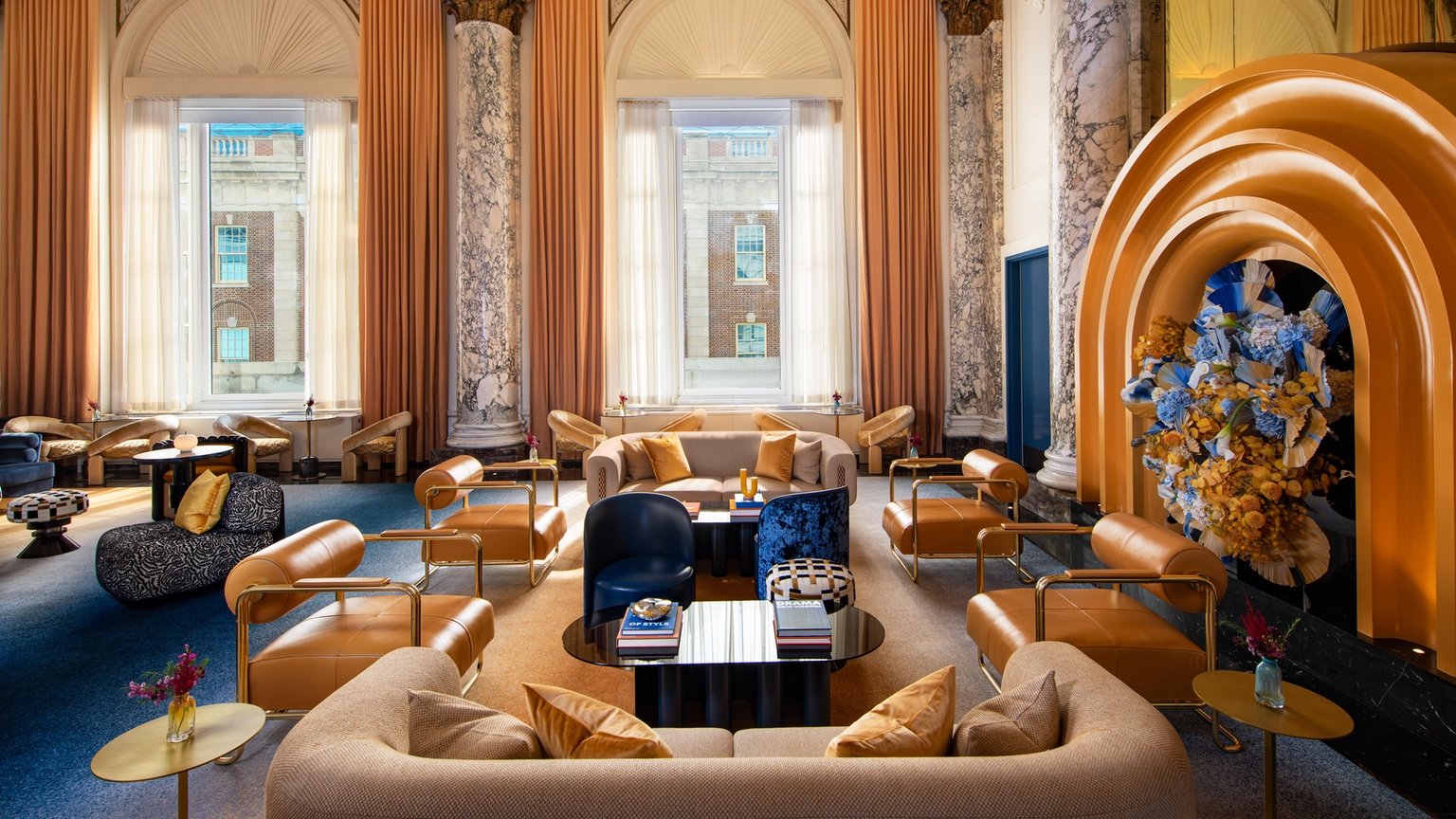
W New York – Union Square, New York, by Rockwell Group
For most people, a hotel is a getaway — but for Rockwell Group, the W New York Union Square represented a homecoming: The studio had also overseen the property’s original design 25 years ago. Back in 1998, W Hotels was still in its infancy; Rockwell Group had also led the design of its very first location, also in New York, just two years earlier. The firm’s concept for W’s Union Square location, set inside a 1911 building that was originally home to Germania Life Insurance, played a key role in establishing the hotelier’s bold brand, which thrives on madcap exuberance. Now, Rockwell’s Union Square revamp sets in motion a multi-year global rebrand of W Hotels — and the outcome is a total blast.
As an unabashed embrace of power-clashing hues and patterns that sometimes feels like it’s free-wheeling its way through every fabric and finish in Rockwell’s material library, the design seems to be permanently on the brink of descending into total chaos. But instead, it totally triumphs as a reflection of the distinctive, frenetic energy of New York. Take, for instance, the lobby. The curved staircase is carpeted in a painterly pattern that spills out at the base into a puddle-shaped rug of rainbow swirls. In the same room, a glass block wall provides a glowing backdrop to mirrored check-in desks featuring curved niches that showcase elaborate floral arrangements, which also weave their way up the staircase. It’s a lot to take in — in a good way.
What keeps the project from going dangerously overboard is its subtle sense of discipline. Botanicals and checkerboard patterns (a reference to the flower vendors and chess players at Union Square outside) are constant motifs throughout the project, providing some moments of consistency. And custom details — like the mural by Brooklyn art collective En Viu that defines Seahorse, the ground floor brasserie — are still given enough breathing room to shine. If NYC visitors want a taste of the Big Apple in all its hyperactive glory, here it is.
.
9
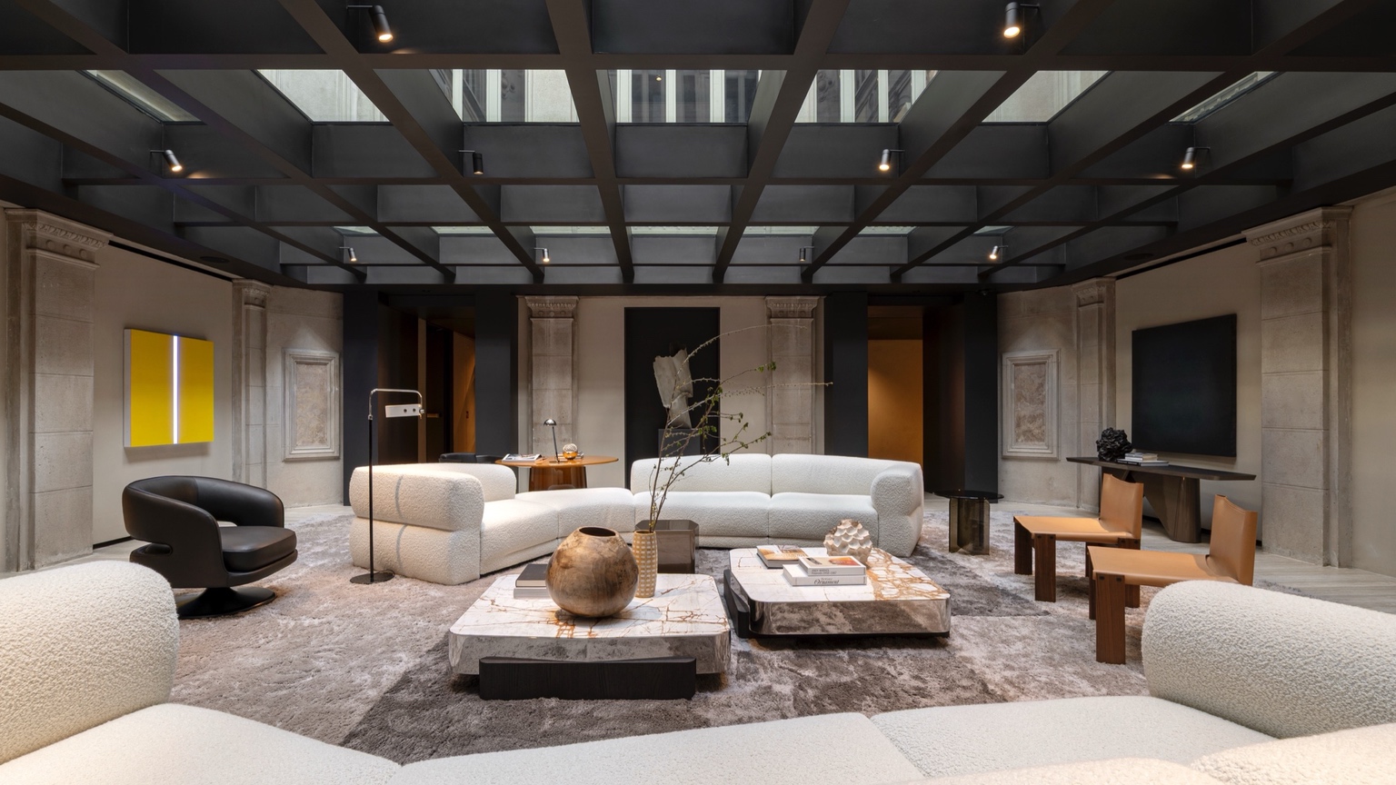
Palazzo Molteni, Milan, by Vincent van Duysen
When Molteni&C moved into a neo-Renaissance palazzo on via Manzoni in Milan, its creative director — the world-renowned Belgian designer Vincent van Duysen — got straight to work. The most significant move he made was to transform the exterior courtyard into an indoor room, a wonderful one with a glass roof that puts a modern riff on the coffered ceiling. Standing in this space, you can both take in the beauty of the interior – with its avocado marble and oak wood finishes and Molteni&C’s latest offerings on display — and its rarified context in the city.
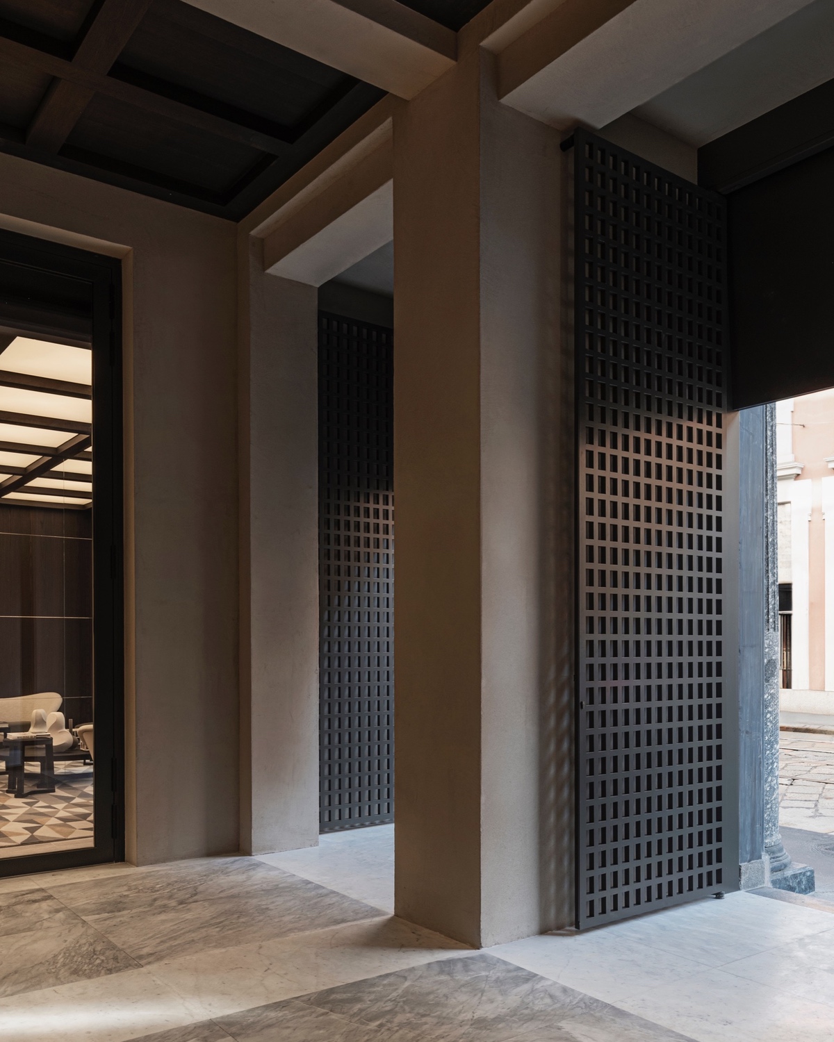
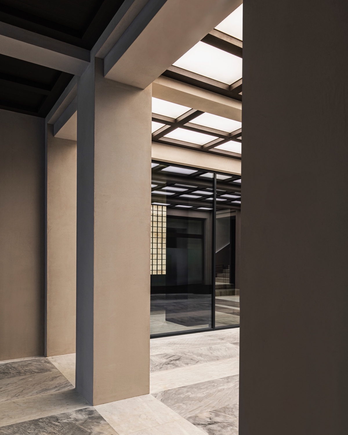
Through the glazing, the palazzo’s historical layers rise around it to evoke a contrast between old and new. Accessed via a sculptural staircase, these upper floors house Molteni Galleria, a space for events, conferences and meetings with designers. But it’s the main level, with its winding spaces and time-traveling charm that captures the spirit of both the Molteni&C brand and this new era.
.

10
Anduhyaun Indigenous Women’s Shelter, Toronto, by LGA Architectural Partners
For women and children fleeing violence, an enduring sense of safety and wellbeing is difficult to come by. For Indigenous women, the challenge is all the greater. While the built environment and interior design can play an important role, even the most comforting, reassuring environments tend to be rooted in a colonial design paradigm. After all, our ideas of what safety and comfort look like are in no small part products of cultural heritage and lived experience.
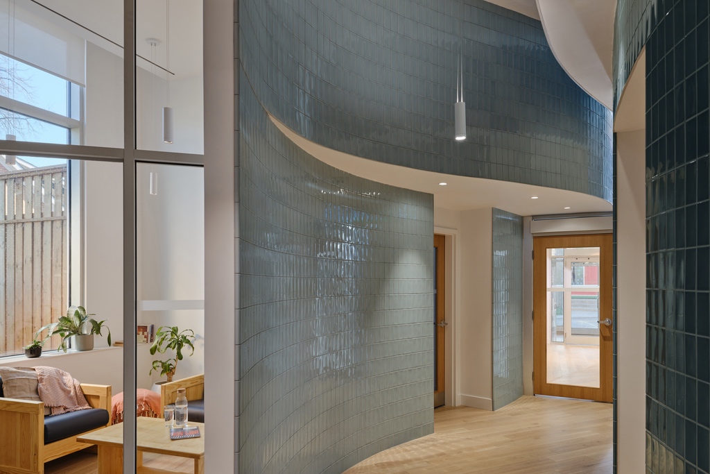
In Toronto, the Anduhyaun Indigenous Women’s Shelter is crafted with uncommon epistemological sensitivity. While serving both Indigenous and non-Indigenous women, the three-storey, 22-room emergency shelter is thoughtfully designed to align with Indigenous traditions. Rounded, organic forms are paired with genuine biophilia, with walls clad in fragrant cedar shingles, anchoring an interior rich in light and plant life. Moving through the place conveys the sense of being carried by gentle waves.
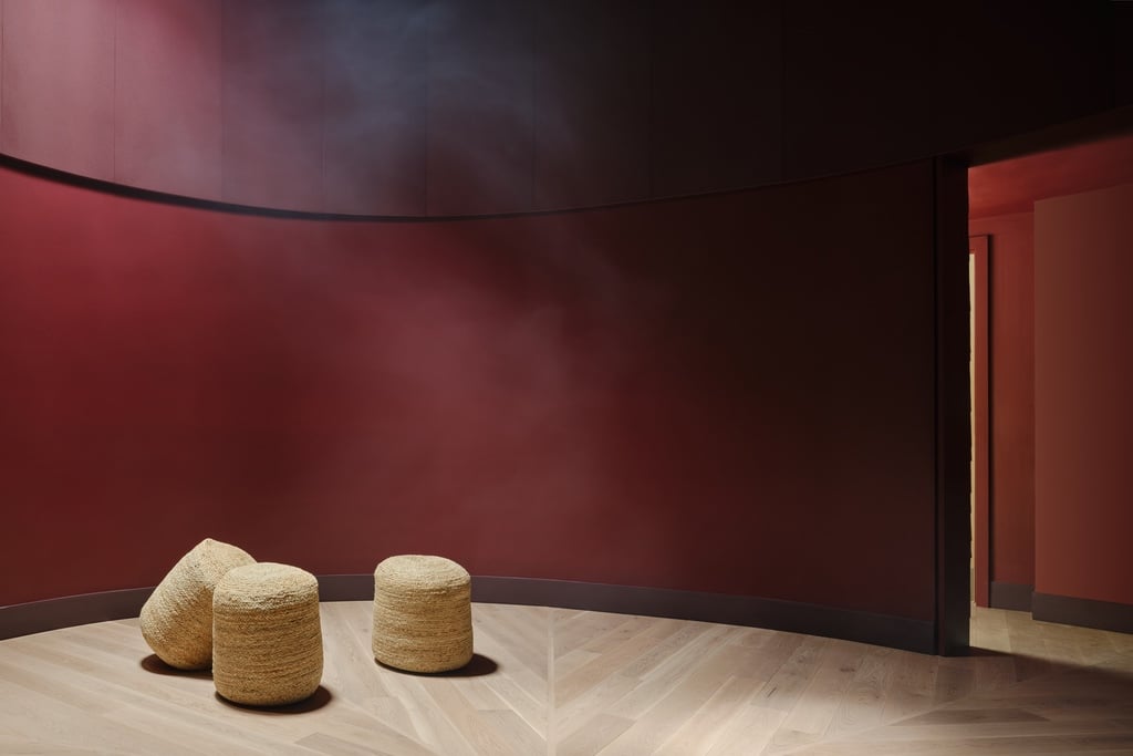
At the heart of the space, a traditional circular healing room is painted sumac-red, with a skylight that paints an ethereal beam across the space. Upstairs, floor plans are configured to give each suite a private three-piece bathroom, with the rooms themselves adaptable to welcome families. And beyond the windows? A lush private garden, where a planned sweat lodge and ceremonial pit are poised to add to the healing. No wonder the project took home our People’s Choice Award for Social Good at this year’s AZ Awards.
Top 10 of 2025: Our Favourite Interiors
Bold creative swings yield big payoffs in a power-clashing hotel, a sequinned bar, and other standout projects from the past 12 months.