The second decade of the 21st Century saw significant cultural shifts that informed interior design across the world. In tandem with the rise of Instagram, a generation of influencers embraced “millennial pink” and brands big and small strove to create increasingly experiential and photogenic retail environments. Terrazzo took over on walls and floors – but dramatically veined marble gave the finish a run for its money. Co-working caused a major pivot in offices and adaptive re-use was at the heart of some of the most inspired interior spaces. These 10 projects of the past 10 years set, defined and elevated the trends we now see everywhere – from Atsugi to São Paulo.
1
Cloud Garden Daycare by Junya Ishigami, 2015

Can a space designed for children also be sophisticated? Any doubters should be directed to Junya Ishigami’s massive yet whimsical concrete partitions for a seventh-storey daycare centre in Atsugi, Japan. Formerly an office cafeteria, the 2,200-square-metre space was studded with a series of bulky columns, which the Tokyo-based architect connected and camouflaged with cloud-like elements referencing the high-rise setting. Their sculptural form and imposing scale suggest a labyrinth as envisioned by Henry Moore, but Cloud Garden, as the design is known, was created entirely with small fry in mind, its arches and cutouts tailor-made for scrambling under, climbing over and gamboling through. During a decade in which many interiors were crafted to appeal to an adult’s inner child, it was refreshing to see a space intended specifically for kids that, conversely, didn’t talk down to them.
2
Valentino Flagship Store by David Chipperfield, 2014

At Valentino’s New York flagship, David Chipperfield created a palazzo of a store that set an early high-water mark for the era of experiential – and Instagram-driven – retail. On the other side of the sleek, eight-storey facade on Fifth Avenue, grey terrazzo defines a space that’s both elegantly austere and deliciously indulgent. A combination of fine-grained and larger-format Palladiana terrazzo lines every surface, creating a monotone backdrop that takes on a surprising sense of opulence through the weight of repetition and the rigour of consistency. The relentless material unity (and careful lighting) also lends the angular space a dramatic chiaroscuro mood in the shadows. Accents of timber, leather and brass create a distinct visual identity on each floor, while never betraying the purity and wholeness of Chipperfield’s design. It’s nothing less than a temple of fashion.
3
Starbucks Dazaifu Tenmangu by Kengo Kuma and Associates, 2012

This ain’t your neighbourhood Starbucks – unless you’re a resident of the Japanese island city of Dazaifu, that is. Situated on the path to a 10th-century Shinto shrine, Kengo Kuma’s first Starbucks outpost is defined by a striking lattice composed of 2,000 wooden batons that embrace the wall and ceiling and extend onto the street, past the café’s glass facade. Despite this defiantly individual presence, the space is also harmoniously integrated into its surroundings. Evoking the angularity and materiality of Japanese vernacular, the project lends the global coffee behemoth a rare sense of genius loci. Amidst the third-wave coffee revolution that spawned independent, locally owned shops around the world, the café is a riposte of sorts from Starbucks. It may be the world’s most common cup of coffee, but this a unique spatial experience. As the decade unfolded, we saw many more one-off Starbucks – several of which were also designed by Kuma.
4
Jaffa Hotel and Residences by John Pawson and Ramy Gill, 2018
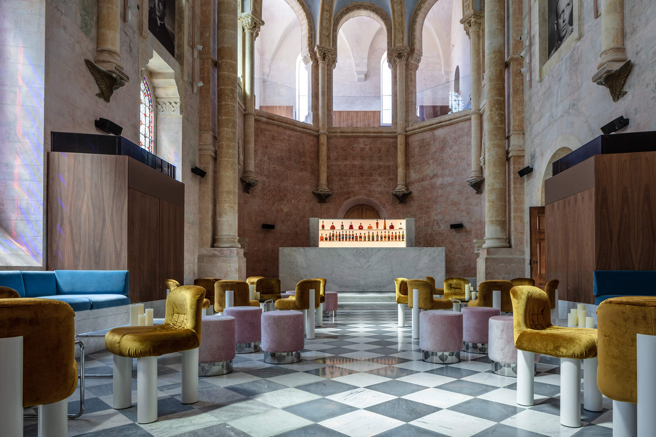
The decision to hire consummate minimalist John Pawson to restore and modernize a former convent school and hospital in the ancient port of Jaffa, now part of Tel Aviv, Israel, may have been counterintuitive. But it was also inspired: The resulting Jaffa Hotel, which he wove from the bones of the two existing buildings as well as a new, six-storey wing housing 32 private residences, is a design palimpsest nonpareil. It encompasses artfully balanced interiors that both celebrate their period origins and come alive with Pawson’s hits of the new (think orange Cappellini chairs accenting the remnants of a 13th-century stone wall or a sumptuous assemblage of gold, blue and soft pink seating under the vaulted ceiling of the onetime school’s chapel). Typically, design updates retain historic exteriors but obliterate interiors. The Jaffa breaks that mould, adopting an ultra-contemporary visual language without stifling context and serving, in the process, as a model for adaptive-reuse projects over the coming 10 years and beyond.
5
Sulwhasoo Flagship Store by Neri & Hu, 2016

With stunning brass latticework that stretches five storeys, Neri&Hu set a standard for high-end retail interior design in 2016. Conceived as part of the transformation of a 13-year-old building in Seoul’s Gangnam district into Korean skincare brand Sulwhasoo’s first flagship, the intricate structure was informed by traditional paper lanterns – how they light the way and mark the beginning and end to a journey – and guides visitors throughout the entire store.

First encountered when approaching the building, the installation unfolds inside where large openings, mirrored volumes and strategically placed custom light fixtures heighten a sense of exploration and exemplify the Shanghai-based firm’s aspiration to always create a “dynamic interaction of experience, detail, material, form and light rather than conforming to a formulaic style.” While the golden hued framework is vast, moving from delicate to industrial, bright to shadowed, enclosed to open, Neri&Hu expertly instilled a curious intimacy that invites discovery around every corner.
6
Pump Room by Yabu Pushelberg, 2011

By the time Yabu Pushelberg‘s George Yabu and Glenn Pushelberg arrived at the Pump Room in the Ambassador Hotel, the legendary hotspot had lost its lustre. Ian Shrager (of Studio 54 fame) had envisioned the property in Chicago’s Gold Coast neighbourhood as the inaugural outpost for what would become the Edition chain, and he tapped the Canadian duo to helm the project. While they also re-designed the rooms above and surrounding public spaces, the revamped Pump Room is the undisputed star. Suspended from the 18-foot ceiling – and occasionally even dropping to meet the edge of the tables below – is a composition of illuminated resin orbs connected to a black-metal framework that fills the recessed dining room with an intimate constellation. The Pump Room would provide the template for Edition’s public spaces to come (they’re now in London, New York and more), all while shaping a distinctly tailored approach to hospitality.
7
Second Home London by SelgasCano, 2014

Over the past decade, the co-working office has grown in popularity as an interior design exercise (even as it’s lately been challenged as an economic reality, with the precipitous decline of WeWork). But SelgasCano, the Spanish firm whose claim to fame was its multi-hued, plastic-fantastic Serpentine Pavilion in 2015, injected a unique energy into the typology when it created Second Home London’s location in the city’s east end in 2014.
The firm’s expertise with colour – the interior’s juicy yellows and oranges practically make the mouth water – and its virtuosity with form took this co-working space out of the realm of mismatched couches and chairs. It introduced areas of quiet contemplation inside of organically shaped glass enclosures, and crisp white communal tables that sinuously snake along the interiors. But most impressive: the firm extended the facade of the existing building, a former carpet factory. Called “the greenhouse,” this orange plastic tube bulges out to the street, making the interior assert itself with an imposing architectural statement.
7
Ròmola by Andres Jaque/Office for Political Innovation, 2018

Since establishing Office for Political Innovation, Andrés Jaque has amassed a significant portfolio of hybrid environments that provide a critical look at the often unseen forces embedded in the built world. Take 2017’s Ròmola, for instance: a combined bakery, café and restaurant constructed in a renovated 1946 garage at the heart of Madrid and described as a “marble-made tent in the galaxy.”
Jaque collaborated with local artisans – from marble manufacturers to leather upholsterers – to reclaim the vernacular of the city’s cafeterias, which had slowly ceded way to encroaching corporate franchises and their uninspired colour and material palettes. The result is a materially rich landscape of lime upholstery, chrome plating and a suspended canopy of triangular engineered super-marble slabs (with glass fibre and resin reinforcements) that resemble guillotines (and that, in our imagination, are about to come down on the heads of the surrounding mass-produced austerity). It’s a playful yet graphic reminder of the socio-political exchanges imbedded in such foundational materials as metal, glass and stone.
9
Gallery at Sketch by India Mahdavi, 2014

India Mahdavi’s interior for Sketch boasts two voguish honours (apart from also appearing in Vogue): It’s the most Instagrammed restaurant in the world and it ushered in the era of millennial pink. Both feats are thanks to its flawless design – that unmistakable rosy tone, which Mahdavi described in The New Yorker as “pink that is like the essence of pink,” is so effective because it’s applied to forms of the utmost elegance. The plush, rounded seating in Sketch is evocative of many delightful shapes at once, from Italian Ladyfingers to cartoonish tulips. And with its zigzagging stone floors, ornate ceiling and undeniably feminine look and feel, the entire restaurant recalls all the warm, traditional, even hygge-inspired spaces that never go out of fashion.

10
Aesop São Paulo by Fernando and Humberto Campana, 2016

With its feature wall in traditional cobogó brick – which allows light and breezes to permeate the interiors – this São Paulo outpost of Aesop, by the city’s own Campana Brothers, authentically speaks to both the luxury skincare brand’s ethos and the bohemian location. The feature wall runs the length of the store and extends to a front courtyard (which doubles as a public square). It’s composed of hundreds of small, square terracotta blocks perforated by a quarter circle and radiating lines that, when puzzled together, create a graphic sunburst motif. This pattern is reversed on the floor; here, the filigreed terracotta modules, filled with concrete, form a smooth counterpoint to the light-filtering wall.


The earthy palette was continued throughout the space, with sisal wallcoverings that provide a textural backdrop to the brick; smooth concrete counters that top the display units and sink; and low-slung timber benches that invite visitors to linger. It’s a masterful illustration of the impact humble materials can have when combined with considered embellishments and attention to detail.
The 10 Interior Designs that Defined the Decade
From the millennial-pink Sketch and the marvellously marble Ròmola to Second Home’s paradigm-shifting London office, these restaurants, co-working spaces and daycares shaped a decade of interior design.

