


An addition to create more space – not an uncommon brief from a family of four with two children under two years of age – can be as simple as adding a room or two. That wasn’t quite enough for Batay-Csorba Architects of Ottawa, when tasked with upgrading a red-brick Victorian from the 1890s. It’s a typology notorious for clustering discrete rooms completely cut off from one another – not a desirable plan for the ways 21st-century families socialize – but CSA was up to the task. “The real challenge for us,” says Jodi Batay-Csorba, who heads up the firm with husband Andrew, “is to produce work that not only looks different, but works and performs differently.”
From outside, the addition is easy to spot: the original brick cube is still there, now painted a gleaming white, while the newly added space is clad in a glossy black. The third storey is the only new massing that can be seen from the street: “It’s subtly peeled back from the front facade and cantilevered along the side,” says Batay Csorba, “which helps to differentiate it, and also creates a visual tension and sense of movement.” The black coated panels, off-the-shelf in three different sizes, are likewise arranged into a random pattern to accentuate the shifts in perspective and the structure’s visual depth.
A three-storey addition also extends from the back of the house; the added space was made as large as possible without intruding into the zone of a protected sugar maple tree by twisting and cantilevering each floor around a central axis, with the tree at the centre. The resulting oblique angles are calculated not just to improve visual appeal from the outside, but to make the tree the focal point of views from the interior as well. On the third floor, where the addition extends into the backyard, BCA has added a private rooftop garden, accessible from the master bedroom, and secluded by high cedar-clad walls.
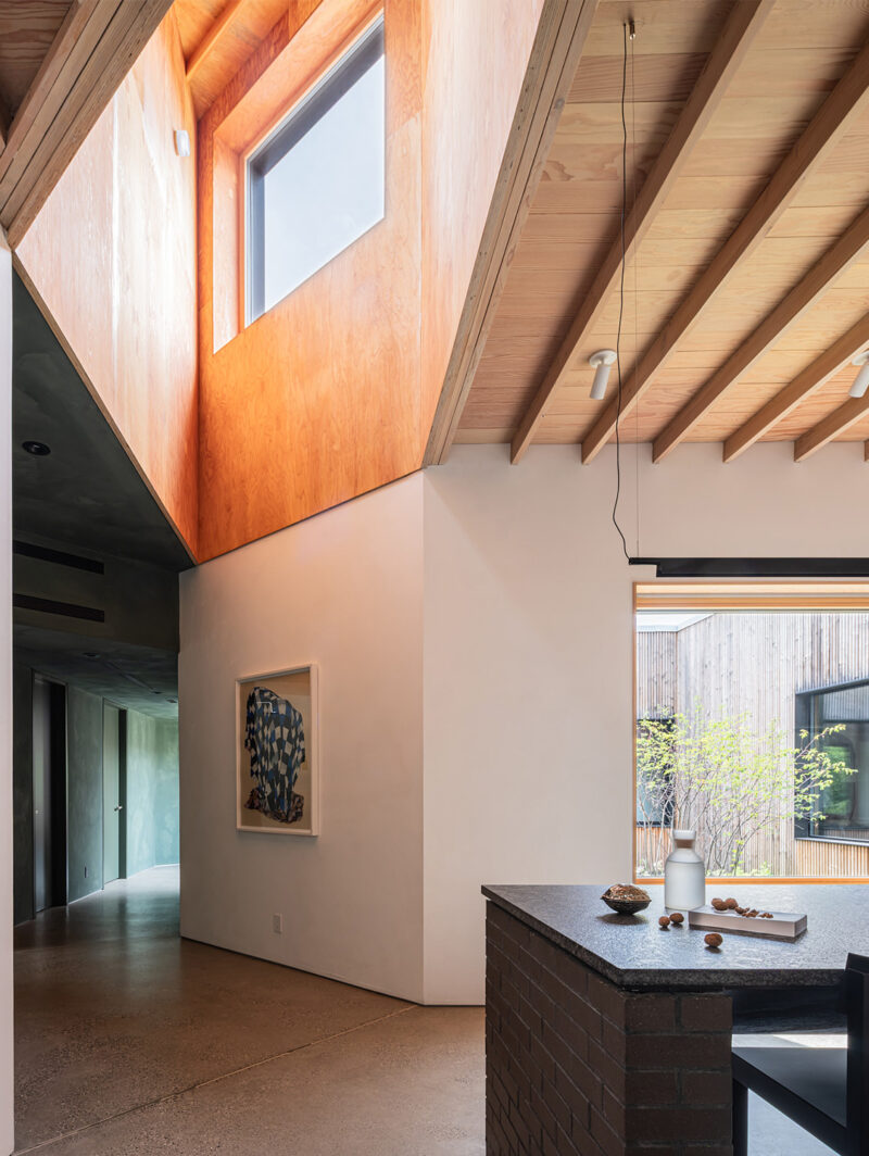
Inside, few traces of the original plan remain. After gutting the interior, the design team started with a three-storey void at the centre of the building, topped by a solar-powered skylight to bring light deep into the house and allow for passive ventilation throughout. The strategy also opens up views, connecting spaces across floors. Reading and sitting rooms that extend off the light well benefit not just from this better circulation but from a sense of being included in the life of the house as well.
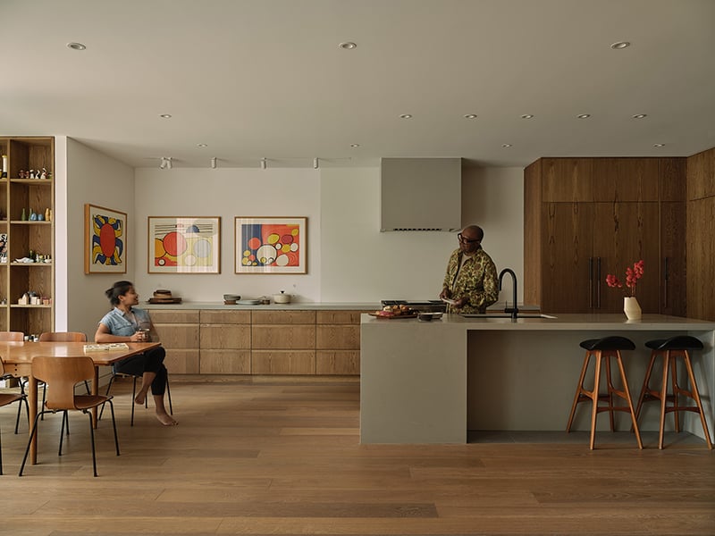
The kitchen is the new social hub; a massive island topped in Caesarstone is designed for all the activities of a young family – not only cooking and eating, but also arts and crafts (and, eventually, homework), bathing the baby, and social events. New dining and sitting spaces extend from both ends of the kitchen, expanding the social properties of the kitchen and opening up the entire floor to longer views and better connection from space to space.