


The recently completed expansion of the San Francisco Museum of Modern Art proves that even in the narrowest of sites, clever moves can bring a neighbourhood closer together.
In the earliest decades of the 20th century, the alleyways of San Francisco’s rough South of Market neighbourhood were the sort of territory that made even the hard-boiled gumshoes of Dashiell Hammett’s noirish detective novels uneasy: a noisy skid row of sweatshops and flophouses. While redevelopment plans slowly began to unfold in the 1980s, things really heated up in the mid-90s with the first dot-com bubble, and the arrival of the city’s leading art museum, the San Francisco Museum of Modern Art. This past May, the district, better known as SoMa, signalled that its gentrification is complete with the opening of the institution’s 10-storey addition, designed by Snøhetta.
“In architecture, meaning is not found in things,” says Snøhetta founding partner Craig Dykers, standing in the new building’s sunlit second-floor ticketing hall. “Instead, meaning is found in between things.” His statement is apropos, given that the extension is an ingenious example of in-between architecture: a permeable structure tucked within a dense block in one of the city’s fastest-changing neighbourhoods.
Six years ago, when the firm was selected to tackle the project, it rejected the impulse to tear down the museum’s existing Third Street home. Architect Mario Botta’s red-brick structure went up in 1995, at the tail-end of an era when walking through the neighbourhood felt less safe than it does today. Botta responded with a museum that was “quite muscular and internally focused,” according to Ruth Berson, who, as the museum’s deputy director of curatorial affairs, oversaw its recent US$300-million expansion. Botta’s hermetic approach kept visitors’ attentions focused on the museum’s objects, and away from the world outside.
Today, two or three Bay Area tech booms later, the area is more dense and pedestrian-friendly, home to web developers, museums, and some of the city’s hottest nightclubs. “The Botta building was so internalized and pushed close to the street that it felt invisible,” says Lara Kaufman, Snøhetta’s project architect, alongside Jon McNeal and Aaron Dorf. “Updating the museum called for multiple entries and lots of ways to engage with passersby.”

To make way for the expansion, the architects lopped off the rear wing of Botta’s T-shaped building, and gained still more space by demolishing a fire station. The firefighters were relocated to a new building a few blocks away, a move funded by the museum. The 10-storey, 22,000-square-metre structure that now rises in their place, adjacent to the W San Francisco Hotel, more than doubles SFMOMA’s total square footage, but occupies only 25 metres of new frontage on a major city street.

In that glass-clad entry on Howard Street, a stepped amphitheatre overlooks the monolithic steel work Sequence by San Francisco native Richard Serra. And from the Third Street entrance, Snøhetta rejigged Botta’s soaring, oculus-topped entry hall with a sculptural stairway that climbs two storeys, framed in steel and clad in white maple.

The stairway is broken up into three shorter segments, with each subsequent rise visible only after you’ve climbed the last. “We used a bit of visual bamboozling to trick people into taking the stairs,” says McNeal. “Once they commit to the first few steps, it’s easy to get them into a groove.”
These two access points converge at a centralized ticketing area on the second floor. All these generous, light-filled spaces, adorned with a mobile by Alexander Calder and a wall-sized painting by Mark Bradford, are accessible without a ticket. But you should buy a ticket, and you should climb even more stairs-“Take the stairs, please!” exclaims Dykers -because things only get more interesting as you rise higher, bending here and offering Escher-like views there.
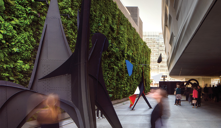
An outdoor sculpture garden on the third level is framed by a massive living wall constructed using more than 19,000 plants; this, plus open-air terraces on the fifth and seventh floors offering city views, serve as what Dykers calls “palate cleansers.” The top three window-filled floors are dedicated to administration and conservation.
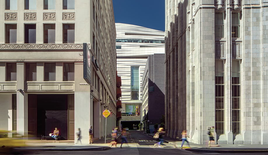
Outside, the galleries are complemented by a gestural facade with an iceberg-white sheen that transcends the clamour of local density. This rippling fibreglass-reinforced polymer cladding – whose topography feels simultaneously organic and digital – faces into the middle of the block. Thus the back alleyways of SoMa, revitalized by Snøhetta’s extension as well as by trendy new bars and restaurants, now offer the most tantalizing glimpses of the building.
“The alleyways became our opportunity to have people wander around this tucked-away building and capture views back towards it,” says Kaufman. These unexpected, partial glances down laneways make SFMOMA’s glinting white geometry a surprise waiting to be uncovered.