In the video for “Cranes in the Sky,” a single off Solange Knowles’ powerful new album A Seat at the Table, the singer appears in a pink sweater reminiscent of stiff strawberry meringue. The garment was designed by Nadine Goepfert and the video was styled by Shiona Turini, and the shot sets the scene for a stunning succession of fashion, architecture and landscape imagery.
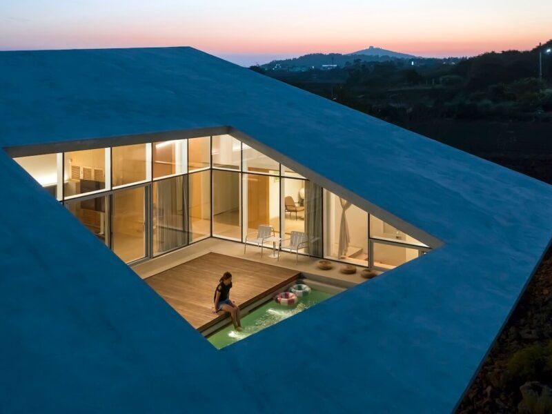
Like the film for her other hit single, “Don’t Touch My Hair,” this one was directed by Knowles and her husband, Alan Ferguson, with help from photographer Carlota Guerrero. It features Knowles and black women in vibrant and muted garments, against the backdrops of New Orleans, Texas and New Mexico. In one scene, Knowles dances on the roof of Roberto Bruno’s Steel House (also known as the “spaceship house”) in Ransom Canyon, Texas, as birds flitter by.
On the album, Knowles explores what it means to be a black woman in America, on a personal level and beyond. In “Cranes In the Sky,” she sings, “I tried to drink it away/ I tried to put one in the air/ I tried to dance it away/ I tried to change it with my hair.” In another track, “F.U.B.U. (For Us, By Us),” her mellifluous soulful voice belies a collective sense of frustration: “When it’s going on a thousand years/ And you pulling up to your crib/ And they ask you where you live again/ But you running out of damns to give.”
The album encapsulates America’s racist history – in one interlude, her father recounts the brutality visited upon him and fellow black students after desegregation – and this particular moment we are living in, with seemingly endless accounts of black men and women dying at the hands of police officers.

The images Knowles has curated for the album artwork speak to these themes. “I wanted to express an almost stately look for black men and women, because I feel like historically we haven’t been put in the most regal or majestic context,” she recently told Vogue. “I set out to create that in the album sonically, and I wanted that to carry through in the visuals as well. My husband, Alan, and I wanted to represent black sisterhood, strength, pride, and elevate the black man and all of his beauty and glory. This was our way of contributing to that narrative.”
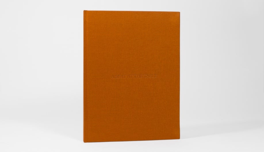
The album’s striking visuals also extend to the lyrics book, designed by Montreal graphic designer Frédérique Gagnon. We got in touch with Gagnon to talk about how she designed the work in collaboration with Knowles and Guerrero.
How did you come to work on the Solange Knowles’ A Seat at the Table project?
I am interested in publication design and have had the opportunity to work on inspiring book projects lately. The majority have been through Anteism, a publisher that specializes in limited/short-run editions. They are based in Montreal but have been working with international artists and galleries, largely out of New York. The founder of Anteism, Harley Smart, lived in New York before and still spends a lot of time there, including this summer, when Solange and her assistants contacted him. I was then asked to explore concepts and designs for the book.
Did you work closely with Solange? What was the starting point of the design – the sources of its inspiration – and how did you decide on the final concept?
I was working from my studio, here in Montreal, and exchanged emails with Solange. I tried to understand a little bit the creative process she went through while working on this album, what kind of visuals would have inspired her. She was helpful and sent a moodboard of graphics, photos, paintings and collages – mentioning a special interest in Donald Judd’s work and minimalism. I was especially inspired when she sent a few Matisse collages, which I already had on my desktop for personal reference.
With this in mind, I started working on mock-ups of the individual pages of the book and sent them a proposal. I gave them the concept for the text layout of the book and they were really happy with it. The rest was completed quickly as there was not a lot of time before her launch date. The art director who had been collaborating with her on the photography, Carlota Guerrero, worked on completing the book, added the photos and included the final versions of the lyrics.

Could you describe your approach and aesthetic in terms of the font design, the layout of the text and other visual elements?
What interests me the most in graphic design is the tension that emerges between a desire to organize and a desire to create confusion. I try to break away from restrictions and expectations, literally bending the qualities of the content. I was therefore glad to hear that this project asked for this kind of play with type/using type as images. I like to explore a graphic language that is gestural, and this project really allowed for that. The purpose of this book was to make the viewers hyper-aware of the content, and one way to do so, I believe, is to subversively err in graphic design. By breaking familiar forms of delivery, you can disrupt the expectations of an audience, emphasizing the content.

How was this project different from others? How was it similar?
This project allowed for a lot of creative freedom, as opposed to some other more commercial work I have done. I enjoy working with artists and photographers on their books. I feel that they appreciate how this process of making books sometimes allow them to consider their work in a new/different way. I value this kind of collaboration a lot and it is a quiet different process then working for clients, for example, on advertising content.

However, the role of graphic design is to create a language that everyone can understand/relate to and that can be true for any type of project, in disregard of the creative freedom involved. The projects I have been pursuing lately explore the role of instability and incidents in visual communications. I try to operate in a state of openness and allow the “random” to affect my work. I get most excited by the dysfunctional qualities of my process. I was therefore really glad to work on this project as sometimes, I don’t have this much latitude when working with certain clients.

What other major projects are you working on at the moment?
I have been working as a freelance art director/graphic designer in Montreal, I like to focus on publication design and exhibition design. I just finished an artist book for L.A. based artist Alison Blickle, to accompany her exhibition at the Kravets Wehby Gallery in New York this month. I am finishing a publication that includes essays by artists and cultural workers from Quebec, who reflect and discuss the current state and future of the arts. I am working with an advertising agency, helping them with their rebrand and the development of their portfolio. I also started my own graphic design studio and work on varied design projects, commissioned and self initiated.
