A Toronto couple looks to their former designers to refresh a three-storey Riverdale residence 10 years on.
- Words
- Evan Pavka
- From
- Gallery, Interiors
- Posted
- Mar 9, 2021


The history of residential architecture is peppered with horror stories of tense relationships between clients and the designers charged with spearheading their projects. (Look no further than the court case that followed the completion of Mies van der Rohe’s Farnsworth House in 1951). Yet, on occasion, this joint effort can be so synchronous that it inspires future endeavours — even on the same site. Case in point: a newly completed renovation along a quiet one-way street in Toronto’s Riverdale neighbourhood lead by local studio PLANT Architect. A decade ago, the firm transformed the spartan landscape outside the three-storey, 133-square-metre abode into an oasis in the city. Upon return to the Canadian metropolis after a detour to the Middle East, homeowners Graham McLeod and Tim O’Fallon looked to their former collaborators to give the interior of the 120-year-old edifice a much-needed update. “We loved what they did with the front yard,” says McLeod. “So, it was a very easy call to make to re-engage them for this reno.”


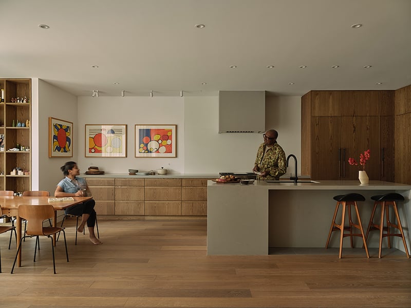
Contending with the home’s relatively narrow footprint — a direct result of a previous renovation in the 1980s that sectioned the structure into three units— was only one of the project’s main hurdles according to PLANT partner Lisa Rapoport. “The most challenging aspect of the site,” she says, “was the skinny floor plate in combination with the fact that unit is on a flank. In this case, you’re arriving in the middle, so everything is very attenuated.” Thus the home’s existing layout was kept intact. Newly laid oak flooring now provides the perfect backdrop to the main floor, which contains an open kitchen (retained from a 2007 addition) and generous dining area framed by the charming arched features of the existing structure, punctuated by Rich Brilliant Wiling’s Vitis pendant above. Hollis + Morris’ Oldtown stool is placed beside the entryway.


Central to the new scheme was a complete reimagining of the staircase that weaves the levels together. The ground floor interior wall was left as is, but a glass enclosure replaced the opaque divider above to “make their home feel more spacious,” says Rapoport, and strengthen “connectivity between the levels.” Custom details — such as the white powder-coated steel and wood handrail, which contains integrated lighting at points — give the slender space a sense of depth. “We wanted it to be modern, but also very warm and open,” McLeod adds. Finally, an added skylight above allows the sleek stairway to double as a light well for the home.


Nestled beneath the soaring ceilings (just over three metres to be exact) is the second-floor living and study area. While walnut millwork featured prominently on the main floor, cherry is used here in a number of architectural and built-in features to contrast the white oak flooring running the length of the space. “It’s just great to relax in here,” says O’Fallon. “On a sunny day, there’s so much light coming in. And, even at night, with the wood panelling, it’s very warm and inviting.”


Above the plush sofa (where O’Fallon confesses he and McLeod routinely fall asleep) and flanked by two arched windows sits a commissioned ceramic work by local artist Talia Silva. The site-specific cluster of cascading porcelain petals is illuminated by a series of fixtures in the cherry woods soffits as well as the soft glow from a collection of Foscarini’s Gregg pendants, casting dramatic shadows against the crisp white wall. The cherry dato running along the perimeter of the space terminates near the stair landing in a discrete media centre inset into the wall.


Immediately across from the living room is the open study, wrapped entirely in cherry wood millwork and fitted with a small oblong desk which McLeod has coopted as his WFH setting. Behind, a curio cabinet-inspired feature wall (an existing feature Rapoport leveraged to her advantage) prominently displays the owner’s eclectic collection of books, globes, sculptures and other storied objects. These areas are flooded with natural light thanks to three large arched windows running along the home’s southern wall. The soaring ceiling, too, offered the perfect setting to “hang something really great that has a lot of moxy,” says the designer of the composition of pendants that continue across the floor.


In addition to increasing the overall transparency of the interior, the renovated glass-clad stairway also provided the prime location to highlight McLeod and O’Fallon’s extensive trove of contemporary art in a three-storey salon of sorts. “They came back with a substantial art collection,” says Rapoport, “and there’s a lot of windows in this long and skinny building. So, there was only one wall to put that art on, the stair wall.” Almost dancing up the wall is an eclectic mix of works by Annie Pootoogook, Daphne Odjig and Bradley Wood to name a few. Open treads on the second and third-floor stairs not only bolster the spacious feel of the home but allow for views of the gallery between all levels.


The new oak steps meet the existing pine flooring on the third level as the folded metal grip with wood underlay gracefully commences at their joint. “I really love the handrail,” Rapoport confesses of the detail, which features integrated lighting at each level. “It’s very contemporary, but it’s not something that stands out. Being white against the white wall, it’s something quiet and really something you feel.”


Immediately off the narrow landing is the washroom, flanked on either side by a dressing and master suite. In the former, a Murphy bed is ingeniously concealed behind a minimal bookshelf to double as a guest room when needed. Floor to ceiling walnut cabinetry with expressive veining adds a sense of rhythm to the tailored space while providing additional closet space.


Walnut details continue into the master suite, ranging from the graphic window frames to the sliding closet doors, that use the existing wooden entry to the washroom as the departure point. “Throughout the project,” Rapoport explains of her archeological strategy, “there was this deference to these little artifacts that were already there. So, we worked with these adjacent elements in a local way.” Above, French architect Odile Decq’s Soleil Noir luminaire for Luceplan adds an organic yet graphic accent.
PHOTOS: Steven Evans

