fbpx
We rely on advertising revenue to support the creative content on our site. Please consider whitelisting our site in your settings, or pausing your adblocker while stopping by.

Get the Magazine

Best of 2020

From landmark structures and immersive spaces to cutting-edge products, these are the best houses, interiors, buildings and designs that defined the year.
Best of 2020: Houses of the Year
1/4
Best of 2020: Top 10 Interiors from Around the World
2/4
Best of 2020: Top 10 Architecture Projects of the Year
3/4
Best of 2020: The Year’s Top 10 Product Designs, from Puffy Chairs to PPE
4/4
Best of 2020
Best of 2020

“Perhaps no one thing distinguishes twentieth-century architecture more than the central role played by the private house,” wrote architecture historian Beatriz Colomina in the mid-90s. “Every aspect of architecture, even the city itself, has been rethought in this century from the house.” Though she was musing on the radical changes to domestic space that began in the early 1900s, her sentiment rings true — maybe even more so — this year.

In the last 10 months, we’ve witnessed our homes take on new meaning (and new dimensions) following global lockdowns that compressed the spheres of life and work, public and private between its studs. Fitting for a year in which many landmark moments played out within our domiciles, we’ve gathered the most unique projects from Toronto to Kuala Lumpur that expertly explore the potential of this typology: 

Stairway House, Tokyo, by Nendo

Staircase in Tokyo house by Nendo
PHOTO: Daici Ano

A multi-generational family house with a sculptural concrete staircase that extends all the way out the door. This daring design is by none other than Nendo, the Tokyo studio led by Japanese-Canadian design virtuoso Oki Sato. As we wrote back in January, a set of grandparents live on the first floor — which also allows their eight cats to roam in and out freely — while the younger couple and their small child reside on the second and third floors. Furnished sleekly — a stunning black kitchen, a minimal window-facing workspace — the home makes practical use of its marvel of a staircase. It encloses functional elements such as bathrooms and passageways from one side of the house to the opposite. And it joins the fabric of the neighbourhood by extending southward on the ground level and upwards through its skylight. Filled with plants, it also creates a diagonal garden and a sun-soaked perch that all three generations can enjoy.

Hinterhouse, Quebec, by Ménard Dworkind

PHOTO: David Dworkind

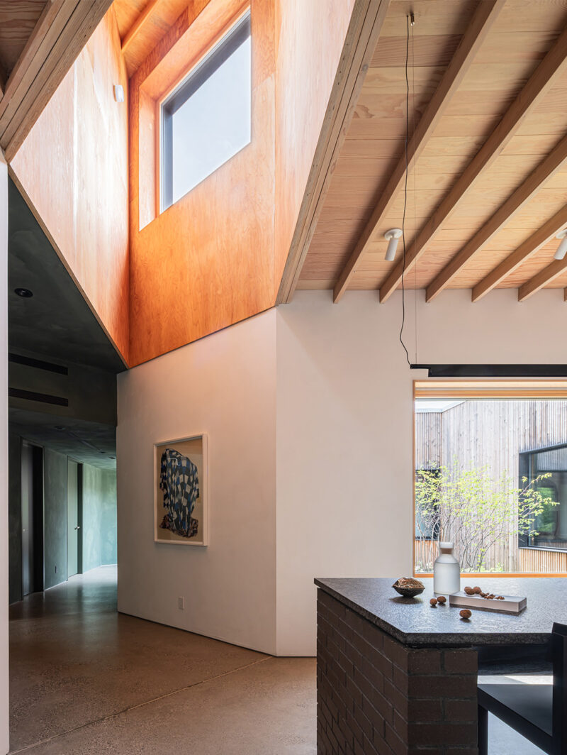
Surrounded by trees and not much else, Hinterhouse in Quebec’s Mont-Tremblant region takes isolation to a new — and undeniably pleasurable — level. Designed by architect David Dworkind of Montreal studio Ménard Dworkind, the 86.3-square-metre cabin is a study in minimalism warmed up by a palette of nature-inspired materials. The flat-roofed single-storey structure is clad in sustainably forested white cedar vertical slat siding with some segments forming shutter-like panels that can be moved sideways to alternately close-off the cabin completely or to reveal floor-to-ceilings windows. It’s a considered touch that gives the inhabitants the ability to manipulate privacy and light levels (the shutters also reduce solar heat gain).

PHOTO: David Dworkind

The interior is equally well-appointed, with poured (and heated) concrete slab flooring and oiled red pine-plank walls and ceilings creating a cosy envelope free from any distracting embellishments. A wood-burning stove provides warmth and anchors the main space, around which the open-plan living and kitchen area, two bedrooms and one bathroom radiate. Mere steps away from the main cabin is a second similar but smaller structure — a four-person sauna with outdoor shower and hanging hammocks. Originally conceived as a private getaway, the cabin is now part of a new hotel concept, meaning this isolated retreat can be enjoyed by anyone looking to decompress and connect with nature.

Prism House and Terraced Room, Conguillío, by Smiljan Radić

PHOTO: Cristóbal Palma

Chilean architect Smiljan Radić is known for his tour-de-force buildings, from the fibreglass egg he fashioned for the 2014 Serpentine Pavilion to the boulder-supported restaurant, Mestizo, he designed in Santiago. Also situated in Chile, near the Conguillío National Park, the Casa Prisma expands on Radic’s radical architecture. Designed for a couple and their combined brood of kids, the house comprises two boldly angular, corrugated-metal-clad structures set opposite each other on a wood foundation with a tree growing through its centre.

PHOTO: Cristóbal Palma

The main building is a dramatic A-frame structure with a ground level wrapped in glass. Along one of its long window walls, a linear cooking island allows for the couple to prepare meals with an unparalleled panorama, all while serving their children and guests in the central dining area. Upstairs, two triangular dormitory-style bedrooms also have spectacular views through west-facing windows. The secondary building, an isosceles triangle laid on its side and modelled after Kazuo Shinohara’s 1974 Prism House in Japan — complete with a diagonal beam dividing its interior — houses the master bedroom and bathroom. As convivial as it is conceptual, Prism House is unlike any other getaway retreat in the world.

VDL, Vale de Cambra, by SUMMARY

PHOTO: Fernando Guerra

When briefed with building a cost-effective development that combined commercial with residential spaces, Porto-based architecture firm SUMMARY took it as an opportunity to flex the capabilities of its Gomos System, a modular prototype made up of prefabricated concrete panels, slabs and rings that founder Samuel Gonçalves first revealed at the 2016 Venice Architecture Biennale.

PHOTO: Fernando Guerra

Situated on a roadside in Vale de Cambra, Portugal, the structure makes for an impressive new landmark with a glass-fronted rectilinear commercial podium topped with six concrete cabins with asymmetrical rooflines. Assembled on-site, the pre-cast-concrete residential volumes (each 45 square metres in size) were left untreated to further mitigate costs, with the hardy material serving as structure, insulation and cladding; subtle variances between the units gives each its own character and enhances privacy from one to the other. Inside the single-storey dwellings, bright yellow and powder-blue were introduced by way of doors, room dividers and built-in kitchens, while ample sunlight streams through large sections of glazing. Winner of the 2020 AZ Award for Best Multi-Unit Residential Building, the complex has, as juror Omar Gandhi puts it, “an incredible clarity from idea to built form” and is a stunning example of how affordable can also be beautiful. 

Three Chimney House, Charlottesville, by TW Ryan Architecture

PHOTO: Joe Fletcher

Like its moniker suggests, TW Ryan Architecture’s Three Chimney House is defined by a trio of nine-metre-tall brick forms that tower above the home’s horizontal profile. In step, three exacting 3.7-metre-high walls shelter the 538-square-metre abode, each corresponding to a separate wing (one a private guest house) radiating around the main hall containing the living space and kitchen. Slender corridors link the muscular masses, which together riff such primary architectural typologies as the roof, wall and chimney in an abstract configuration of seemingly autonomous single- and two-storey volumes. It’s an austere and elemental — even primordial — extension of a remote 45-acre site in North Carolina, drawing on the very essence of regional building practices. In other words, it’s a structure both of its time and place yet, ultimately, far beyond either. 

High Park Residence, Toronto, by Batay-Csorba

PHOTO: Doublespace

Call it expressive simplicity. Accented by a vaulted carport, a monolithic facade of extruded brick makes Batay-Csorba’s High Park Residence an instant standout in a Toronto street of century-old homes. And while the handsome brick frontage lends the house an outward-facing connection to its Victorian surroundings, the vaulted geometry establishes a motif that carries through the living space, giving the home an elegant distinguished identity. 

PHOTO: Doublespace

Built for an Italian couple looking to age in place, the home is designed to include a carport without introducing the overwhelming presence of a street-front garage. Inside, the same vaulted ceilings — inspired by ancient Roman architecture — delineate and frame the living spaces in a rich chiaroscuro, drawing in natural light from the double-height volumes that punctuate the design. Upstairs, the second floor is organized into quiet, private rooms connected by bridges.

Skigard Hytte, Kvitfjell, by Mork-Ulnes Architects

PHOTO: Tor Ivan Boine

There’s truth in the maxim that great things often spring from humble origins. Witness the alluringly patterned facade, inspired by traditional farm fences, of Skigard Hytte, a 144-square-metre aerie designed by Mork-Ulnes Architects for a mountaintop site in Norway (skigard is Norwegian for the farm posts in question, while hytte means cottage). To cover the low-slung rectangular home, which sits on chunky wooden stilts, the wood posts were cut and arranged diagonally, making the structure almost vibrate visually. The effect is even more magical after it snows, when the slats are limned in white.

PHOTO: Tor Ivan Boine

Occupants could be forgiven for never venturing outdoors, however. Inside the home, which won this year’s AZ Award for Single-Family Houses, the ruggedness of the exterior is offset by a canvas of soft pine walls and floors. Square frustum ceilings also made of pine soar atop each of the four main spaces, which are connected by a central corridor. Of course, the outside is never far away: Almost every room in the cabin offers panoramic views of its sublime surroundings, making Skigard Hytte, in the words of AZ Awards juror Marion Weiss, “one of the most striking examples of a sculptural connection to site.”

Lighthouse, Shinjuku City, by YSLA

PHOTO: Munetaka Onodera

What do you do with a hotel during a global pandemic? For Tokyo-based studio YSLA the answer was simple: turn it into a towering residential complex. And, that’s exactly what the four-year-old studio did when their recently completed project Lighthouse in Japan’s Shinjuku City inaugurated amid COVID-19. 

PHOTO: Munetaka Onodera

Though the narrative of this nimble programmatic shift is captivating, so to is YSLA’s execution. Eight floors wrapped in cool grey tile cascade down to the streetscape, where the facade peels back in two grand scalloped gestures — as if pulling back a “levitating sheet” or curtain according to the architects — that reveal the glazed ground floor co-working space beneath (originally the hotel lobby). This material treatment continues within, complemented by a series of stepped platforms that define the interior environments. Custom modular furniture conceived by the firm paired with the addition of two balconies per floor further made the conversion from suites to residential units possible. In a year where much has been asked of architecture, Lighthouse (originally designed as a beacon for travellers) signals the far-reaching potential for architectural adaptation if designers remain agile.

Bewboc House, Kuala Lampur, by Fabian Tan

PHOTO: Ceavs Chua

Often it’s the simplest gestures that yield the greatest results. For Kuala Lampur-based Fabian Tan, the inclusion of a two storey vaulted concrete addition transformed a routine residential renovation in a suburban area of his hometown into the now iconic Bewboc House. Designed for a young couple, the architect leveraged the dramatic form to capitalize on the corner site and draw a deliberate contrast to plot’s existing residence. The now 343-square-metre complex divides public and private along the lines of old and new; the historic tropical home featuring a studio as well as the pair’s private quarters while cavernous volume housing the public spaces. In addition to containing a generous living area below, the structure shelters a cantilevered study on the second floor punctured with semi-circular voids to bathe the brutalist interior in light. Two grand wooden doors at one end of the barrel connect the muted interior to the lush landscape surrounding the home, providing the simultaneous sense of connection and protection. 

Duravcevic Ben-Ari House, Long Island, by SO – IL and Shenton Architects

PHOTO: Iwan Baan

For SO – IL’s first residential project designed from the ground up, the acclaimed Brooklyn-based studio took its vision in every direction — literally. Located on the windswept North Fork of Long Island and completed with Shenton Architects, the 600-square-metre house was laid out in an unusual yet iconic cruciform shape, enabling views of the surrounding landscape from each of its four wings. Those wings, which converge at a communal dining/library area in the centre of the home, were each given over to distinct functions — kitchen, living room, master suite, bedrooms — while a Japanese-style engawa stretches seamlessly around the base of the structure to extend the living space outdoors.

PHOTO: Iwan Baan

At first glance, the house has all the trappings of standard domestic architecture (gabled roofs, latticework), but a closer look reveals how cleverly those elements are subverted. At one point, the peaked roofs meet in a protective swoop over a terrace, while the latticework, made of stainless steel, supports an expanded section of one wing to frame views of the seascape beyond. It’s a masterpiece, in short, of function as well as form, each flourish having a purpose. Look for a feature article on the project in Azure’s January/February issue.

One bright side to 2020: It’s been a year in which we collectively reconsidered the rooms we inhabit, giving much thought to how our intimate surroundings affect our moods and mindsets and embarking on ways to make them better. It’s possible that interior design has never been more important than it is now. In that spirit, we’re tipping our hats to these 10 beautifully designed interiors – the homes that inspire us, the public spaces that raise the bar and the hospitality and retail gems that we hope we’ll get to visit (and support) in the very near future.

Bermonds Locke, London, by Holloway Li

Exemplifying the laid-back-luxury vibe of the Locke brand, the Bermonds Locke hotel features all the amenities of a studio apartment with the convenience of a hotel. With 143 guest suites featuring kitchen and living areas as well as laundry facilities, it allows guest to stay for months-long sojourns and make use of its lobby co-working space. While these are all great attributes – in COVID-19 times, guests might choose to physically distance by staying put in their fully equipped rooms – the main reason it’s on our list is its bold use of recycled materials.

As we wrote in our November/December issue, the palette is an imaginative ode to upcycling, with insulated bricks edging the joinery junctions with the floors, co-working tables built with reused concrete blocks and bed frames made of rebar. Altogether, Holloway Li‘s scheme represents a new way of thinking about sustainable interior design.

Gusto 501, Toronto, by Partisans

Photo by Arash Moallemi

Clad in 6,500 terracotta bricks, the walls of Gusto 501 seem to ripple and recede, their embedded LEDs flickering like candlelight. Wrapped in this warm yet ostentatious cloak that at once evokes an organic landscape and a parametrically rendered volume, the restaurant extends upwards into a multi-tiered variety of dining experiences. From the capacious ground floor sheathed with an operable glass facade, a floating blackened steel and walnut staircase ascends to a cozy mezzanine that houses the wine collection, a cocktail bar under a vast skylight, a floating dining room with a view of a strip of highway, and and – at its apex – a rooftop patio. It’s a tour de force in materiality, spatial experience and ambience.

Photo by Arash Moallemi

Papi Restaurant, Paris, by Neri & Hu

A brilliant marriage between past and present, Neri & Hu‘s design for Papi Restaurant, inside a late-19th-century Haussmann building in Paris, honours the inherent beauty of imperfection. Taking a sensitive and meticulous approach to the overhaul, the Shanghai-based studio first peeled away decades-worth of updates and finishes to expose original limestone and brick walls (along with one brick and one steel column) and, resisting the urge to fix or perfect the time-worn materials, they left them raw in tribute to the city’s heritage. From here, the designers added their contemporary masterstroke: an oversized cylindrical volume placed slightly off-centre in the 52-square-metre space.

Clad in vertically arranged, handmade white ceramic tiles (which were also seamlessly carried onto the floor), the curious structure is lined with smooth birch plywood and features large openings that both serve as bench seating and allow light to flow through the space (the insertion also incorporates the chef’s prep counter and areas for display). To not crowd the compact footprint, Neri & Hu custom-designed simple upholstered wood chairs (made by De La Espada) and tables and chose minimal light fixtures by Viabizzuno to contrast the soft stone. The result is a harmonious blending of materials, eras and shapes to create a character-filled space that at once speaks to the past and feels utterly of the moment.

086, Porto, by Fala Atelier

In the seven years since its founding, Porto-based practice Fala Atelier has become a leading figure in the city’s design renaissance. And, for good reason. The practice’s sensitive and graphic renovations and additions into the metropolis’ historic fabric play off “naive” geometries to quite literally reimagine the shape(s) of contemporary life. Take, for instance, a recent remodelling that sees a seemingly mercurial mint-green floor unify a fragmented domestic interior — inside and out. Paired with a series of charming natural wood doors, sharp white walls, bold marble elements and a custom kitchen with patchwork cabinetry, the collage-like scheme captures the nuanced qualities of the post-digital images for which the practice has become renowned. 

Stereoscope, Los Angeles, by Wick Architecture & Design and LAND Design Studio

Drop pendant lights hang from ceiling with graphic mural in Stereoscope Coffee's newest cafe in Los Angeles

Before cafes everywhere were hastily adapting to a pandemic reality, these spaces were enticing customers with bold and immersive interiors. For coffee chain Stereoscope’s second outpost in Los Angeles, designers David Wick (of Wick Architecture & Design) and Andrew Lindley (of LAND Design Studio) followed suit, turning a soaring volume with a narrow footprint into a Neo-Baroque cathedral. The pair adapted American photographer Christy Lee Rogers’s dramatic underwater scene The Reunion of Cathryn Carrie and Jean into a three-dimensional image wrapping the entire ceiling of the spartan 62-square-metre, L-shaped space. Minimal blonde wood millwork elements, blue orca marble and tailored globe pendants further accent the scheme to ensure all eyes are looking up.

Aldgate Tower, London, by Basha-Franklin

Tasked with turning the formerly austere, impersonal and disconnected lobby of Aldgate Tower into a cohesive and inviting arrival point, creative design firm Basha-Franklin pulled out all the stops. While the office building, located in a burgeoning London-adjacent neighbourhood, is home to a diverse portfolio of companies like Uber, WeWork and Black Sheep Coffee, the 464.5-square-metre ground-floor entry point lacked identity and was under-utilized by its community.

Approaching the project in a way that would elicit “an emotional response to place, community, craft and culture,” the multidisciplinary studio layered in texture and warmth via a carefully selected materials palette that nods to the history of the area: handmade glazed ceramic tile clad a trio of circular leather-upholstered booths, specially shaped brickwork covers a feature wall, patinated bronze sheeting and rich terrazzo enliven the reception desk and three large-scale aluminum-chainlink suspended canopies (from Kriskadecor) in gradated bronze, silver and green fill the double-height space. Between the three booths and two other lounge areas (generously furnished with a variety of seating from Bla Station, Established & Sons, Gubi and others) the lobby now supports a multitude of activities and has become a gathering space for socializing as well as working. 

Coastal Belgian Apartment by Carmine Van Der Linden and Thomas Geldof

If ever an interior conveyed a deep sense of calm, it’s this soothing seaside apartment by Belgium’s Carmine Van Der Linden and Thomas Geldof. Based respectively in Ghent and Antwerp, the two architects successfully brought the ambiance of the two-floor unit’s dune-studded setting on the North Sea coast inside via a deft integration of watery hues, birchwood paneling and various natural stones. In the kitchen, which features grey terrazzo flooring and a handsome marble-topped table, the same seaweed green that covers walls in the hallways and guest bathroom has been applied to the cabinetry, shelving and backsplash. A two-storey bookcase fronted by a galvanized-steel staircase with a pearlescent finish dominates the living room, while a dark-toned sauna overlooking the beachscape through floor-to-ceiling glazing magnifies the aah factor. Cumulatively, it’s the design equivalent of a slow exhale, the perfect antidote to 2020.

Church of Beatified Restituta, Brno, by Atelier Štěpán

They don’t call this exquisitely realized Czech project the Rainbow Church for nothing. Dedicated to a local saint born 600 metres away, the Church of Beatified Restituta in Lesná, a neighbourhood of Brno, was 50 years in the making. It was well worth the wait. As striking as its austere architecture — comprising the circular church volume, a triangular tower and a rectangular spiritual centre — may be, the real miracle is the interior, specifically the altar room. Ringed by textured concrete walls under a flattened, roughly finished dome, this sprawling space is enlivened by the daytime cascade of coloured light that filters through annular tinted-glass windows just beneath the roof. Standing in the space as the light (shaded red, yellow, green and blue) bounces off the concrete, the polished stone floors and the wooden platforms and trim is akin to being in a kaleidoscope. The effect is — dare we say it? — divine.

Seiranri Public Area, Hanghzhou, by PIG Design

There’s nothing more powerful than a black hole. So when it comes to the magnetism of urban place-making, there’s no more powerful inspiration than gravity itself. In the heart of Hangzhou’s Central Business District, PIG Design’s audacious riff on spacetime yielded a series of public restrooms like no other. Framed in vivid monochrome tiles that extend from the lavatories to elevator bays and hallways, it all converges to form a showpiece 1,500-square-metre public space. The white, green and purple ceramic hues are a powerful gesture with more than a hint of gravitational pull. Leading the way to the restrooms, the space-age decor hints at the sinks, toilets, mirrors – and even toilet paper holders – inside to offer subtle wayfinding through the complex. In other words, it’s a portal to another realm.

Off-White, Miami, by Virgil Abloh and AMO

At first glance, Virgil Abloh and AMO‘s Miami flagship for Off-White meets the eye with a sense of industrial minimalism. Corrugated metal walls, concrete floors, stainless steel shelving and an opaque polycarbonate facade combine to give the 262-square-metre space an unvarnished elegance. But as we’ve come to be expect from Abloh, there’s more to it. Elevated by luxe pops of colour – including an electric blue staircase and rails in black marquina – the flexible floorplan is designed to be a community hub as much as a point of sale, hosting a multitude of events throughout the year. When the weather is good (and in Miami, it usually is), the translucent facade can even be pulled back to blur the line between store and street.

In January, our pre-pandemic selection of 10 striking projects to shape architecture in 2020 looked ahead to a very different future. But while the COVID-19 pandemic delayed the opening of many of the most hotly anticipated museums and cultural venues on our list, a year of quarantines and lockdowns only amplified the influence of the built environment and the latent vitality of public life. From hospitals and schools to affordable homes and civic hubs, these are the architecture projects that drew our eye – and lifted our spirits – in 2020:

Bevan Road Terrace, London, U.K., by Peter Barber Architects

At Bevan Road, a shared outdoor space with seating and greenery doubles as circulation through the site, creating a public venue for residents.
PHOTO: Morley von Sternberg

What a year it’s been for Peter Barber Architects. Celebrated for bringing intimacy, grace, dignity – and undeniable style – to affordable London housing, Barber’s trademark palette of buff brick, arches, playfully varied massing and subtly extruded fenestration has spread across the capital, from Greenwich’s terrace estates to Peckham Road’s mid-rise “tenement mansion.” They’re all hits. But the best of the bunch might be the row of social housing suites inserted into what the architect described as a site “previously thought to be undevelopable” in south London.

PHOTO: Morley von Sternberg

Designed for residents over 60, the Bevan Road homes replace a row of garages with 11 new apartments that emerge onto an elegantly landscaped pedestrian passage. Framed in a brick arch, each suite’s front door emerges directly onto the narrow mews, fostering a tranquil outdoor social space insulated from cars and the bustle of the city. Once the pandemic subsides, an indoor common room will also welcome residents. From a leftover scrap of London, Peter Barber has created an elegant, inclusive and uncommonly intimate new urban milieu.

WA Museum Boola Bardip, Perth, Australia, by Hassell and OMA

PHOTO: Peter Bennetts

The artful stitching together of old and new buildings may be old hat. But even by today’s jaded standards, Perth’s spectacularly reimagined WA Museum Boola Bardip, a state institution devoted to the history and culture of Western Australia, stands out from the crowd. The design by Hassell and OMA — who sought to project “a series of virtual stories” through the reconceived facility (boola bardip means “many stories” in Nyungar, an Aboriginal language still spoken by the region’s Noongar people) — preserves five heritage buildings under a dynamic massing of contemporary volumes sheathed in glass and perforated metal. At the centre of the site, their intersection forms a new sheltered plaza that the architects call the City Room. Inside, two intersecting loops steer visitors through the galleries along vertical and horizontal pathways. At 19,000 square metres, the new WA Museum Boola Bardip is triple the size it once was. More than just reviving the institution, however, it also invigorates Perth. In addition to filtering daylight, that perforated metal cladding effuses a glow at night, serving as both a summons to locals and a beacon to the world.

PHOTO: Peter Bennetts

Bayalpata Hospital, in Achham, Nepal, by Sharon Davis Design

PHOTO: Elizabeth Felicella

As architecturally relevant as it is socially important, the Bayalpata Hospital provides new healthcare facilities as well as staff housing in a remote part of Nepal where the doctor-patient ratio is 150 times more extreme than what’s recommended by the World Health Organization. New York studio Sharon Davis Design created the 4,227-square-metre project, built with help from unskilled labour and constructed with rammed earth – a readily available material that exudes warmth and a sense of familiarity for both healthcare workers and patients. “When we are in these buildings we feel at home, because our homes in our district are made of mud walls,” says Dr. Bikash Gauchan, the hospital’s director. 

PHOTO: Elizabeth Felicella

A compelling display of vernacular, the structures feature setbacks, gabled roofs and tall windows that provide generous views. All of the doors, louvers and built-in furniture were crafted in local SAL wood. Much attention was paid to ensuring the complex’s energy systems were as green and self-sufficient as possible: A 100kW array of PV panels installed across all south-facing roofs generates more energy on site than the campus requires, while breezeways, clerestory ventilation and ceiling fans provide passive relief from the sun and a network of landscaped terraces and bio-swales manage monsoon-driven erosion.

YueCheng Courtyard Kindergarten, Beijing, China, by MAD

PHOTO: Hufton + Crow

Absolutely stunning. Is there any other way to describe this 10,778-square-metre kindergarten, embedded into an 18th century Siheyuan courtyard in Beijing, whose completion we’ve been eagerly anticipating for a while now? Whimsical, fun, inspiring – these would also be appropriate descriptors. Most of us have seen images of the YueCheng Courtyard Kindergarten’s floating roof, a hilly playscape in red that hugs the site and provides connection between the school and a senior citizens’ apartment adjacent to it. Below this canopy, the classrooms are wrapped in floor-to-ceiling glass walls and lead out to three circular courtyards that wrap around several old trees.

PHOTO: Hufton + Crow

The incredible contrast between the old Siheyuan structures and MAD’s daring new architecture is felt throughout, augmenting an already progressive kids’ learning experience. “The ‘borderless’ learning space, ubiquitous reading environment, and curriculum focusing on learning through exploratory play, not only enriches the interaction between children, but also allows teaching and learning to take place in an optimal atmosphere,” the firm explains.

Museum of Fine Arts Houston, Houston, USA, by Steven Holl Architects

Museum of Fine Arts Houston
PHOTO: Peter Molick

Highly anticipated since initial visuals of the project were released in early 2015, the Nancy and Rich Kinder Building at the Museum of Fine Arts Houston campus by Steven Holl Architects was completed this fall and officially opened its doors in late November. The three-storey, 2,200-square-metre structure is wrapped in an opaque veil of custom tubular glass that shrouds its scalloped concrete bones. These bulbous masses — described by the studio as “concave curves, imagined from cloud circles”— are bisected by a number of gardens that form the entrance to the institution’s main floor exhibition spaces. Torqued, overlapping features continue within, modulating the natural light flooding the second and third-floor galleries through an expressive and gestural canopy that enlivens the interior with a playful rhythm. While these moves are striking, they’re contextual as much as aesthetic, buffering the museum from the harsh Texas sun. Its a testament to the power and potential of the core tenets of Holl’s practice — form, space and light — when thoughtfully combined. 

PHOTO: Peter Molick

Tainan Spring Lagoon, Tainan, Taiwan, by MVRDV

PHOTO: Daria Scagliola

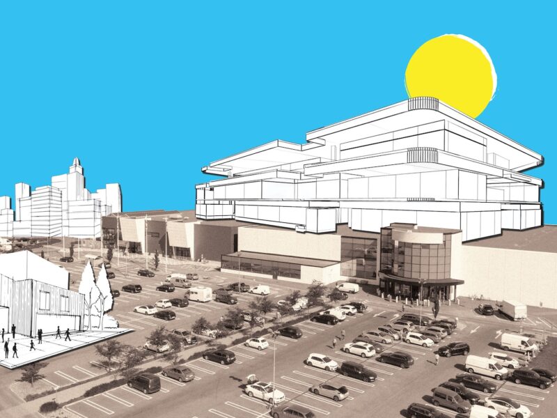
The question of what to do with floundering shopping malls in the age of online retail (not to mention the current pandemic) continues to confound municipalities from North America to New Zealand. In the Taiwanese city of Tainan, MVRDV has provided one of the year’s most eloquent responses to the problem in the form of Tainan Spring Lagoon, a new sunken plaza nestled into the footprint of a demolished mall originally built on the site only 37 years ago. As its name suggests, an open-air pool dominates the square, which covers 54,600 square metres and sits at the level of the shopping centre’s onetime underground parking garage.

PHOTO: Daria Scagliola

In hot weather, temperature-reducing mist sprayers offer relief to visitors, as does the shadowy arcade encircling the space. The water levels of the pool itself rise and fall according to the dry and rainy seasons. Perhaps the most show-stopping feature of the plaza, which also contains concrete follies left behind by the artful deconstruction of the mall, is a glass floor that exposes part of a second basement level. It all comes together, as MVRDV puts it, “like a contemporary Roman Forum,” offering a visual marker of the past as well as a way forward.

PowerHouse Telemark, Norway, by Snøhetta

Powerhouse Telemark by Snøhetta
PHOTO: Ivaar Kvaal

While its irregular crystalline form makes a striking impression, the true beauty of Snøhetta’s PowerHouse Telemark in the town of Porsgrunn, Norway, is how it performs. The fourth in the firm’s portfolio of energy-positive buildings, the mixed-use 11-storey structure was designed to produce more energy than it consumes over its lifetime. Its defining feature is the sloped roof – angled just so to increase surface area and maximize sun exposure – clad in photovoltaic panels that supply power to not only the 8,400-square-metre smart office building itself, but enough for 20 typical Nordic homes (excess is sold and transferred to the main public power grid). To ensure low-carbon emissions, a series of geothermal underground wells contribute to overall heating while dense concrete walls and triple-insolated windows help retain the geothermal and solar energy.

PHOTO: Ivaar Kvaal

Tianjin Juilliard School, Tianjin, China, by Diller Scofidio + Renfro

PHOTO: Zhang Chao

When the venerable New York conservatory The Juilliard School — a name synonymous with excellence in the performing arts — was interested in expanding its presence in China, it looked no further than an equally renowned hometown practice: DS+R. No stranger to landmark cultural buildings (take, for instance, the expertly renovated Lincoln Centre that also includes the organization’s own updated digs), the firm conceived a sprawling complex fit for the “the first performing arts institution in China to offer a U.S.-accredited Master of Music degree.” (The school also provides youth and adult programming and also hosts public events). 

PHOTO: Zhang Chao

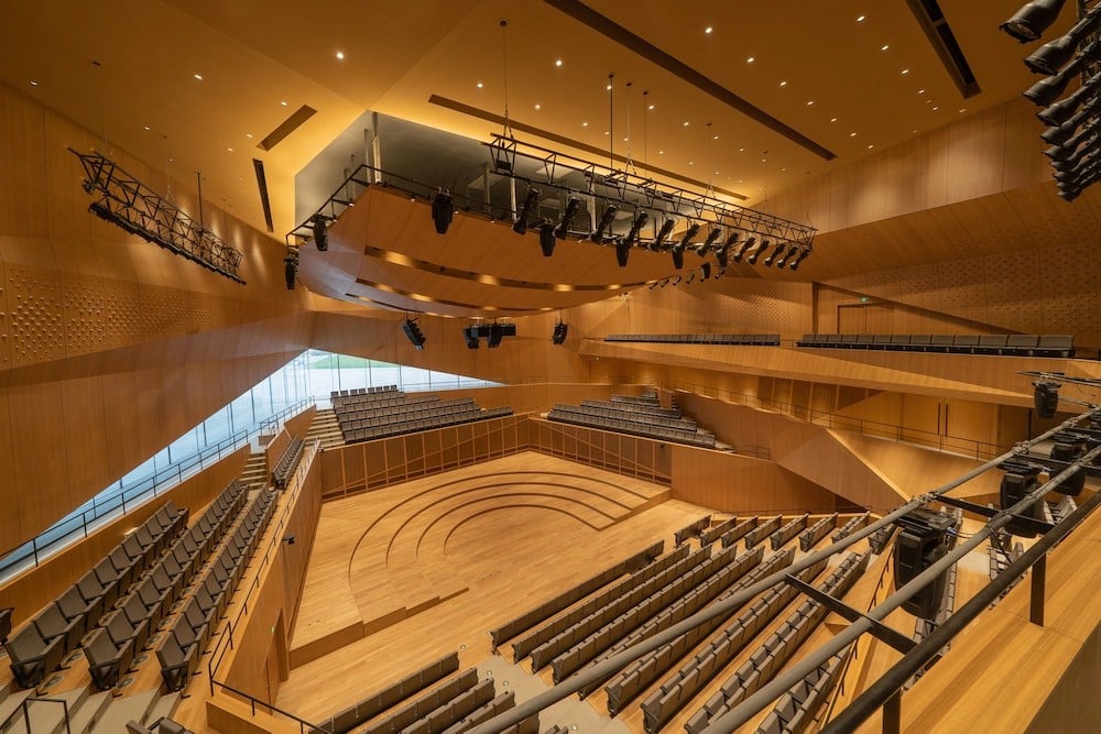
Within the over 30,000-square-metre campus, a concert hall, black box theatre, recital hall and more are contained within four pavilions that appear to have been carved by the waters of the nearby Hai River. A series of bridges that house classrooms, studios and practice spaces knit together the autonomous volumes while creating ample indoor gathering areas below. Not to be outdone, the theatres are just as impressive. In a deliberate nod to the warmth of the stateside venue, DS+R clad the interiors almost entirely in faceted wood.

Maggie’s Centre, Leeds, U.K., by Heatherwick Studio

Maggie's Leeds exterior of building
PHOTO: Hufton + Crow

Sprouting from a sloped corner lot on the campus of St. James’s University Hospital in Leeds, the newest Maggie’s Centre is an outstanding expression of humane architecture. Designed by Heatherwick Studio – the London firm’s first completed healthcare facility and the charitable organization’s 26th in the U.K. – the staggered three-volume structure reads as a grouping of large-scale planters with a strong connection to nature: Landscaping by Balson Agius includes dense gardens encircling the entire structure and capping each rooftop. Planted with native evergreens, deciduous trees and other species, the foliage is directly integrated with the building’s program to provide a sense calm and an opportunity for guests to spend time interacting with and tending to the gardens. 

Maggie's Leeds interior area with staircase
PHOTO: Hufton + Crow

The internal spaces are the epitome of tranquility enhanced by a well-appointed palette of natural and sustainable materials. From the blonde spruce wood base, walls of prefabricated frames (made from sustainably sourced spruce) soar to the ceiling, with rib-like protrusions adding an elegant and organic form. Integrated shelving is appointed with even more greenery and space for patients to display personal mementoes and keepsakes; porous lime-plaster walls aide in maintaining a comfortable internal humidity level throughout the naturally ventilated building. Light-filled and soothing, the Maggie’s Leeds Centre is a compassionate and thoughtful approach to patient care.  

Beloit College Powerhouse, Beloit, USA, by Studio Gang

PHOTO: Tom Harris

On the eastern bank of Wisconsin’s Rock River, the shell of the decommissioned generating remains as imposing as ever. But new life stirs within – with a striking polycarbonate volume hinting at the profound transformation inside. Architects Studio Gang have transformed and reimagined the former industrial powerhouse into a multi-purpose student hub for local liberal arts school Beloit College.

PHOTO: Tom Harris

The preserved bones of the coal-fired complex are now home to a recreation centre complete with an eight-lane pool, an elegant field house, and a showpiece running track that winds through the 11,000-square-metre facility suspended from the ceiling. Alongside a 164-seat auditorium, spaces for social life, collaborative work and study round out the facility, which is heated and cooled by radiant panels drawing from the river. And at night, the field house’s seemingly weightless polycarbonate shell lights up like a lantern.

What relevance does product design have in a world gripped by viral disease? A great deal, as it turns out. During a year in which many of us were forced to shelter in place, the ways in which we accoutre said places — the stuff that we surround ourselves with, the things that protect us and help us adapt to change — became top of mind and even more important. Suddenly, that poorly laid out kitchen, rickety work desk and uncomfortable armchair weren’t just inconveniences, but real hindrances to joy and productivity. And in a marketplace flooded with masks and shields (many of them poorly designed), the live-saving retooling of existing gadgetry (snorkel gear!) stands out as a stroke of genius.

Here, then, is our Top 10 list of 2020’s best designed products, from an AI-powered home fitness system and the puffiest lounge chair around to handsome workplace privacy booths for when we do return to the office.

Taba Collection by Alfredo Häberli for Moroso

Though intended for everyday use, there is nothing remotely pedestrian about Moroso’s Taba collection. Which is no surprise considering the pieces are the work of Zurich-based Argentinian designer Alfredo Häberli, long known for his marvellous merging of poetry and precision. Promoting the “existential multi-functionality” of life, the Taba family of upholstered pieces — one sofa, two armchairs, one bench and four pouffes — is defined by sinuous contours that harmonize the individual elements.

The organic shapes sprung from Häberli’s memories of a childhood game that involved the tossing of a cow bone, with the resulting asymmetrical lines creating an opportunity for various seating possibilities. A practical embellishment in the form of a flat shelf-like surfaces runs along the backs of the sofas and armchairs, creating a functional surface. On their own, the pieces have a sculptural presence; in a grouping, they nest closely together in a way that is meant to encourage interaction between people. After a year of social distancing, the idea of furniture as a place to “live, sit, talk [and] work” together is a refreshing — and welcome — proposition.

Dandy Plus by Fabio Novembre for Scavolini

If Dandy Plus exudes a retro-chic vibe, that’s because it draws direct inspiration from Scavolini’s best-selling Dandy system from the 1980s. In terms of high-tech function, however, it was made for 2020. Among its visual highlights are rounded corners, decorative textures and bright accent colours; the wall and base units, tables and consoles, meanwhile, are framed in a pleasing light grey.

Belying the friendly yesteryear aesthetic is the integration of the latest technology. An Alexa-compatible smart speaker affixed to a wall-mounted aluminum profile called the Task Bar, for instance, allows voice activation of the hood and lights as well as access to music playlists and recipe instructions; the Task Bar also contains USB ports and power outlets limned in those vibrant accents, elevating what are often eyesores, while the worktop features a built-in wireless charger. If technology sometimes feels overwhelming, this kitchen system wonderfully balances the comforts of the past with the constant connectivity of the now. All of its style and functionality also extend to the living room and bathroom furnishings that complete the Dandy Plus line.

Era Scrittorio by David Lopez Quincoces for Living Divani

Although it wasn’t conceived as such, Spanish designer David Lopez Quincoces’s Era Scrittorio for Italy’s Living Divani is just about the perfect desk for the WFH era. Clean-lined and elegant, with a three-compartment drawer on one side of its wood veneer top and a handy open shelf on the other, the 75-centimetre-tall-by-117-centimetre-wide unit offers a generous work surface, deep storage options and plenty of leg room underneath. Clear away your laptop and paperwork, however, and the desk becomes an (understated) statement piece, as quietly sublime as it is serviceable.

The charm is all in the details. That veneered top (available in trademarked Stone Oak or a lacquered walnut called Canaletto) sits on a tubular steel frame coated gunmetal grey, a discreet V form adorning the back. The coloured drawer front and desk sides can be had in a range of shades (including grey, cream, wine red and ocean blue, plus the two wood veneers), while the matte brass accents at the base of the legs add just a hint of lustre. Both subtle and complex, multifaceted yet cohesive, it’s a model of material and chromatic harmony — and as pretty a perch as any to labour away at.

Aura Light by Sabine Marcelis for Established & Sons

As anyone who endured a poorly illuminated Zoom meeting can attest, good lighting proved essential to effective (not to mention attractive) communication this year. Fortunately, Rotterdam-based designer Sabine Marcelis, whose creations are normally available through galleries, unveiled her Aura Light as part of Established & Sons‘ aptly named LIVE/WORK line in September. Harnessing Marcelis’s expertise in the use of cast translucent materials, Aura emits a soft ambient light that, says the brand, “is ideal for a home-working environment as well as relaxed living and office spaces.” The fixtures themselves are also easy on the eyes, encasing their replaceable LED tubes in suspended cylindrical bars shaded luscious citrus tones.

And there’s substance behind the style, too. Over a metre in length, the bars are made of a bio-epoxy resin, formulated using byproducts from the agricultural industry. The design, Marcelis explains, “is the first step towards making some [of her] lighting available to a wider audience, but in a conscious and sustainable manner.”

Forme Life by Yves Béhar and Trent Ward

Released at a time in which outside activity was and remains limited, this state-of-the-art at-home fitness system is more than timely, proving how well-designed exercise equipment (powered by AI) can keep us healthy and fit without eating up precious floor space. Designed by Yves Béhar, Forme Life is in fact a functional shape shifter: A full-length mirror when it isn’t in use, it comes alive when users speak to it, activating a digital instructor that guides them through a wide range of fitness classes and customized routines.

As we wrote when it first launched, the system adapts to individual strengths and weaknesses via cameras and sensors that capture movements and create a workout history, allowing users to preset sessions. The machine can also adjust weight levels in real time, using biometric data to decide whether to add or subtract one-pound increments to the pulley-controlled resistance arms. Just about the only thing it can’t do, in fact, is the actual lifting and pulling.

Puffy Lounge Chair by Faye Toogood for Hem

Cozy isn’t often the first word that comes to mind when describing classic modernist steel-framed furniture, but there really is no other way to characterize the Puffy Lounge chair. Created by Faye Toogood, the voluptuous piece marks the British designer’s first collaboration in a series with Swedish contract-furniture maker Hem intended to explore the softer side of tubular furniture. 

What sets Puffy apart is its plump duvet-inspired upholstery that envelops the minimal structured frame; stuffed with padding made from silicone ball fibre and foam, the detachable quilted cover feels as familiar as a reassuring embrace. Equal parts playful and functional, Puffy Lounge is available in three neutral colourways with its 30-millimetre steel-tube base in sandblasted stainless steel and powder-coated anthracite or chalk. In short, it’s comfortable, good-looking and distinctive — all the makings of a future icon.

Patkau Cocoon by Patkau Architects for Nienkämper

In 2011, B.C.-based Patkau Architects brought a series of sinuous plywood shelters to a frozen river delta in Winnipeg as part of the city’s Warming Huts architecture competition. Inspired by herds of buffalo with their backs to the wind, the design introduced a warm, lively and subtly poetic presence to the frigid landscape. Nearly a decade later, the mesmerizing shelters provided inspiration for Nienkämper’s Patkau Cocoon, a workplace privacy booth like no other.

The curved plywood and wood veneer cocoons bring an uncommonly delicate and refined presence to the office, with the humble materials elevated by a sophisticated design language and unfussy functionality. Offering just the right degree of visual and acoustic separation, the organic setting makes for a soothing workplace retreat — and a mesmerizing visual accent.

Fence-e Nature by Philippe Starck for Cassina

A standout among Cassina’s portfolio of recently released outdoor collections (which featured bold offerings from the Italian brand’s art director Patricia Urquiola and more), Philippe Starck’s Fence-e Nature is a trio of tailored furnishings including a sofa, an armchair and a coffee table in two heights. Although each of the pieces shares a refined die-cast aluminum base, it’s the solid teak details that are most striking. In the one-, two- and three-seater options, two planks-cum-armrests are connected by a linear dowel bisected by a slender pin.

These wooden elements — inspired by the traditional joinery used in Eastern architecture — are paired with a tall woven backrest to give the line’s industrial frame a graceful handcrafted quality; the upholstered polyester and memory foam cushions with graphic piping lend it yet more sophistication. The effect is what Starck succinctly describes as “relaxed elegance” or, in other words, exactly what life outdoors should be. 

Roll by MUT for Sancal

When Spanish studio MUT unveiled its design for the annual Das Haus conceptual residence at IMM Cologne last January, founders Alberto Sanchez and Eduardo Villalon could hardly have known that their al-fresco-oriented abode would be so prophetic. Among the 12 prototypes that populated the installation — which included everything from scalloped ceramic tiles to textured coloured-glass tables — was Roll, a charming and graphic seat for manufacturer Sancal.

To create Roll, the Valencia-based designers riffed on the geometries of gym equipment, adapting the plush portions of leg presses into two tubular upholstered elements that function as a seat and backrest respectively. Released as part of Sancal’s Museo collection (alongside works by Note Design Studio, Sylvian Willenz and more), Roll is offered in an array of fabrics and leathers (plus 16 lacquered frame options) and is simultaneously quotidian and futuristic (even stackable up to four chairs high). It’s an instant classic.

Decathlon Mask Ventilator by ISSINOVA

Even in the early stages of the pandemic, simple cloth face coverings quickly became available at just about every corner store, but critical shortages of respiratory ventilators persisted for months. Fortunately, design responded. While a wide range of innovative solutions helped fill the gap, Italian engineering start-up ISSINOVA’s inventive adaption of snorkelling equipment proved a practical, functional and aesthetic standout.

In collaboration with doctor Renato Favero, the Brescia-based firm designed an emergency ventilator that combines standard Decathlon International snorkelling equipment with its custom 3D-printed “Charlotte Valve” to provide reliable performance on a rapid and easily reproducible scale. After extensive testing at the hospital in the small city of Chiari, the patent for the valve was made freely available for use around the world, along with a step-by-step video installation guide. In hard-hit Lombardy and beyond, it proved a life-saver.