


Australia’s Aesop doesn’t do much traditional advertising, and it doesn’t really have sales. Instead, the luxury skin care brand relies on subtle but declarative product branding – and eye-catching interior design. Now boasting close to 250 retail outlets, the brand has emerged as a global presence. But no two stores are alike, with an impressive roster of – often local – architects and designers shaping each marquee space as an expression of both brand and locale. Here, we bring together seven spaces – many previously covered on our website and in our magazine – that best express Aesop’s sophisticated identity while celebrating their urban contexts.
1
Rome – Studio Luca Guadagnino

A chance encounter in Los Angeles between Aesop founder Dennis Paphitis and Italian filmmaker Luca Guadagnino – of Call Me By Your Name fame – was the genesis of an unexpected design partnership. According to Guadagnino, Paphitis tasked the director-turned-designer with creating “a sense of monastic order and tranquility.”

In a nod to the city’s history, a material palette of rough-cut stone and straw bricks evokes ancient buildings, while a quietly luxurious interplay of marble tones anchors the space, also reflecting the faded colours of surrounding Roman architecture. We like this space so much we included it in our favourite interiors of 2018.
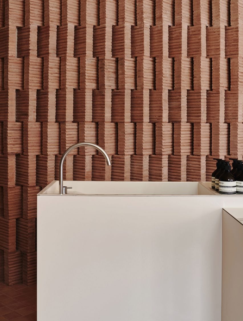
2
Seoul – Mlkk Studio

Reclaimed red bricks dominate the two-storey Aesop store just south of central Seoul. The richly textured surface rises from floor to ceiling and throughout a series of curved arches to create a sense of a warm and cosy retreat.

The bricks (which were also used to clad service counters) are complemented and contrasted by soothing pastel walls, while notes of copper lend the faucets and shelves a glimmering presence. Through rigorous material consistency, Hong Kong-based Studio Mllk has created a memorable space that’s an especially welcoming retreat in Seoul’s chilly winters.
3
Brooklyn – Frida Escobedo

In Park Slope, Mexican architect Frida Escobedo used rammed earth bricks to define a simple and uncluttered space. Sourced from Mexico and arranged into diagonal rows of tessellated patterns, the bricks create a surprising sense of variety.

Inspired by traditional Mexican architecture, the subtle design also draws on the masonry of surrounding brownstones in Brooklyn, where the Aesop Store has been integrated into an existing building on a prominent corner lot. Escobedo retained the building’s expansive windows and interior detailing, as well the original stamped-tin ceiling. This wasn’t the architect’s first Aesop in Brooklyn – she designed a rustic yet simple spot previously.
4
Brussels – Bernard Dubois

Bricks are the star of the show in Brussels too. This time, local architect Bernard Dubois used distinctively Belgian yellow bricks – which were nearly ubiquitous in the mid-20th century – to create a contemporary variation on a familiar aesthetic.
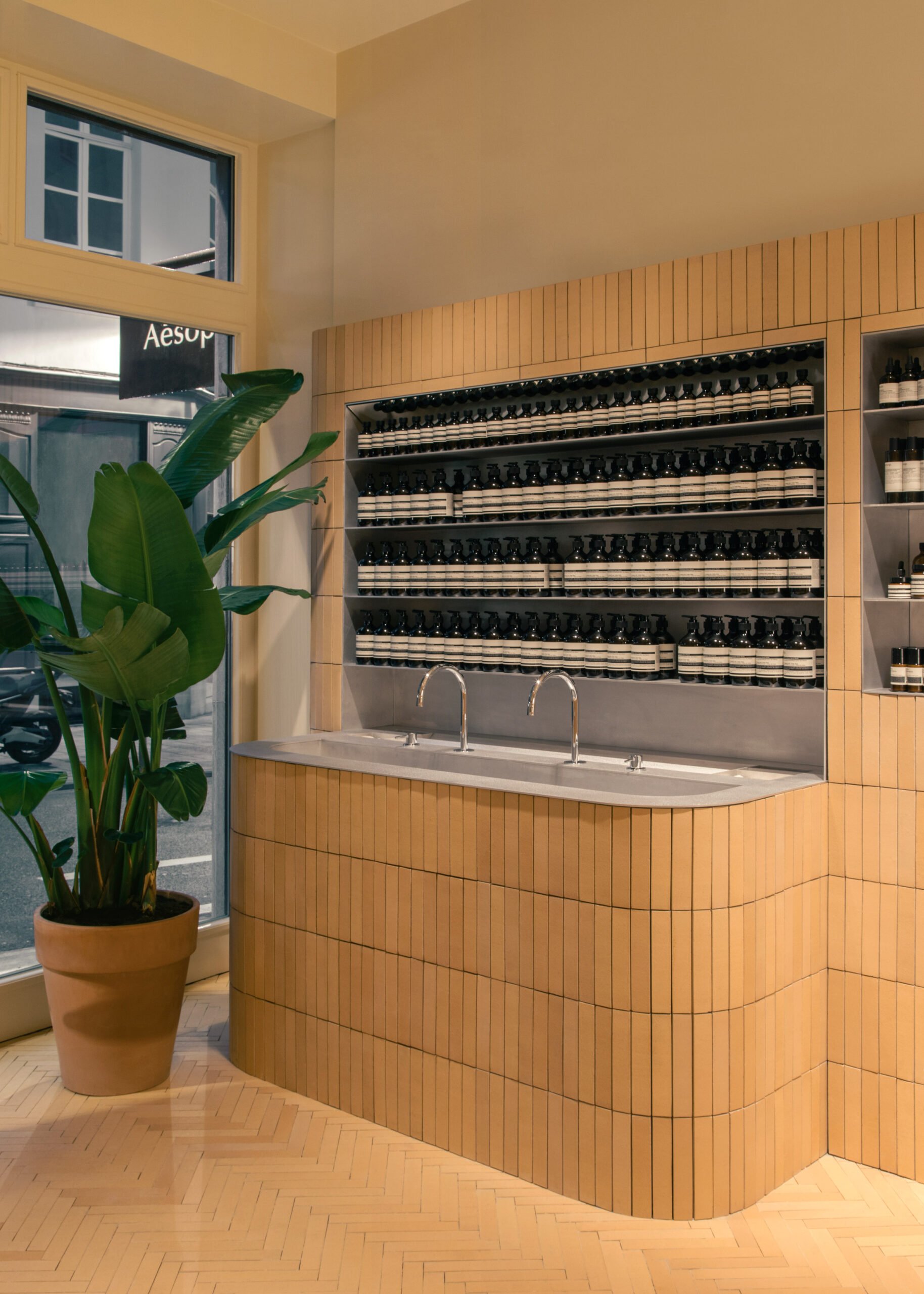
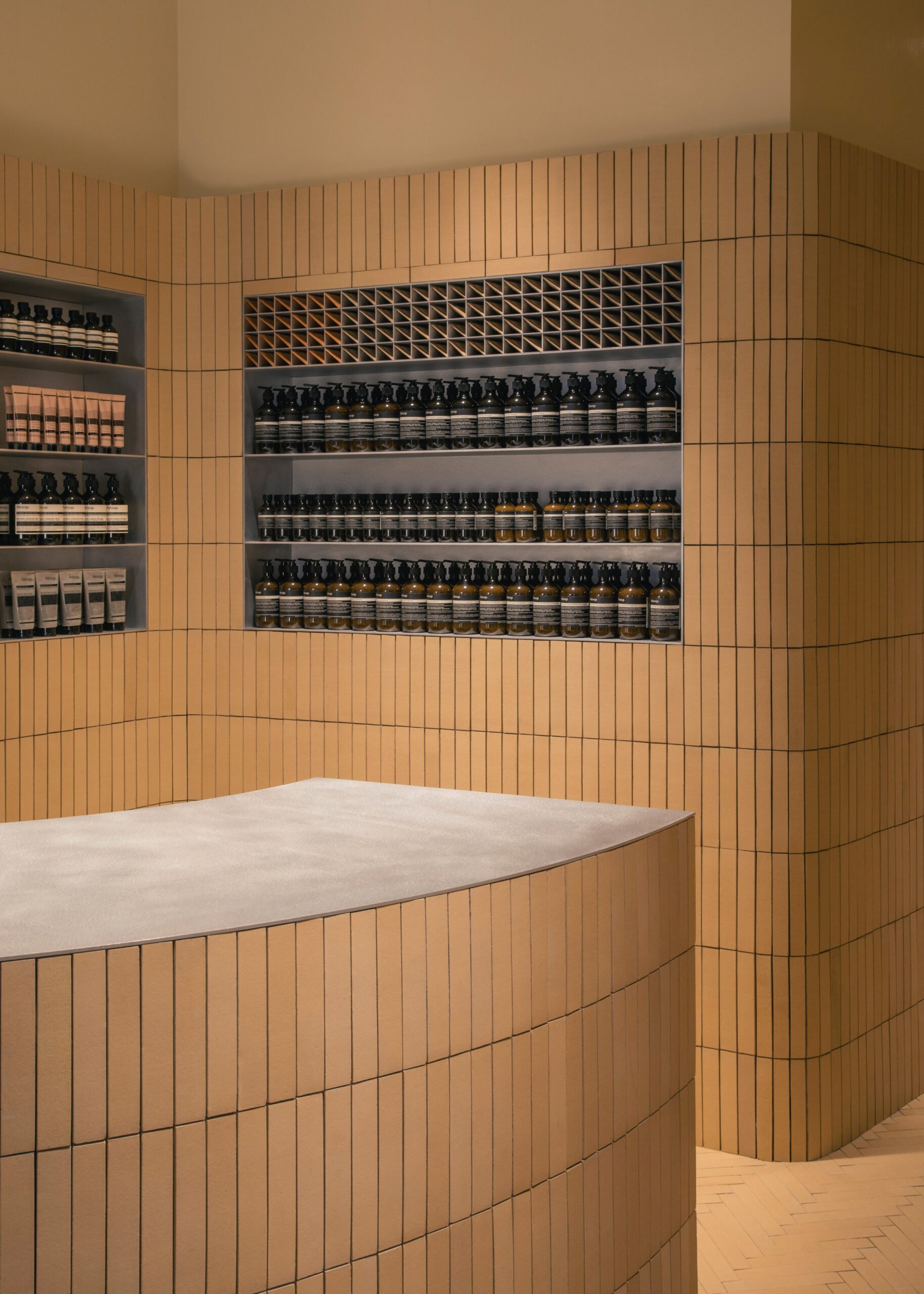
Complemented by brushed aluminum accents, the signature bricks are stacked vertically across the shelves and counters, seamlessly hugging the curved fixtures. On the floor, the same bricks create a parquet pattern.
5
Montreal – Alain Carle
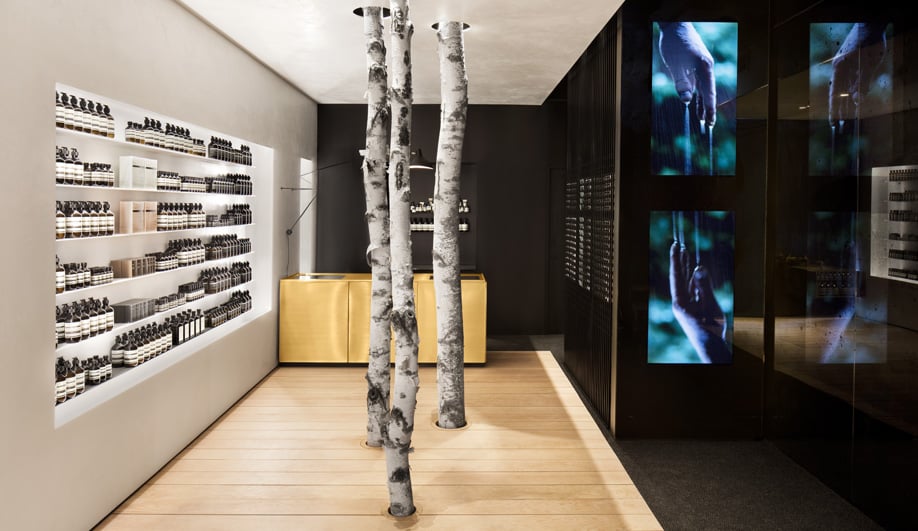
A poetic presence – and a whimsical aesthetic – can be felt in the Westmount Aesop designed by Montreal’s own Alain Carle. (We originally covered it, together with Naturehumaine’s Mile End shop, here.) A trio of birch trees punctures both floor and ceiling at the heart of the room, and the ritual of cleansing is evoked by artist Pascal Grandmaison‘s immersive multimedia installation. Meanwhile, Carle’s commanding gold-hued sinks and counters celebrate water and the black-glass mirror at the back visually doubles the space, reflecting the whole of the room back to customers.
6
London – Snøhetta

If it feels like Snøhetta is everywhere, that’s because it is. The Norwegian firm has now designed over half a dozen flagship locations for Aesop alone – partnering with the brand across the globe. London’s Chelsea neighbourhood may be home to Snøhetta’s most striking Aesop store to date.

Evoking the signature curves of modernist master Oscar Niemeyer, a dramatic column sits at the heart of the space. Snøhetta turned the structural support into a marquee feature, with a dozen flying buttresses reaching out to embrace the room. For more on the space, check out our May 2018 feature.
7
São Paulo – Fernando and Humberto Campana

In their home city of São Paulo, sibling designers Fernando and Humberto Campana turned to traditional Brazilian Cobogó bricks to foster an earthy and natural ambiance.
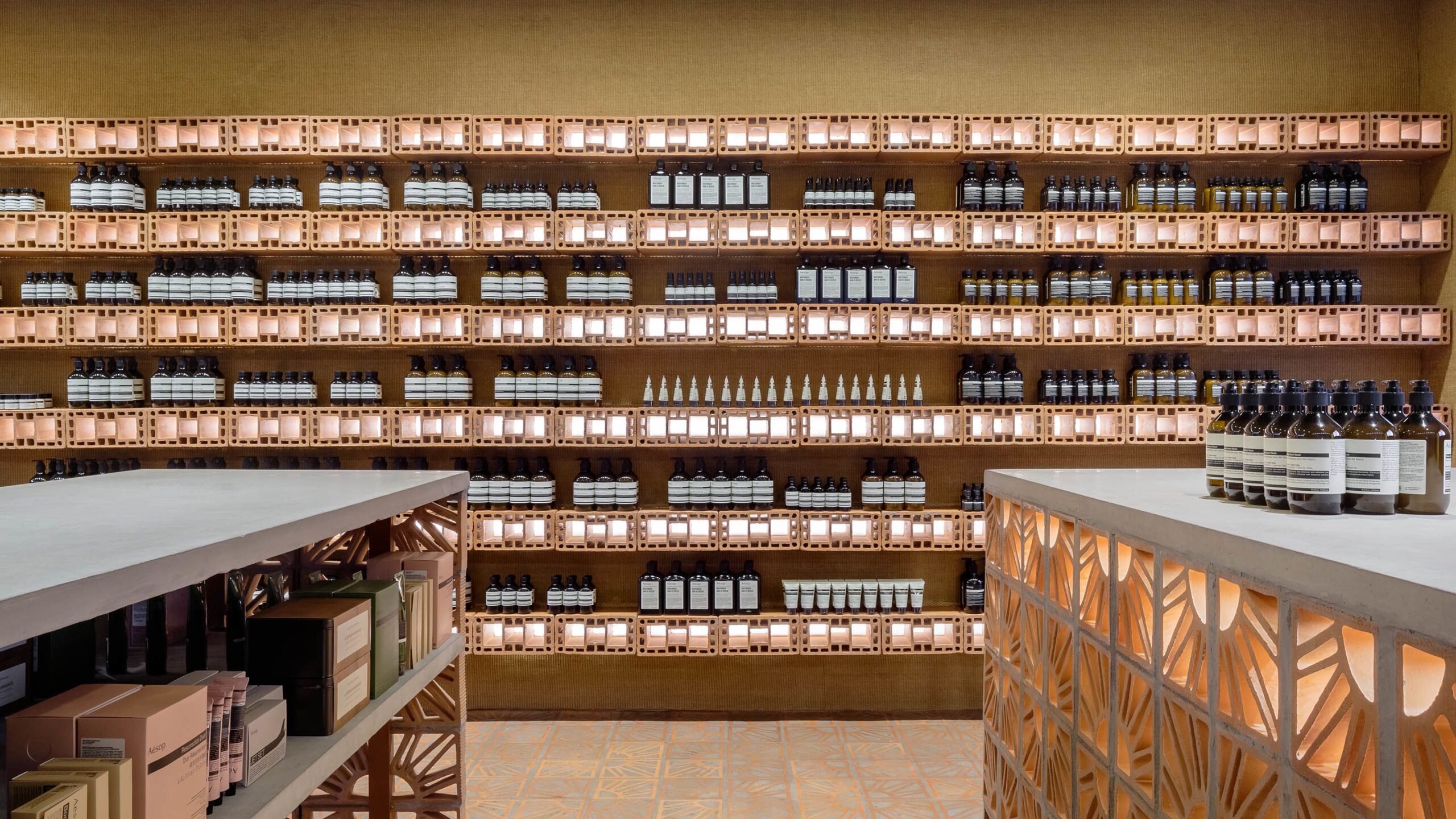
Spanning the walls and stretching out into a small courtyard, the bricks also create shelves and display spaces. Widely used across South America, the hollow ceramic blocks allow light and air to filter evenly into buildings, creating breathable spaces.


Did we leave out your favourite Aesop location? Let us know – and check out our previous coverage of the brand here.
7 Aesop Stores that Elevate the Urban Apothecary
For Australian skin care brand Aesop, interior design is a key part of the draw.