


1 New Bordeaux Stadium by Herzog & deMeuron, in Bordeaux, France
Elegant and delicate are not words usually associated with football stadiums, but then Herzog & deMeuron’s latest sports arena in Bordeaux, France, is hardly typical. From a distance, it appears as a forest of slender white trunks surrounding a floating bowl, which flares dramatically into a rectangle at the top.
Although it looks impossibly light, the bowl supports seating for 42,000 fans. Around the perimeter, open corridors weave among the pillars, while on two sides, ziggurat-like stairs to the interior climb the sides of a plinth that underpins the stadium, and houses the mechanical, VIP and media functions. For all this sculptural beauty, though, the stadium is reassuringly familiar from the inside, with two tiers of pigeon-grey seats lining stands that overlook the soccer pitch. An opening in the flat roof has the same dimensions as the grassy field, admitting light that focuses attention where it belongs while shading spectators from the elements.


2 Learning Hub by Heatherwick Studio and CPG Consultants, in Singapore
Whether you see it as a cluster of beehives or as a pile of dim sum baskets, the Learning Hub is a visual marvel, inside and out. It is part of a £360-million redevelopment of the Nanyang Technological University in Singapore, and to draw international attention to the expanding campus, the school hired Heatherwick Studio, one of the most original and inventive design firms in the world. Working with local firm CPG Consultants, the studio envisioned the building as a meeting point for students to learn independently; and while it is filled with learning spaces, its main purpose is to encourage 34,000 students to meet up, connect and share ideas.
Architecture writer Michael Webb reviewed the building for Azure when it first opened in March: “To make the facility welcoming, Heatherwick decided to give the concrete ‘love.’ He specified a warm tone, and reusable silicone moulds that would give every surface a three-dimensional texture, within the maximum allowable depth of 25 millimetres (any deeper, and the reliefs would encroach on the steel reinforcement). The curved concrete panels that clad the exterior are ribbed in subtly different patterns, and the aggregate is exposed. The 66 structural columns have gently undulating surfaces that capture the play of light and shadow; Heatherwick likens them to a human belly.”


3 Timmerhuis by OMA, in Rotterdam, the Netherlands
Like many top firms, OMA is angling to conceive buildings that boast a lengthy list of eco-friendly features – solar panels, passive shading systems, recyclable materials et al – as well as having very long lives. For a building to avoid costly gutting or simply being torn down, its initial plans need to accommodate future purposes that are not yet known. Timmerhuis, a cascading building that contains offices, retail shops and 23 housing units, is one such project, designed to morph with time and as its tenants dictate. Its cube-based structure can be easily retooled. If a new unit is needed, for instance, blocks can be added like Lego pieces that match in form to the existing silhouette of irregular peaks. What are now generous apartment terraces in the heart of Rotterdam can be converted into enclosed rooms.
Inside, two atria act as the building’s lungs; outside, the glazed facade uses high-tech translucent insulation to maximize energy efficiency. The main tenant is Rotterdam’s municipal offices, which requested in the original brief that its new home be the most sustainable building in the Netherlands. Six years later OMA has delivered. “We are very proud of Timmerhuis,” states lead architect Reiner de Graaf. “Rather than adding to Rotterdam’s revisionist planning and cacophony of architectural styles, the typical mass of Timmerhuis negotiates between the architectures of the buildings surrounding it.”

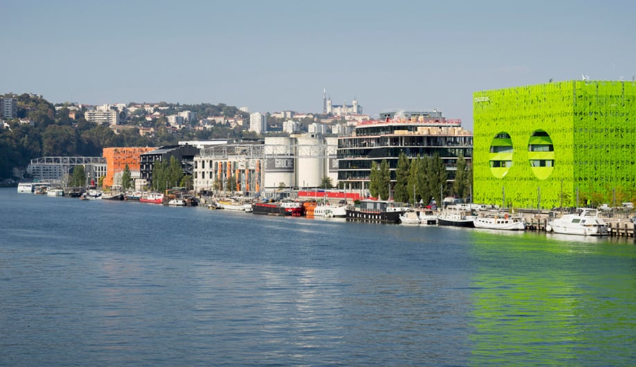

4 Euronews headquarters by Jakob + Macfarlane, in Lyon, France
It can hardly be said that Euronews headquarters, perched on the bank of the Saône River in Lyon, blends in with its environment. Surrounded by a backdrop of monotone mid-rises, the flat-roofed structure by Jakob + Macfarlane of Paris is wrapped in vivid lime-green aluminum panels. The sinuously perforated facade, designed by French artist Fabrice Hyber, introduces light into the interior spaces in dynamic ways, and allows for natural airflow to occur throughout the building.
Most staggering are the two conical atria that puncture the river-facing side of the building and appear as a pair of giant eyes gazing out, a symbolic gesture meant to reference the news organization “capturing the events of the world.” They also expose the 10,000-square-metre, six-storey office to further light and views of the river. Conceived by the firm in tandem with its sister structure down river, The Orange Cube, the two buildings are part of an ambitious revitalization scheme happening in Lyon that has seen other major buildings rise in the past few years, including the Confluence Museum by Viennese firm Coop Himmelb(l)au and an architecture school by Odile Decq.


Roughly 750,000 cases of cholera – a curable disease – have been documented in Haiti since the island was hit by a devastating earthquake in 2010. The staggering figure reveals the dire need to rethink public health infrastructure in regions where hospitals and clinics are in short supply or non-existent.
MASS Design Group, a not-for-profit Boston firm co-founded by Michael Murphy and Alan Ricks, is doing just that. This summer the firm opened the Gheskio Cholera Treatment Centre, where passive features kept construction costs low and stripped away the need for prohibitively high-cost operating systems. The porous cladding (built by local metalworkers) provides natural light and ventilation for better air circulation; an on-site wastewater treatment facility helps thwart further recontamination; and floors are pitched toward drains to assist in washing away surface microbes.
As New York Times architecture critic Michael Kimmelman noted, solution-based design thinking like this might even nudge Western hospitals away from the outmoded sealed building paradigm that relies on energy- and money-sucking mechanical systems. “Architectural innovation these days can travel south to north, after all,” he wrote, “not just north to south.”


6 Arnhem Central Station by UNStudio, in Arnhem, the Netherlands
Twenty years in the making and the largest post-war development in the Dutch city, the transfer terminal of Arnhem Central Station was finally unveiled last month. A twisting prefabricated coated-steel roof caps the 21,750-square-metre hub, conceived by Amsterdam’s UNStudio in collaboration with international engineering firm Arup. The undulating forms also provide structural support, enabling column-free expanses that stretch up to 60 metres. Glazing extends from the facade up and over the roof, becoming skylights that punctuate the interior timber ceilings.
Along with the train, tram and bus waiting areas and docking facilities, the terminal contains retail shops, restaurants, offices and a conference centre spread over four above-ground levels, with two additional underground levels for vehicle and bike parking. The complex system is anticipated to change the face of the city and become a major transport hub between Germany, the Netherlands and Belgium.


7 432 Park Avenue, by Rafael Viñoly Architects, in New York
Even as it was being built, criticism swirled around 432 Park Avenue - a striking, ruler-straight condo for the ultra-rich. Its record-breaking height (425.5 metres) surpasses the Empire State Building by 45.7 metres, yet it contains only 104 units, and its penthouse suite went on the market for a cool US$95million.
The tower makes our list for a number of reasons, including its unwitting role as an overt symbol of just how unaffordable mega-metropolises like New York have become. Also, it shows that the trend for ever-skinnier, ever-taller skyscrapers continues to grow: Foster + Partners’ 61-storey tower is now rising next door to Mies van der Rohe’s Seagram Building, and a 411-metre super-tower by SHoP will soon redefine 11 West 57th Street in Manhattan. All three call into question another heated issue: shadow-casting. After all, who is entitled to steal sunlight from our shared streets and public parks?
Despite the maelstrom of controversy, 432 Park Avenue is a marvel of glass and concrete. Its 96 floors take in views of the city from every direction, visible through 10-by-10 foot windows. Its designer, Rafael Viñoly, has described the building as an expression of the purest geometric form, the square. And its inspiration came from an unexpected place: a similarly shaped trash can designed by Josef Hoffman in 1905.


8 Ryerson Student Learning Centre by Snøhetta and Zeidler Partnership Architects, in Toronto
Toronto’s Yonge and Dundas intersection is not unlike Times Square. For one, both have risen from seedy pasts to become flashy, tourist-driven commercial districts defined by jumbo screens and megastores. It’s into this chaotic fabric that Norwegian firm Snøhetta, along with Toronto’s Zeidler Partnership Architects, have found a place for the Ryerson Student Learning Centre. The iceberg-like building faces onto bustling Yonge Street on one side and a leafy campus boulevard on the other.
Snøhetta’s design emphasizes the 10-storey structure’s street-level facade with one corner of the building chopped off to create a yawning entrance. Shimmering blue panels that clad part of the exterior continue inside, lead students up a monumental staircase and into a soaring, glass-lined lobby. Many of the floor plates are tilted, creating not just sloped ceilings but also amphitheatre-like rooms with tiered seating. Especially popular is the top floor Beach, where wooden ramps wind their way towards two fully glazed walls that overlook Yonge Street. Each level is branded with a different saturated colour and has a name that is inspired by nature: the Garden, the Sun, and so on.
Students were instantly enamoured with the building. When we were invited to wander the interior with Snøhetta principal Craig Dykers for the official inauguration in March, every desk, seat and beanbag chair within the 14,000-square-metre centre was already spoken for.


9 Leadenhall Building by Rogers Stirk Harbour + Partners, in London
Among the high-tech tall buildings that are filling London’s financial district, the Leadenhall stands out even among this rarified milieu. Nicknamed the Cheesegrater (and situated near the Gherkin and the Walkie Talkie), the gleaming, glass-clad skyscraper cuts a sharp figure with a form tapered to protect views of St. Paul’s Cathedral and other historic landmarks.
The building’s construction was a feat of high-stakes preparation: the team at Rogers Stirk Harbour + Partners initially assembled it in virtual models dozens of times before actually building it. Its 18,000-metric-ton structure was prefabricated and shipped to the site (24-metre beams were transported under cover of night) and secured with 3,000 bolts (three of which have since popped out, due to hydrogen embrittlement).
The 222-metre-tall, 45-storey building features the fastest panoramic elevators in Europe, and is BREEAM-rated, thanks to its sustainability measures, which include solar-responsive blinds, water-saving plumbing, and energy-use monitors. It’s such an effective calling card for Rogers Stirk Harbour + Partners that the firm has made the building its official home.


To house one of the richest collections of modern and contemporary art in the world, Italy’s Renzo Piano Building Workshop has created a space that is all about viewing art; not out-scaling it. Clad in pale blue-grey steel panels, the eight-storey building is wildly asymmetrical and bulky from almost any angle you look at it. “But stepping inside feels like cracking open a geode,” wrote Azure contributing editor Tim McKeough, who toured the museum just days after it opened in May.
The tough exterior gives way to a welcoming environment of unexpected beauty. “When you approach from Gansevoort Street, as most visitors will, the base of the building peels upward to reveal an expansive glass-walled lobby. From there, four elevators – with interiors by artist Richard Artschwager – and an intimate winding staircase lead to the column-free main galleries.”
We chose the new Whitney twice in our annual reviews: as one of the best cultural institutions of the year, and one of the top 10 buildings overall of 2015. Beyond its cultural significance, this stellar project shows how the High Line, the ultimate urban renewal project, has engendered yet more urban renewal. The new Whitney is fast becoming the famous elevated park’s crowning jewel.
See the rest of our 2015 Top 10 lists here.