Even as the bookstore at the University of British Columbia approached its 95-year milestone, its quarters were stuck in the darkest decades of the last century’s architectural trends. Along the bunker-like concrete structure’s tiered brutalist facade, the bookstore’s northeast-facing windows and below-grade arcade were hidden deep behind heavy concrete pillars and dark bushes. The interior was largely below grade as well, putting it even further out of reach of sunlight and adding to the feeling of stepping into a dungeon.
Vancouver’s Office of McFarlane Biggar was brought in to improve the bookstore’s visibility and the function of the service spaces, but their simple transformation ultimately produced far more remarkable results: the new interior is not only larger and better organized – with sophisticated amenities and more daylighting – but the exterior areas have also been reactivated and made safer thanks to improved sight-lines from inside the building to out.
OMB’s primary move was to push the perimeter of the building outwards and upwards, squaring it off and wrapping it in high-performance glazing to protect the remaining concrete elements. The massive pillars fortifying the exterior came down, replaced with slim steel columns inside.
Topping off the now two-storey tall space, and running along the perimeter of the newly expanded footprint, is a mezzanine that projects out over the first floor on the exterior, and surrounds a double-height lobby inside. The expanded glazing of this student gathering zone brings light deep into the building core, and offers relaxing students excellent views overlooking the courtyard and campus beyond.
To customize the glazing that lines this mezzanine, OMB asked the university’s professors, students and administrators, as well as tourists, to supply the name of a favourite book. The first sentences of these books were then combined to create a frit pattern that creates playful shadows across the interior, and reduces glare.
In a move that vastly improves both accessibility and a sense of connection to the rest of the campus, the architects have placed the expansion at grade, allowing the coffee shop and convenience store to spill directly onto the newly landscaped courtyard, energizing the boundaries of the building and beyond.
While the retail space in the deepest part of the building remains below grade, OMB has drastically widened the staircase, connecting the lower section of the building to the double-height glazed entryway, and channeling more light into the core. These poured concrete steps incorporate tiered seating topped with wood, offering students another area to converge for impromptu meetings or staging presentations.
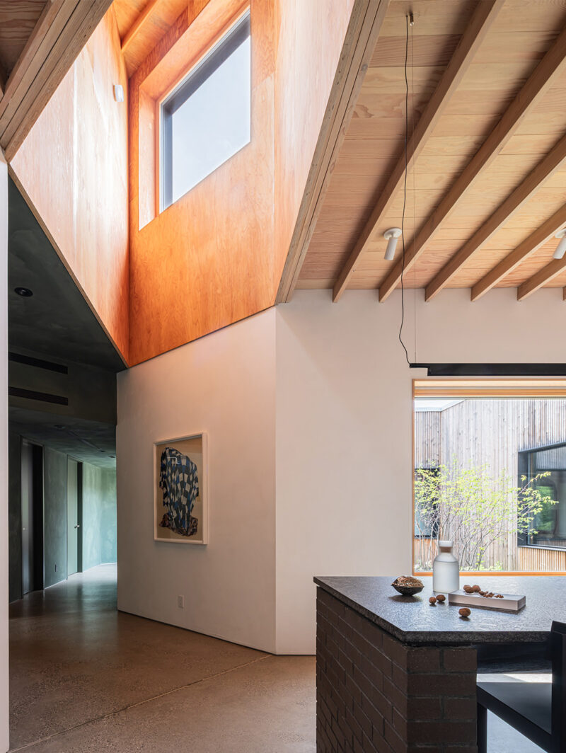
Virtually all of the interior spaces are completed using just three finishes: warm wood tones, polished concrete and flat white surfacing. The latter includes both the white-painted steel columns and railings, as well as the white laminate merchandising units in the retail area. Warmer wood tones are continued through the checkout counters, merchandising casework lining the retail space’s walls and – most notably – in the new timber ceiling which unifies all the interior spaces.

