“Form follows function.” When I started at Azure, that was the first design-world mantra I absorbed as part of my new lexicon. A journalism school grad beginning my first internship, I wasn’t versed in the world of architecture, but soon embraced this phrase as gospel. In the 18 years that followed, I learned — and continue to relearn — that it’s only the tip of the iceberg. As I begin my role as Editor in Chief, and after more than a year of an ongoing pandemic, the notion of “function” has become increasingly enriched by more inclusive perspectives, and more than ever, it must reflect how people of diverse groups, identities, abilities and backgrounds experience space. It also encompasses the feeling of safety and solace that our interior worlds must communicate, both intuitively and explicitly.
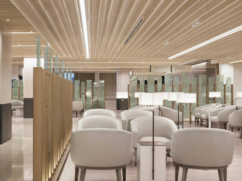
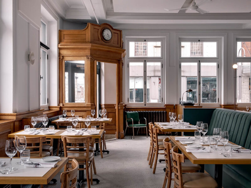
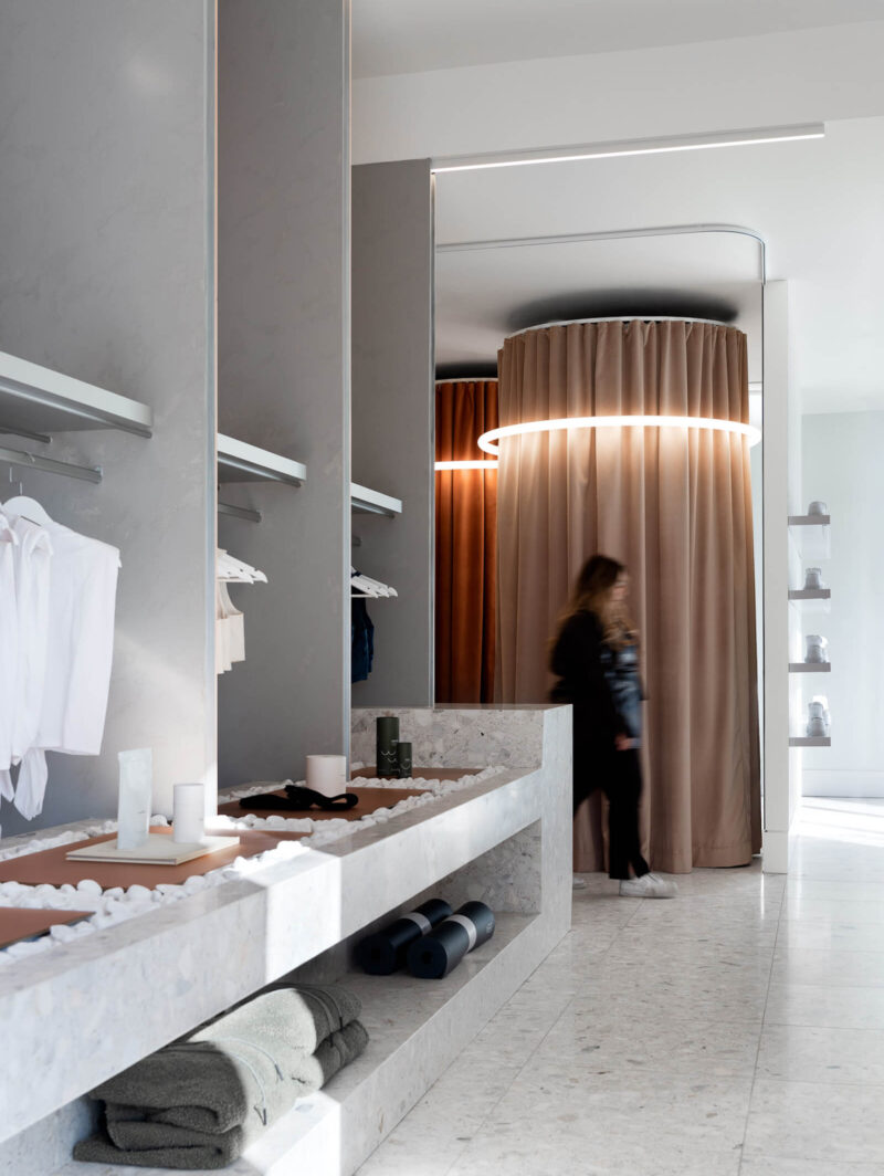
One thing we all have in common these days is our yearning to be reunited — and in the places that have been off-limits to gathering. Restaurants, bars and hotels are currently being recalibrated and reimagined with improved functions and modalities. But what does an interior that both reassures us and raises our spirits look like, feel like? In this issue, we present a variety of new spaces that we love for their uplifting qualities, their embrace of sunlight, plant life, whimsy and serenity.
And many of these projects augment what was already there: a TV headquarters in a 19th-century building in Madrid, a school addition for a building in Leeuwarden, the Netherlands, that was destined for demolition, a Jewish museum that integrates Frankfurt’s Rothschild Palais. They adapt old structures with vibrancy as part of an urban-minded strategy that is at the heart of sustainability.
At Azure, celebrating sustainability has always been at the forefront of our mandate. That’s another reason we are so proud of this, our first-ever carbon-neutral edition. It is printed on paper that contains 100 per cent post-consumer fibre and is manufactured using renewable energy by Rolland, an FSC-certified company. The printing process itself was powered mostly by renewable energy sources, and any non-renewable energy consumption required (as well as emissions from transit) was mitigated with the purchase of carbon offsets. The entire rigorously vetted endeavour was undertaken in collaboration with Keilhauer.
To bring the eco-friendly experience to our digital platform, we have created an energy-saving black-and-white default mode for the month of May. We hope you love this issue as much as we do, inside and out, in print and on the screen.
Step Inside Our First-Ever Carbon-Neutral Issue
In May/June 2021, we present a variety of new spaces that we love for their uplifting qualities, their embrace of sunlight, plant life, whimsy and serenity.


