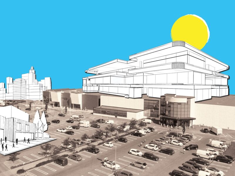
For a downtown site halfway between Foster + Partners’ Bow Building and the iconic Calgary Tower, BIG has proposed a single high-rise that would house both commercial office spaces and residential units. It will be located in the financial district, characterized by a mix of high- and mid-rise structures interspersed with the occasional parking lot, to which most people commute then leave after business hours.
Since the development team hopes to improve the livability and variety of the city centre while increasing density and walkability, the Telus Sky Tower is poised to sit near light rail and arterial roads. The attention to a pedestrian-friendly streetscape is evident in the tower’s most dramatic flourishes: on a block where today you’ll find a two-storey edifice of yellow brick, the firm has planned a pedestrian concourse. Sheltered by an awning of tilted glass panels, it seems to float like a pleated curtain in a breeze. An invitation to enter the sunlit atrium of the new tower, it also offers protection to those waiting for transit.
The firm conceived the tower in two parts. The bottom half is modelled on a typical commercial skyscraper, with a rectangular footprint and a flat, fully glazed facade. As it rises, the structure narrows, twisting inward on the broader north- and south-oriented facades. It’s a gesture reminiscent of BIG’s plan for Vancouver’s Beach and Howe tower, but the Calgary project tapers upwards for a more delicate profile, rather than downwards to reduce its footprint.
The residential units are housed in the narrowed upper portion. Rather than simply stepping the entire facade back to allow for uniform balconies, the tower is pared back only on the opposing northeast and southwest corners. The result is a zigzag of units on the upper floors. Although these blocks are aligned with the plinth of office spaces below, they are offset relative to one another, creating a skewed floor plan with open spaces for balconies that are sheltered between units for added privacy.
From below, there’s no clear delineation between the slabs of office space and the residential units above. As with the goal of the project as a whole, the flow from working to living is so smooth, it’s nearly invisible.

