


The home goods and furniture brand EQ3 may be a household name among design-savvy consumers in Canada, but, in the United States, the family-owned company is relatively unheralded. That won’t be the case for long.
The past year has been a milestone one for EQ3, shorthand for “emotional quotient in the third dimension” (or, as the company puts it, how spaces make us feel). Armed with refreshed branding geared toward the American market, it has opened four U.S. locations in quick succession: three in the greater Chicago area and the fourth in New York City.
For the latter — a built-from-the-ground-up flagship on Seventh Avenue in Manhattan’s Chelsea district — designer and former EQ3 creative director Thom Fougere led a team that included both architect and interior designer Kenne Shepherd and ARC Architecture + Design Studio, while Canadian creative studio Wedge revamped the company’s branding and identity.

Most of the time, architects and their clients aim for building designs that blend in with or reference their surroundings, but Fougere approached the Manhattan project in an almost inverse manner. “Not being a part of the New York scene is what makes this project special,” he says.
“The outsider’s perspective is an asset, especially for a brand based out of below-the-radar Winnipeg in the Canadian Prairies.” Wedged into a corner lot surrounded by brick high-rises, EQ3’s New York toehold stands out with a minimalist steel and glass form. “This focal point,” Fougere says, “almost pulls you off the sidewalk and into the building.”
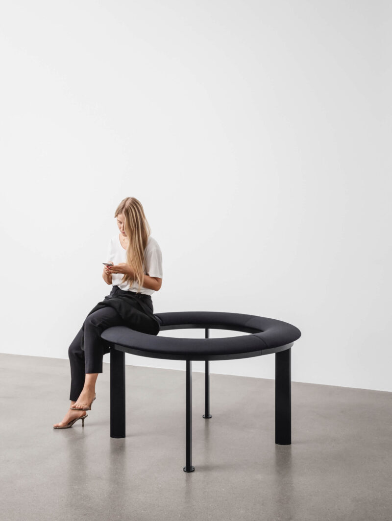
Indeed, the cubic structure functions as a jewel box of sorts, using a curtain-wall grid that frames vignettes through eight-by-eight-foot glazed openings. Inside, merchandisers can easily reconfigure the displays to showcase new products as they arrive. The interior aesthetic is modern, clean-lined and tranquil, much like the goods on offer.


On the ground and second levels, wide-plank oak floors evoke residential interiors and will patinate over time; complementary oak millwork creates cohesion, while neutral white walls provide a quiet backdrop to the changing furniture, lighting and accessory displays. The basement shares this palette but, as it’s windowless, incorporates more strategic spot and cove lighting.
Exceptional product in a pristine environment is only one component to the successful launch of a foreign label in America. Branding is another. “Our identity in the past was more unassuming and quiet,” says Nils Vik, EQ3’s senior director of brand development.

“As we were entering several new markets, we challenged ourselves to critically analyze the way we were representing EQ3 to a new audience.” Then, as if preordained, Toronto’s 2019 Interior Design Show (IDS) facilitated a chance encounter between Vik and Montreal-based Wedge.
“When I saw EQ3 in the show, it was like a moth to a flame, as I’ve always loved their furniture,” says Wedge partner and creative director Sarah Di Domenico. “I said something like, ‘Your furniture is amazing. I’m surprised more people don’t know about you.’ ”
She had no idea that she was speaking to the brand director, but, from that meeting on, their collaboration took off. “Part of the task was a fresh and elevated visual identity,” says Di Domenico, “but we went much deeper to unearth their purpose and help find their voice as a Canadian brand.”


These moves can be spotted throughout the New York flagship, from the subtly updated logo, product-tag design and typography to a new “Canadian by Design” ethos and campaign. The most noticeable introduction is a brand magazine, Made in Consideration Journal, which features product stories and lifestyle photography as well as insightful interviews with designers and partners such as Marimekko.
“Our new visual identity,” says Vik, “better represents the confidence of EQ3 and, as a result, we are experiencing increased engagement with existing customers and an increase in new customers. It was incredible to see the flagship store flooded with people in its opening week.”
Since then, the interest of the U.S. city’s denizens has unquestionably been piqued, positioning Canada — and perhaps even Winnipeg — as a product-design and retail force to be reckoned with.
Coming to America: Canada’s EQ3 Makes a Splash in Manhattan
Canadian home furnishings brand EQ3 caps off its recent expansion into the U.S. with its most ambitious toehold yet: an 840-square-metre, from-the-ground-up flagship in the heart of New York City’s Chelsea district.